💻 Activity: Refining a Simple Plot#
In every lab and many classes, you’ll need to visualize data, which requires making it meaningful to your audience.
Please work alongside me as we refine a simple plot of the trigonometric functions sine and cosine.
Create data#
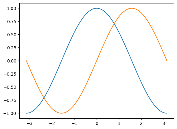
The first step is to get the data for the sine and cosine functions.
Note that we import pyplot from matplotlib. You’ll need to import this module when you want to use pyplot to visualize 2-D data.
import numpy as np
import matplotlib.pyplot as plt
%matplotlib inline

# creates a linear spaced array
X = np.linspace(-np.pi, np.pi, 256, endpoint=True)

# computes the sine and cosine
C, S = np.cos(X), np.sin(X)
X is now a NumPy array with 256 values ranging from -π to +π (included). C is the cosine (256 values), and S is the sine (256 values).
# plot the cosine against X
plt.plot(X, C)

# plot the sine against X
...

plt.show()
Customizing Plots#
Matplotlib was made to make 2-dimensional plotting easy! Nevertheless, tremendous customization is possible if desired as described in these resources and other documentation.
Let’s adjust the color of the lines to have the cosine in blue and the sine in red. Also, let’s make the lines slightly thicker with a width of 2.5.
We’ll also slightly alter the figure size to make it more horizontal.
plt.figure(figsize=(10, 6), dpi=80)
plt.plot(X, C, color="blue", linewidth=..., linestyle="-")
plt.plot(X, S, color="...", linewidth=..., linestyle="-")
[<matplotlib.lines.Line2D at 0x117e9e7c0>]
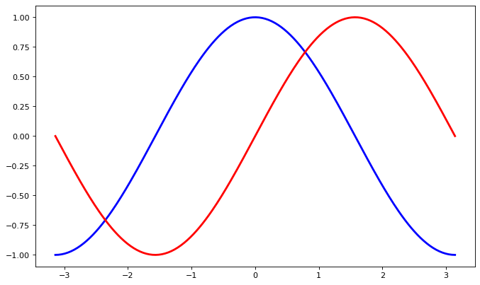
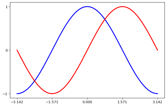
Setting Limits#
The current limits of the figure are a bit too tight, so we want to extend the range of the x- and y-axes.
Specifically, extend the ranges to be 10% more negative at the minimum and 10% greater at the maximum.
plt.figure(figsize=(8, 5), dpi=80)
plt.subplot(111)

X = np.linspace(-np.pi, np.pi, 256, endpoint=True)
C, S = np.cos(X), np.sin(X)

# copy these lines from above
plt.plot(X, C, ...)
plt.plot(X, S, ...)

plt.xlim(X.min() * ..., X.max() * ...)
plt.ylim(C.min() * ..., C.max() * ...)

plt.show()
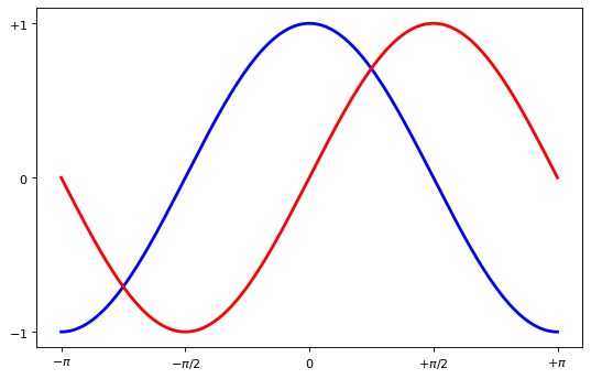
Setting Ticks#
The current ticks are not ideal because they do not show the interesting values (+/-π,+/-π/2) for sine and cosine.
We’ll change them such that the ticks show only these values.
Use the yticks function to make ticks only at -1, 0, and 1.
plt.figure(figsize=(8, 5), dpi=80)
plt.subplot(111)

X = np.linspace(-np.pi, np.pi, 256, endpoint=True)
C, S = np.cos(X), np.sin(X)

# copy these lines from above
plt.plot(X, C, ...)
plt.plot(X, S, ...)

# copy these lines from above
plt.xlim(...)
plt.ylim(...)

plt.xticks([-np.pi, -np.pi / 2, 0, np.pi / 2, np.pi])
plt.yticks(...)

plt.show()
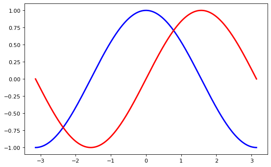
Setting the Tick Labels#
The ticks are now properly placed, but their label is not very explicit.
We could guess that 3.142 is π, but it would be better to make it explicit.
When we set tick values, we can also provide a corresponding label in the second argument list.
Note that we’ll use latex to allow for a nice rendering of the label.
import numpy as np
import matplotlib.pyplot as plt

plt.figure(figsize=(8, 5), dpi=80)
plt.subplot(111)

X = np.linspace(-np.pi, np.pi, 256, endpoint=True)
C, S = np.cos(X), np.sin(X)

# copy these lines from above
plt.plot(X, C, ...)
plt.plot(X, S, ...)

# copy these lines from above
plt.xlim(...)
plt.ylim(...)

plt.xticks(
    [-np.pi, -np.pi / 2, 0, np.pi / 2, np.pi],
    [r"$-\pi$", r"$-\pi/2$", r"$0$", r"$+\pi/2$", r"$+\pi$"],
)

plt.yticks([-1, 0, +1], [r"$-1$", r"$0$", r"$+1$"])

plt.show()
Moving Splines#
Splines are the lines connecting the axis tick marks and noting the boundaries of the data area.
They can be placed at arbitrary positions. Until now, they were on the border of the axis.
We’ll change that since we want to have them in the middle.
Since there are four of them (top/bottom/left/right), we’ll discard the top and right by setting their color to none.
We’ll move the bottom and left ones to the origin of the graph.
import numpy as np
import matplotlib.pyplot as plt

plt.figure(figsize=(8, 5), dpi=80)
ax = plt.subplot(111)

ax.spines["right"].set_color("none")
ax.spines["top"].set_color("none")
ax.xaxis.set_ticks_position("bottom")
# move the bottom spline to the origin
ax.spines["bottom"].set_position(("data", 0))
ax.yaxis.set_ticks_position("left")
# move the left spline to the origin
ax.spines["..."].set_position(("data", ...))

X = np.linspace(-np.pi, np.pi, 256, endpoint=True)
C, S = np.cos(X), np.sin(X)

# copy these lines from above
plt.plot(X, C, ...)
plt.plot(X, S, ...)

# copy these lines from above
plt.xlim(...)
plt.ylim(...)

plt.xticks(
    [-np.pi, -np.pi / 2, 0, np.pi / 2, np.pi],
    [r"$-\pi$", r"$-\pi/2$", r"$0$", r"$+\pi/2$", r"$+\pi$"],
)

plt.yticks([-1, 0, +1], [r"$-1$", r"$0$", r"$+1$"])

plt.show()
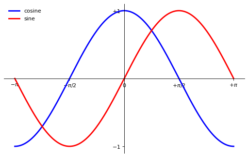
Adding a Legend#
Legends are necessary for accurate interpretation of graphics.
Let’s add a legend in the upper left corner by adding the keyword argument label (that will be used in the legend box) to the plot commands.
import numpy as np
import matplotlib.pyplot as plt

plt.figure(figsize=(8, 5), dpi=80)
ax = plt.subplot(111)
ax.spines["right"].set_color("none")
ax.spines["top"].set_color("none")
ax.xaxis.set_ticks_position("bottom")
ax.spines["bottom"].set_position(("data", 0))
ax.yaxis.set_ticks_position("left")
ax.spines["left"].set_position(("data", 0))

X = np.linspace(-np.pi, np.pi, 256, endpoint=True)
C, S = np.cos(X), np.sin(X)

plt.plot(X, C, color="blue", linewidth=2.5, linestyle="-", label="cosine")
plt.plot(X, S, color="red", linewidth=2.5, linestyle="-", label="...")

# copy these lines from above
plt.xlim(...)
plt.ylim(...)

plt.xticks(
    [-np.pi, -np.pi / 2, 0, np.pi / 2, np.pi],
    [r"$-\pi$", r"$-\pi/2$", r"$0$", r"$+\pi/2$", r"$+\pi$"],
)

plt.yticks([-1, +1], [r"$-1$", r"$+1$"])

plt.legend(loc="upper left", frameon=False)
plt.show()