Nonlinear Data
Contents
from IPython.display import HTML
import numpy as np
import matplotlib.pyplot as plt

from sklearn.datasets import make_circles
from sklearn.svm import SVC
Nonlinear Data#
So far, we have assumed that all data is linear, this is usually not the case.
We should add non-linearity to help learn nonlinear trends.
HTML('<iframe width="868" height="651" src="https://www.youtube.com/embed/3liCbRZPrZA" frameborder="0" allow="accelerometer; autoplay; encrypted-media; gyroscope; picture-in-picture" allowfullscreen></iframe>')
C:\Users\jca92\.conda\envs\jupyterbook\lib\site-packages\IPython\core\display.py:419: UserWarning: Consider using IPython.display.IFrame instead
  warnings.warn("Consider using IPython.display.IFrame instead")
Kernel Trick#
A Kernel trick converts data to a higher dimensional space where classes are linearly separable
Kernel methods owe their name to the use of kernel functions, which enable them to operate in a high-dimensional, implicit feature space without ever computing the coordinates of the data in that space, but rather by simply computing the inner products between the images of all pairs of data in the feature space.
Looking at Kernels#
def plot_svc_decision_function(model, ax=None, plot_support=True):
    """Plot the decision function for a 2D SVC"""
    if ax is None:
        ax = plt.gca()
    xlim = ax.get_xlim()
    ylim = ax.get_ylim()

    # create grid to evaluate model
    x = np.linspace(xlim[0], xlim[1], 30)
    y = np.linspace(ylim[0], ylim[1], 30)
    Y, X = np.meshgrid(y, x)
    xy = np.vstack([X.ravel(), Y.ravel()]).T
    P = model.decision_function(xy).reshape(X.shape)

    # plot decision boundary and margins
    ax.contour(X, Y, P, colors='k',
               levels=[-1, 0, 1], alpha=0.5,
               linestyles=['--', '-', '--'])

    # plot support vectors
    if plot_support:
        ax.scatter(model.support_vectors_[:, 0],
                   model.support_vectors_[:, 1],
                   s=300, linewidth=1, facecolors='none');
    ax.set_xlim(xlim)
    ax.set_ylim(ylim)
X, y = make_circles(100, factor=.1, noise=.1)

clf = SVC(kernel='linear').fit(X, y)

plt.scatter(X[:, 0], X[:, 1], c=y, s=50, cmap='RdBu')
plot_svc_decision_function(clf, plot_support=False);
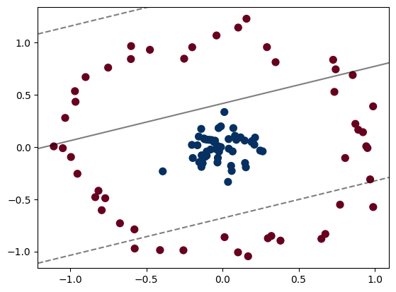
Clearly, we cannot use a linear classifier to classify this data!
We could apply a radial basis function centered on the central clump to expand this data into a higher dimensional and make it amenable to a linear classifier
from ipywidgets import interact, fixed


from mpl_toolkits import mplot3d

r = np.exp(-(X ** 2).sum(1))
plt.figure(figsize=(8,8))
ax = plt.axes(projection='3d')
ax.scatter3D(X[:,0], X[:,1], r, c=r, cmap='RdBu')
<mpl_toolkits.mplot3d.art3d.Path3DCollection at 0x189939f2290>
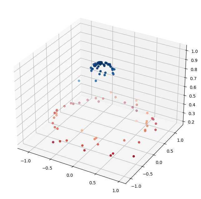
Now, making a linear classifier is trivial
How Kernel Tricks Work#
It is not possible to randomly try to find the correct location for a kernel when you have a large number of dimensions
You can use a kernel trick - we do not have time to go into the mathematics of kernel tricks. If you are interested in learning more go here
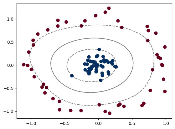
Example: Using Kernel Tricks#
clf = SVC(kernel='rbf', C=1E6)
clf.fit(X, y)
SVC(C=1000000.0)In a Jupyter environment, please rerun this cell to show the HTML representation or trust the notebook.
On GitHub, the HTML representation is unable to render, please try loading this page with nbviewer.org.
SVC(C=1000000.0)
Plotting the results#
plt.scatter(X[:, 0], X[:, 1], c=y, s=50, cmap='RdBu')
plot_svc_decision_function(clf)
plt.scatter(clf.support_vectors_[:, 0], clf.support_vectors_[:, 1],
            s=300, lw=1, facecolors='none');
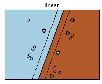
There are a bunch of kernels that you can use
Visualization of Different Kernels#
# Code source: Gaël Varoquaux
# License: BSD 3 clause
import numpy as np
import matplotlib.pyplot as plt
from sklearn import svm
# Our dataset and targets
X = np.c_[(.4, -.7),
(-1.5, -1),
(-1.4, -.9),
(-1.3, -1.2),
(-1.1, -.2),
(-1.2, -.4),
(-.5, 1.2),
(-1.5, 2.1),
(1, 1),
# --
(1.3, .8),
(1.2, .5),
(.2, -2),
(.5, -2.4),
(.2, -2.3),
(0, -2.7),
(1.3, 2.1)].T
Y = [0] * 8 + [1] * 8
# figure number
fignum = 1
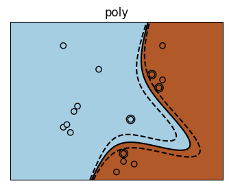
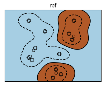
# fit the model
for kernel in ('linear', 'poly', 'rbf'):
clf = svm.SVC(kernel=kernel, gamma=2)
clf.fit(X, Y)
# plot the line, the points, and the nearest vectors to the plane
plt.figure(fignum, figsize=(4, 3))
plt.clf()
plt.scatter(clf.support_vectors_[:, 0], clf.support_vectors_[:, 1], s=80,
facecolors='none', zorder=10, edgecolors='k')
plt.scatter(X[:, 0], X[:, 1], c=Y, zorder=10, cmap=plt.cm.Paired,
edgecolors='k')
plt.axis('tight')
plt.title(kernel)
x_min = -3
x_max = 3
y_min = -3
y_max = 3
XX, YY = np.mgrid[x_min:x_max:200j, y_min:y_max:200j]
Z = clf.decision_function(np.c_[XX.ravel(), YY.ravel()])
# Put the result into a color plot
Z = Z.reshape(XX.shape)
plt.figure(fignum, figsize=(4, 3))
plt.pcolormesh(XX, YY, Z > 0, cmap=plt.cm.Paired)
plt.contour(XX, YY, Z, colors=['k', 'k', 'k'], linestyles=['--', '-', '--'],
levels=[-.5, 0, .5])
plt.xlim(x_min, x_max)
plt.ylim(y_min, y_max)
plt.xticks(())
plt.yticks(())
fignum = fignum + 1
plt.show()
It is rare, particularly with high-dimensional data that you will know what your kernel should be \(\rightarrow\) you can use hyperparameter tuning to discover the best model.