Interactive Graphing with Dash
Contents
Interactive Graphing with Dash#
Written on top of Plotly.js and React.js, Dash is ideal for building and deploying data apps with customized user interfaces. It’s particularly suited for anyone who works with data.
Through a couple of simple patterns, Dash abstracts away all of the technologies and protocols that are required to build a full-stack web app with interactive data visualization.
Dash is simple enough that you can bind a user interface to your code in less than 10 minutes
Dash apps are rendered in the web browser. You can deploy your apps to VMs or Kubernetes clusters and then share them through URLs. Since Dash apps are viewed in the web browser, Dash is inherently cross-platform and mobile ready
Dash Basics#
Dash apps are composed of two parts.
The first part is the
layoutof the app and it describes what the application looks like.The second part describes the interactivity
from dash import Dash, html, dcc
import plotly.express as px
import pandas as pd
from jupyter_dash import JupyterDash
from IPython.display import IFrame
A First Example with Dash#
app = Dash(__name__)

# This is the dataframe where the data is stored.
# Plot.ly and dash like to use Pandas dataframe. This is a data structure like an excel spreadsheet
df = pd.DataFrame(
    {
        "Fruit": ["Apples", "Oranges", "Bananas", "Apples", "Oranges", "Bananas"],
        "Amount": [4, 1, 2, 2, 4, 5],
        "City": ["SF", "SF", "SF", "Montreal", "Montreal", "Montreal"],
    }
)

# Plots a bar graph
fig = px.bar(df, x="Fruit", y="Amount", color="City", barmode="group")

app.layout = html.Div(
    children=[
        # heading
        html.H1(children="Hello Dash"),
        # subheading
        html.Div(
            children="""
        Dasher: A web application framework for your data.
    """
        ),
        dcc.Graph(id="example-graph", figure=fig),
    ]
)
app.run_server()
The layout is composed of a tree of
componentssuch ashtml.Divanddcc.Graph. The Dash HTML Components module (dash.html)has a component for every HTML tag.
The html.H1(children='Hello Dash')component generates a<h1>Hello Dash</h1>HTML element in your application.The children property is special. By convention, it’s always the first attribute which means that you can omit it:
html.H1(children='Hello Dash')is the same ashtml.H1('Hello Dash'). It can contain a string, a number, a single component, or a list of components.You can apply custom css stylesheets if you know HTML and web development
Making Changes to Dash Plot#
Dash enables hot reloading, this means you can modify the code of a plot and see the changes in real time. This is achieved by using app.run_server(debug=True)
%%writefile dash_scripts/dash_1.py

from dash import Dash, html, dcc
import plotly.express as px
import pandas as pd

app = Dash(__name__)

# This is the dataframe where the data is stored.
# Plot.ly and dash like to use Pandas dataframe. This is a data structure like an excel spreadsheet
df = pd.DataFrame({
    "Fruit": ["Apples", "Oranges", "Bananas", "Apples", "Oranges", "Bananas"],
    "Amount": [4, 1, 2, 2, 4, 5],
    "City": ["SF", "SF", "SF", "Montreal", "Montreal", "Montreal"]
})

# Plots a bar graph
fig = px.bar(df, x="Fruit", y="Amount", color="City", barmode="group")

app.layout = html.Div(children=[
    # heading
    html.H1(children='Hello Dasher'),

    # subheading
    html.Div(children='''
        Dash: A web application framework for your data.
    '''),

    dcc.Graph(
        id='example-graph',
        figure=fig
    )
])

if __name__ == '__main__':
    app.run_server(debug=True)
HTML Components#
Dash HTML Components (dash.html) contains a component class for every HTML tag as well as keyword arguments for all of the HTML arguments.
Let’s customize the text in our app by modifying the inline styles of the components. Create a file named dash_2.py with the following code:
%%writefile dash_scripts/dash_1.py

# Run this app with `dash_scripts/dash_1.py` and
# visit http://127.0.0.1:8050/ in your web browser.

from dash import Dash, dcc, html
import plotly.express as px
import pandas as pd

app = Dash(__name__)

# sets the colors in a dictionary
colors = {
    'background': '#111111',
    'text': '#7FDBFF'
}

# assume you have a "long-form" data frame
# see https://plotly.com/python/px-arguments/ for more options
df = pd.DataFrame({
    "Fruit": ["Apples", "Oranges", "Bananas", "Apples", "Oranges", "Bananas"],
    "Amount": [4, 1, 2, 2, 4, 5],
    "City": ["SF", "SF", "SF", "Montreal", "Montreal", "Montreal"]
})

fig = px.bar(df, x="Fruit", y="Amount", color="City", barmode="group")

fig.update_layout(
    plot_bgcolor=colors['background'],
    paper_bgcolor=colors['background'],
    font_color=colors['text']
)

# These are all HTML tags
app.layout = html.Div(style={'backgroundColor': colors['background']}, children=[
    html.H1(
        children='Hello Dash',
        style={
            'textAlign': 'center',
            'color': colors['text']
        }
    ),

    html.Div(children='Dash: A web application framework for your data.', style={
        'textAlign': 'center',
        'color': colors['text']
    }),

    dcc.Graph(
        id='example-graph-2',
        figure=fig
    )
])

if __name__ == '__main__':
    app.run_server(debug=True)
Visualization Options#
Bar charts are not that interesting. Plot.ly provides a lot of graph options.
The Dash Core Components module (
dash.dcc) includes a component called Graph.Graph renders interactive data visualizations using the open source plotly.js JavaScript graphing library. Plotly.js supports over 35 chart types and renders charts in both vector-quality SVG and high-performance WebGL.
Creating a scatterplot from a pandas dataframe#
%%writefile dash_scripts/dash_2.py

# Run this app with `python app.py` and
# visit http://127.0.0.1:8050/ in your web browser.

from dash import Dash, dcc, html
import plotly.express as px
import pandas as pd


app = Dash(__name__)

# reads a dataframe from the web
df = pd.read_csv('https://gist.githubusercontent.com/chriddyp/5d1ea79569ed194d432e56108a04d188/raw/a9f9e8076b837d541398e999dcbac2b2826a81f8/gdp-life-exp-2007.csv')

# plots the scatterplot
fig = px.scatter(df, # dataframe
                 x="gdp per capita", # x value
                 y="life expectancy", # y value
                 size="population", # size of scatter
                 color="continent", # color of scatter
                 hover_name="country", # What appears on the scatter
                 log_x=True, size_max=60)

app.layout = html.Div([
    dcc.Graph(
        id='life-exp-vs-gdp',
        figure=fig
    )
])

if __name__ == '__main__':
    app.run_server(debug=True)
Dash Markdown#
Since HTML can be somewhat less familiar it is also possible to use markdown in dash
%%writefile dash_scripts/dash_3.py

# Run this app with `python app.py` and
# visit http://127.0.0.1:8050/ in your web browser.

from dash import Dash, html, dcc

app = Dash(__name__)

markdown_text = '''
### Dash and Markdown

Dash apps can be written in Markdown.
Dash uses the [CommonMark](http://commonmark.org/)
specification of Markdown.
Check out their [60 Second Markdown Tutorial](http://commonmark.org/help/)
if this is your first introduction to Markdown!
'''

app.layout = html.Div([
    dcc.Markdown(children=markdown_text)
])

if __name__ == '__main__':
    app.run_server(debug=True)
Core Components#
Dash Core Components (
dash.dcc) includes a set of higher-level components like dropdowns, graphs, markdown blocks, and more.Every option that is configurable is available as a keyword argument of the component.
You can view all of the available components in the Dash Core Components overview.
%%writefile dash_scripts/dash_4.py

# Run this app with `python app.py` and
# visit http://127.0.0.1:8050/ in your web browser.

from dash import Dash, html, dcc

app = Dash(__name__)

app.layout = html.Div([
    html.Div(children=[
        html.Label('Dropdown'),
        # Dropdown
        dcc.Dropdown(['New York City', 'Montréal', 'San Francisco'], 'Montréal'),

        html.Br(),
        # Dropdown multiselect
        html.Label('Multi-Select Dropdown'),
        dcc.Dropdown(['New York City', 'Montréal', 'San Francisco'],
                     ['Montréal', 'San Francisco'],
                     multi=True),

        html.Br(),
        html.Label('Radio Items'),
        dcc.RadioItems(['New York City', 'Montréal', 'San Francisco'], 'Montréal'),
    ], style={'padding': 10, 'flex': 1}),

    html.Div(children=[
        html.Label('Checkboxes'),
        # Checklist
        dcc.Checklist(['New York City', 'Montréal', 'San Francisco'],
                      ['Montréal', 'San Francisco']
        ),

        html.Br(),
        # Label
        html.Label('Text Input'),
        dcc.Input(value='MTL', type='text'),

        html.Br(),
        html.Label('Slider'),
        # Slider
        dcc.Slider(
            min=0,
            max=9,
            marks={i: f'Label {i}' if i == 1 else str(i) for i in range(1, 6)},
            value=5,
        ),
    ], style={'padding': 10, 'flex': 1})
], style={'display': 'flex', 'flex-direction': 'row'})

if __name__ == '__main__':
    app.run_server(debug=True)
Callbacks#
So far we created adaptive visualization, these did not have interactivity
Callbacks are used to perform an operation when an action is taken
This is a common concept in all interactive programming
Simple Interactive Dash App#
%%writefile dash_scripts/dash_5.py

from dash import Dash, dcc, html, Input, Output

app = Dash(__name__)

app.layout = html.Div([
    # text
    html.H6("Change the value in the text box to see callbacks in action!"),
    html.Div([
        "Input: ",
        dcc.Input(id='my-input', value='initial value', type='text')  # input
    ]),
    html.Br(),
    html.Div(id='my-output'), # Id

])

# Here is a decorator
# when my-input or my-output is changed
@app.callback(
    Output(component_id='my-output', component_property='children'),
    Input(component_id='my-input', component_property='value')
)
# returns a string that is the new input value
def update_output_div(input_value):
    return f'Output: {input_value}'


if __name__ == '__main__':
    app.run_server(debug=True)
The “inputs” and “outputs” of our application are described as the arguments of the @app.callback decorator.
In Dash, the inputs and outputs of our application are simply the properties of a particular component. In this example, our input is the “value” property of the component that has the ID “my-input”. Our output is the “children” property of the component with the ID “my-output”.
Whenever an input property changes, the function that the callback decorator wraps will get called automatically. Dash provides this callback function with the new value of the input property as its argument, and Dash updates the property of the output component with whatever was returned by the function.
The
component_idandcomponent_propertykeywords are optional (there are only two arguments for each of those objects). They are included in this example for clarity.
Notice how we don’t set a value for the children property of the my-output component in the layout. When the Dash app starts, it automatically calls all of the callbacks with the initial values of the input components in order to populate the initial state of the output components.
In this example, if you specified the div component as html.Div(id=’my-output’, children=’Hello world’), it would get overwritten when the app starts.
Common updates#
childrenthis is the property of an HTML componentfigureto change the display data of a graphstyleto change the style of a graph or an object
Updating Graphs#
%%writefile dash_scripts/dash_6.py

from dash import Dash, dcc, html, Input, Output
import plotly.express as px

import pandas as pd

df = pd.read_csv('https://raw.githubusercontent.com/plotly/datasets/master/gapminderDataFiveYear.csv')

app = Dash(__name__)

app.layout = html.Div([
    dcc.Graph(id='graph-with-slider'),
    dcc.Slider(
        df['year'].min(),
        df['year'].max(),
        step=None,
        value=df['year'].min(),
        marks={str(year): str(year) for year in df['year'].unique()},
        id='year-slider'
    )
])


@app.callback(
    Output('graph-with-slider', 'figure'),
    Input('year-slider', 'value'))
def update_figure(selected_year):
    # filters the dataframe
    filtered_df = df[df.year == selected_year]

    # updates the graph with the filtered data
    fig = px.scatter(filtered_df, x="gdpPercap", y="lifeExp",
                     size="pop", color="continent", hover_name="country",
                     log_x=True, size_max=55)

    # animation for the updated layout
    fig.update_layout(transition_duration=500)

    return fig


if __name__ == '__main__':
    app.run_server(debug=True)
In this example, the “value” property of the dcc.Slider is the input of the app, and the output of the app is the “figure” property of the dcc.Graph.
Whenever the value of the
dcc.Sliderchanges, Dash calls the callback functionupdate_figurewith the new value.The function filters the dataframe with this new value, constructs a figure object, and returns it to the Dash application.
Key Features#
We use the Pandas library to load our dataframe at the start of the app:
df = pd.read_csv('...'). This dataframe df is in the global state of the app and can be read inside the callback functions.
Loading data into memory can be expensive. By loading querying data at the start of the app instead of inside the callback functions, we ensure that this operation is only done once – when the app server starts.
When a user visits the app or interacts with the app, that data (df) is already in memory.
If possible, expensive initialization (like downloading or querying data) should be done in the global scope of the app instead of within the callback functions.
The callback does not modify the original data, it only creates copies of the dataframe by filtering using pandas.
your callbacks should never modify variables outside of their scope.
If your callbacks modify global state, then one user’s session might affect the next user’s session and when the app is deployed on multiple processes or threads, those modifications will not be shared across sessions.
We are turning on transitions with layout.transition to give an idea of how the dataset evolves with time: transitions allow the chart to update from one state to the next smoothly, as if it were animated.
Dash App with Multiple Inputs#
Any “output” can have multiple “input” components.
Here’s a simple example that binds five inputs (the
valueproperty of twodcc.Dropdowncomponents, twodcc.RadioItemscomponents, and onedcc.Slidercomponent) to one output component (the figure property of thedcc.Graph component).Notice how
app.callbacklists all five Input items after the Output. This allows for the consideration of all filters
%%writefile dash_scripts/dash_7.py

from dash import Dash, dcc, html, Input, Output
import plotly.express as px

import pandas as pd

app = Dash(__name__)

df = pd.read_csv('https://plotly.github.io/datasets/country_indicators.csv')

app.layout = html.Div([
    html.Div([

        # x column
        html.Div([
            dcc.Dropdown(
                df['Indicator Name'].unique(), # all the unique indicator names
                'Fertility rate, total (births per woman)', # default
                id='xaxis-column'
            ),
            dcc.RadioItems(
                ['Linear', 'Log'], # log or linear
                'Linear',
                id='xaxis-type',
                inline=True
            )
        ], style={'width': '48%', 'display': 'inline-block'}),

        # y column
        html.Div([
            dcc.Dropdown(
                df['Indicator Name'].unique(), # all the unique indicator names
                'Life expectancy at birth, total (years)', # default
                id='yaxis-column'
            ),
            dcc.RadioItems(
                ['Linear', 'Log'],
                'Linear',
                id='yaxis-type',
                inline=True
            )
        ], style={'width': '48%', 'float': 'right', 'display': 'inline-block'})
    ]),

    dcc.Graph(id='indicator-graphic'),

    dcc.Slider(
        df['Year'].min(), # min year range
        df['Year'].max(), # max year range
        step=None,
        id='year--slider',
        value=df['Year'].max(),
        marks={str(year): str(year) for year in df['Year'].unique()}, # where the marks go

    )
])


@app.callback(
    Output('indicator-graphic', 'figure'),
    # note that we take all of  the input paramters each time the callback is called
    Input('xaxis-column', 'value'),
    Input('yaxis-column', 'value'),
    Input('xaxis-type', 'value'),
    Input('yaxis-type', 'value'),
    Input('year--slider', 'value'))
def update_graph(xaxis_column_name, yaxis_column_name,
                 xaxis_type, yaxis_type,
                 year_value):
    # filters the data based on year
    dff = df[df['Year'] == year_value]

    # filters the data in the scatterplot
    fig = px.scatter(x=dff[dff['Indicator Name'] == xaxis_column_name]['Value'],
                     y=dff[dff['Indicator Name'] == yaxis_column_name]['Value'],
                     hover_name=dff[dff['Indicator Name'] == yaxis_column_name]['Country Name'])

    fig.update_layout(margin={'l': 40, 'b': 40, 't': 10, 'r': 0}, hovermode='closest')

    # sets the scales of the axis
    fig.update_xaxes(title=xaxis_column_name,
                     type='linear' if xaxis_type == 'Linear' else 'log')

    fig.update_yaxes(title=yaxis_column_name,
                     type='linear' if yaxis_type == 'Linear' else 'log')

    return fig


if __name__ == '__main__':
    app.run_server(debug=True)
Dash App with Multiple Outputs#
You can also have multiple outputs
%%writefile dash_scripts/dash_8.py

from dash import Dash, dcc, html
from dash.dependencies import Input, Output

external_stylesheets = ['https://codepen.io/chriddyp/pen/bWLwgP.css']

app = Dash(__name__, external_stylesheets=external_stylesheets)

app.layout = html.Div([
    dcc.Input(
        id='num-multi',
        type='number',
        value=5
    ),
    html.Table([
        html.Tr([html.Td(['x', html.Sup(2)]), html.Td(id='square')]),
        html.Tr([html.Td(['x', html.Sup(3)]), html.Td(id='cube')]),
        html.Tr([html.Td([2, html.Sup('x')]), html.Td(id='twos')]),
        html.Tr([html.Td([3, html.Sup('x')]), html.Td(id='threes')]),
        html.Tr([html.Td(['x', html.Sup('x')]), html.Td(id='x^x')]),
    ]),
])


@app.callback(
    # here is where the multiple outputs are defined
    Output('square', 'children'),
    Output('cube', 'children'),
    Output('twos', 'children'),
    Output('threes', 'children'),
    Output('x^x', 'children'),
    Input('num-multi', 'value'))
def callback_a(x):
    return x**2, x**3, 2**x, 3**x, x**x


if __name__ == '__main__':
    app.run_server(debug=True)
Dash app with chained callbacks#
You can also chain outputs and inputs together: the output of one callback function could be the input of another callback function.
This pattern can be used to create dynamic UIs where, for example, one input component updates the available options of another input component. Here’s a simple example.
%%writefile dash_scripts/dash_9.py

from dash import Dash, dcc, html, Input, Output

external_stylesheets = ['https://codepen.io/chriddyp/pen/bWLwgP.css']

app = Dash(__name__, external_stylesheets=external_stylesheets)

all_options = {
    'America': ['New York City', 'San Francisco', 'Cincinnati'],
    'Canada': [u'Montréal', 'Toronto', 'Ottawa']
}
app.layout = html.Div([
    # country radio item
    dcc.RadioItems(
        list(all_options.keys()),
        'America',
        id='countries-radio',
    ),

    html.Hr(),

    # City radio item
    # The cities available will depend on the country
    dcc.RadioItems(id='cities-radio'),

    html.Hr(),

    html.Div(id='display-selected-values')
])

# if countries change it will change the cities
@app.callback(
    Output('cities-radio', 'options'),
    Input('countries-radio', 'value'))
def set_cities_options(selected_country):
    return [{'label': i, 'value': i} for i in all_options[selected_country]]

# updates the available city options when a country is selected
@app.callback(
    Output('cities-radio', 'value'),
    Input('cities-radio', 'options'))
def set_cities_value(available_options):
    return available_options[0]['value']

# when the country or city is updated this will print the current values
@app.callback(
    Output('display-selected-values', 'children'),
    Input('countries-radio', 'value'),
    Input('cities-radio', 'value'))
def set_display_children(selected_country, selected_city):
    return u'{} is a city in {}'.format(
        selected_city, selected_country,
    )


if __name__ == '__main__':
    app.run_server(debug=True)
The first callback updates the available options in the second
dcc.RadioItemscomponent based off of the selected value in the firstdcc.RadioItemscomponent.The second callback sets an initial value when the options property changes: it sets it to the first value in that options array.
The final callback displays the selected value of each component.
If you change the value of the countries
dcc.RadioItemscomponent, Dash will wait until the value of the cities component is updated before calling the final callback. This prevents your callbacks from being called with inconsistent state like with “America” and “Montréal”
Controls with States#
Sometimes you would like to wait until the user finishes making their selections before computing an update. This is called a State
State allows you to pass along extra values without firing the callbacks.
Here’s the same example as above but with the two dcc.Input components as State and a new button component as an Input.
%%writefile dash_scripts/dash_10.py

# -*- coding: utf-8 -*-
from dash import Dash, dcc, html
from dash.dependencies import Input, Output, State

external_stylesheets = ['https://codepen.io/chriddyp/pen/bWLwgP.css']

app = Dash(__name__, external_stylesheets=external_stylesheets)

app.layout = html.Div([
    dcc.Input(id='input-1-state', type='text', value='Montréal'),
    dcc.Input(id='input-2-state', type='text', value='Canada'),
    html.Button(id='submit-button-state', n_clicks=0, children='Submit'),
    html.Div(id='output-state')
])


@app.callback(Output('output-state', 'children'),
              Input('submit-button-state', 'n_clicks'),
              State('input-1-state', 'value'),
              State('input-2-state', 'value'))
def update_output(n_clicks, input1, input2):
    return u'''
        The Button has been pressed {} times,
        Input 1 is "{}",
        and Input 2 is "{}"
    '''.format(n_clicks, input1, input2)


if __name__ == '__main__':
    app.run_server(debug=True)
Interactive Visualizations#
The dcc.Graph component has four attributes that can change through user-interaction: hoverData, clickData, selectedData, relayoutData. These properties update when you hover over points, click on points, or select regions of points in a graph.
%%writefile dash_scripts/dash_11.py

import json

from dash import Dash, dcc, html
from dash.dependencies import Input, Output
import plotly.express as px
import pandas as pd

external_stylesheets = ['https://codepen.io/chriddyp/pen/bWLwgP.css']

app = Dash(__name__, external_stylesheets=external_stylesheets)

styles = {
    'pre': {
        'border': 'thin lightgrey solid',
        'overflowX': 'scroll'
    }
}

df = pd.DataFrame({
    "x": [1,2,1,2],
    "y": [1,2,3,4],
    "customdata": [1,2,3,4],
    "fruit": ["apple", "apple", "orange", "orange"]
})

fig = px.scatter(df, x="x", y="y", color="fruit", custom_data=["customdata"])

fig.update_layout(clickmode='event+select')

fig.update_traces(marker_size=20)

app.layout = html.Div([
    dcc.Graph(
        id='basic-interactions',
        figure=fig
    ),

    html.Div(className='row', children=[
        html.Div([
            dcc.Markdown("""
                **Hover Data**

                Mouse over values in the graph.
            """),
            html.Pre(id='hover-data', style=styles['pre'])
        ], className='three columns'),

        html.Div([
            dcc.Markdown("""
                **Click Data**

                Click on points in the graph.
            """),
            html.Pre(id='click-data', style=styles['pre']),
        ], className='three columns'),

        html.Div([
            dcc.Markdown("""
                **Selection Data**

                Choose the lasso or rectangle tool in the graph's menu
                bar and then select points in the graph.

                Note that if `layout.clickmode = 'event+select'`, selection data also
                accumulates (or un-accumulates) selected data if you hold down the shift
                button while clicking.
            """),
            html.Pre(id='selected-data', style=styles['pre']),
        ], className='three columns'),

        html.Div([
            dcc.Markdown("""
                **Zoom and Relayout Data**

                Click and drag on the graph to zoom or click on the zoom
                buttons in the graph's menu bar.
                Clicking on legend items will also fire
                this event.
            """),
            html.Pre(id='relayout-data', style=styles['pre']),
        ], className='three columns')
    ])
])


@app.callback(
    Output('hover-data', 'children'),
    Input('basic-interactions', 'hoverData'))
def display_hover_data(hoverData):
    return json.dumps(hoverData, indent=2)


@app.callback(
    Output('click-data', 'children'),
    Input('basic-interactions', 'clickData'))
def display_click_data(clickData):
    return json.dumps(clickData, indent=2)


@app.callback(
    Output('selected-data', 'children'),
    Input('basic-interactions', 'selectedData'))
def display_selected_data(selectedData):
    return json.dumps(selectedData, indent=2)


@app.callback(
    Output('relayout-data', 'children'),
    Input('basic-interactions', 'relayoutData'))
def display_relayout_data(relayoutData):
    return json.dumps(relayoutData, indent=2)


if __name__ == '__main__':
    app.run_server(debug=True)
Update Graph on Hover#
%%writefile dash_scripts/dash_12.py

from dash import Dash, html, dcc, Input, Output
import pandas as pd
import plotly.express as px

external_stylesheets = ['https://codepen.io/chriddyp/pen/bWLwgP.css']

app = Dash(__name__, external_stylesheets=external_stylesheets)

df = pd.read_csv('https://plotly.github.io/datasets/country_indicators.csv')


app.layout = html.Div([
    html.Div([

        html.Div([
            dcc.Dropdown(
                df['Indicator Name'].unique(),
                'Fertility rate, total (births per woman)',
                id='crossfilter-xaxis-column',
            ),
            dcc.RadioItems(
                ['Linear', 'Log'],
                'Linear',
                id='crossfilter-xaxis-type',
                labelStyle={'display': 'inline-block', 'marginTop': '5px'}
            )
        ],
        style={'width': '49%', 'display': 'inline-block'}),

        html.Div([
            dcc.Dropdown(
                df['Indicator Name'].unique(),
                'Life expectancy at birth, total (years)',
                id='crossfilter-yaxis-column'
            ),
            dcc.RadioItems(
                ['Linear', 'Log'],
                'Linear',
                id='crossfilter-yaxis-type',
                labelStyle={'display': 'inline-block', 'marginTop': '5px'}
            )
        ], style={'width': '49%', 'float': 'right', 'display': 'inline-block'})
    ], style={
        'padding': '10px 5px'
    }),

    html.Div([
        dcc.Graph(
            id='crossfilter-indicator-scatter',
            hoverData={'points': [{'customdata': 'Japan'}]}
        )
    ], style={'width': '49%', 'display': 'inline-block', 'padding': '0 20'}),
    html.Div([
        dcc.Graph(id='x-time-series'),
        dcc.Graph(id='y-time-series'),
    ], style={'display': 'inline-block', 'width': '49%'}),

    html.Div(dcc.Slider(
        df['Year'].min(),
        df['Year'].max(),
        step=None,
        id='crossfilter-year--slider',
        value=df['Year'].max(),
        marks={str(year): str(year) for year in df['Year'].unique()}
    ), style={'width': '49%', 'padding': '0px 20px 20px 20px'})
])


@app.callback(
    Output('crossfilter-indicator-scatter', 'figure'),
    Input('crossfilter-xaxis-column', 'value'),
    Input('crossfilter-yaxis-column', 'value'),
    Input('crossfilter-xaxis-type', 'value'),
    Input('crossfilter-yaxis-type', 'value'),
    Input('crossfilter-year--slider', 'value'))
def update_graph(xaxis_column_name, yaxis_column_name,
                 xaxis_type, yaxis_type,
                 year_value):
    dff = df[df['Year'] == year_value]

    fig = px.scatter(x=dff[dff['Indicator Name'] == xaxis_column_name]['Value'],
            y=dff[dff['Indicator Name'] == yaxis_column_name]['Value'],
            hover_name=dff[dff['Indicator Name'] == yaxis_column_name]['Country Name']
            )

    fig.update_traces(customdata=dff[dff['Indicator Name'] == yaxis_column_name]['Country Name'])

    fig.update_xaxes(title=xaxis_column_name, type='linear' if xaxis_type == 'Linear' else 'log')

    fig.update_yaxes(title=yaxis_column_name, type='linear' if yaxis_type == 'Linear' else 'log')

    fig.update_layout(margin={'l': 40, 'b': 40, 't': 10, 'r': 0}, hovermode='closest')

    return fig


def create_time_series(dff, axis_type, title):

    fig = px.scatter(dff, x='Year', y='Value')

    fig.update_traces(mode='lines+markers')

    fig.update_xaxes(showgrid=False)

    fig.update_yaxes(type='linear' if axis_type == 'Linear' else 'log')

    fig.add_annotation(x=0, y=0.85, xanchor='left', yanchor='bottom',
                       xref='paper', yref='paper', showarrow=False, align='left',
                       text=title)

    fig.update_layout(height=225, margin={'l': 20, 'b': 30, 'r': 10, 't': 10})

    return fig

# These are the hoverdata updates
@app.callback(
    Output('x-time-series', 'figure'),
    Input('crossfilter-indicator-scatter', 'hoverData'),
    Input('crossfilter-xaxis-column', 'value'),
    Input('crossfilter-xaxis-type', 'value'))
def update_y_timeseries(hoverData, xaxis_column_name, axis_type):
    country_name = hoverData['points'][0]['customdata']
    dff = df[df['Country Name'] == country_name]
    dff = dff[dff['Indicator Name'] == xaxis_column_name]
    title = '<b>{}</b><br>{}'.format(country_name, xaxis_column_name)
    return create_time_series(dff, axis_type, title)


@app.callback(
    Output('y-time-series', 'figure'),
    Input('crossfilter-indicator-scatter', 'hoverData'),
    Input('crossfilter-yaxis-column', 'value'),
    Input('crossfilter-yaxis-type', 'value'))
def update_x_timeseries(hoverData, yaxis_column_name, axis_type):
    dff = df[df['Country Name'] == hoverData['points'][0]['customdata']]
    dff = dff[dff['Indicator Name'] == yaxis_column_name]
    return create_time_series(dff, axis_type, yaxis_column_name)


if __name__ == '__main__':
    app.run_server(debug=True)
Crossfiltering#
There are many times in machine learning where you want to filter high dimensional data.
One common way to do this is called parallel coordinate plots.
import dash
import dash_core_components as dcc
import dash_html_components as html
import plotly.graph_objects as go

import pandas as pd

df = pd.read_csv(
    "https://raw.githubusercontent.com/bcdunbar/datasets/master/parcoords_data.csv"
)

fig = go.Figure(
    data=go.Parcoords(
        line=dict(
            color=df["colorVal"],
            colorscale="Electric",
            showscale=True,
            cmin=-4000,
            cmax=-100,
        ),
        dimensions=list(
            [
                dict(
                    range=[32000, 227900],
                    constraintrange=[100000, 150000],
                    label="Block Height",
                    values=df["blockHeight"],
                ),
                dict(range=[0, 700000], label="Block Width", values=df["blockWidth"]),
                dict(
                    tickvals=[0, 0.5, 1, 2, 3],
                    ticktext=["A", "AB", "B", "Y", "Z"],
                    label="Cylinder Material",
                    values=df["cycMaterial"],
                ),
                dict(
                    range=[-1, 4],
                    tickvals=[0, 1, 2, 3],
                    label="Block Material",
                    values=df["blockMaterial"],
                ),
                dict(
                    range=[134, 3154],
                    visible=True,
                    label="Total Weight",
                    values=df["totalWeight"],
                ),
                dict(
                    range=[9, 19984],
                    label="Assembly Penalty Wt",
                    values=df["assemblyPW"],
                ),
                dict(range=[49000, 568000], label="Height st Width", values=df["HstW"]),
            ]
        ),
    )
)
fig.show()
C:\Users\jca92\AppData\Local\Temp\ipykernel_4424\778747459.py:2: UserWarning:
The dash_core_components package is deprecated. Please replace
`import dash_core_components as dcc` with `from dash import dcc`
  import dash_core_components as dcc
C:\Users\jca92\AppData\Local\Temp\ipykernel_4424\778747459.py:3: UserWarning:
The dash_html_components package is deprecated. Please replace
`import dash_html_components as html` with `from dash import html`
  import dash_html_components as html
Other Cool Examples#
IFrame(src="https://dash.gallery/Portal/", width=800, height=800)
Other Interactive Visualization Tools#
Bokeh#
Very similar to plotly. Somewhat simpler to deploy but less powerful
IFrame(
    src="https://docs.bokeh.org/en/latest/docs/gallery.html#gallery",
    width=800,
    height=800,
)
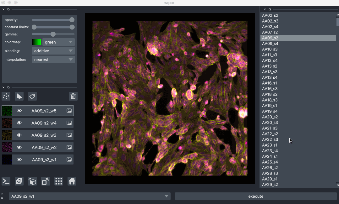
Napari#
napari is a fast, interactive, multi-dimensional image viewer for Python.
It’s designed for browsing, annotating, and analyzing large multi-dimensional images.
It’s built on top of Qt (for the GUI), vispy (for performant GPU-based rendering), and the scientific Python stack (numpy, scipy).
It includes critical viewer features out-of-the-box, such as support for large multi-dimensional data, and layering and annotation. By integrating closely with the Python ecosystem, napari can be easily coupled to leading machine learning and image analysis tools (e.g. scikit-image, scikit-learn, TensorFlow, PyTorch), enabling more user-friendly automated analysis.
IFrame(src="https://napari.org/stable/", width=800, height=800)