Introduction to Image Analysis with Scikit-Image
Contents
Introduction to Image Analysis with Scikit-Image#
# Magic command to make plotting inline
%matplotlib inline

# sets the figure format
%config InlineBackend.figure_format = 'retina'
import numpy as np
from numpy import dtype
from matplotlib import pyplot as plt
import os
from ipywidgets import interact, widgets
from __future__ import division, print_function
from matplotlib import patches
from scipy import ndimage as ndi
from skimage.morphology import disk
from skimage.restoration import denoise_tv_bregman
import skimage.filters as filters
from skimage.transform import hough_circle
from skimage import util, measure, exposure, feature
from skimage import segmentation, morphology, draw
from skimage import io, data, color, img_as_float

%matplotlib inline
Structure of Images#
Images are commonly stored as multidimensional Numpy arrays
Images are represented in scikit-image using standard numpy arrays. This allows maximum interoperability with other libraries in the scientific Python ecosystem, such as matplotlib and scipy.
Building a Grayscale Image#
# Builds a random numpy array
random_image = np.random.random([500, 500])

# plots the numpy array
plt.imshow(random_image, cmap="gray")

# Draws the colorbar
plt.colorbar()
<matplotlib.colorbar.Colorbar at 0x1d84f064610>

Real World Images#
# imports a coins image
coins = data.coins()

# displays information about the data
print("Type:", type(coins))
print("dtype:", coins.dtype)
print("shape:", coins.shape)

# plots the data
plt.imshow(coins, cmap="gray")
Type: <class 'numpy.ndarray'>
dtype: uint8
shape: (303, 384)
<matplotlib.image.AxesImage at 0x1d84f5d3700>
Color Images#
A color image is a 3D array, where the last dimension has size 3 and represents the red, green, and blue channels:
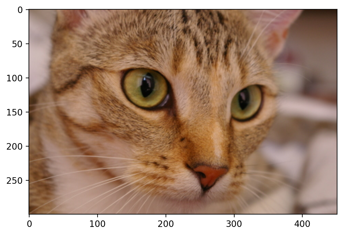
# collects the cat data
cat = data.chelsea()

print("Shape:", cat.shape)
print("Values min/max:", cat.min(), cat.max())

plt.imshow(cat)
Shape: (300, 451, 3)
Values min/max: 0 231
<matplotlib.image.AxesImage at 0x1d84f64f9d0>
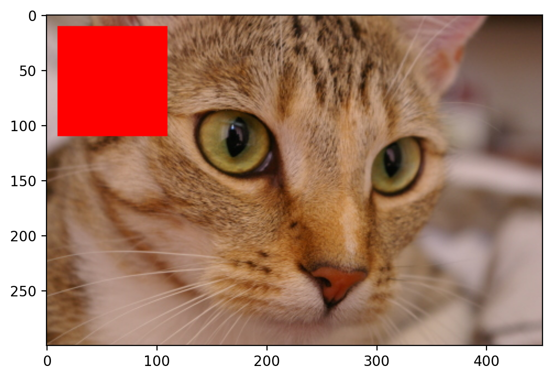
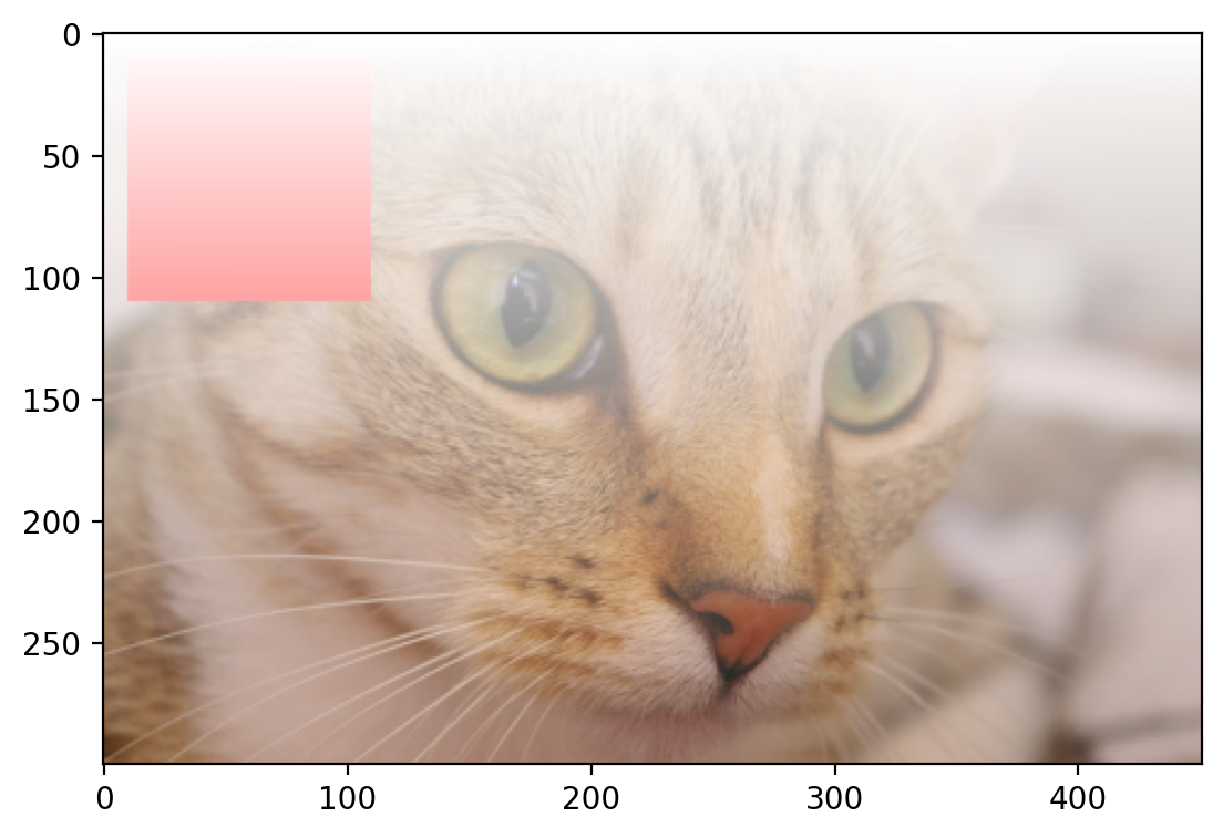
Modifying Images#
Images are just NumPy arrays. e.g., we can make a red square by using standard array slicing and manipulation:
# replaces values to be red by indexing the image
cat[10:110, 10:110, :] = [255, 0, 0]  # [red, green, blue]

plt.imshow(cat)
<matplotlib.image.AxesImage at 0x1d84f6b2020>
Changing Transparency of Images#
Images can also include transparent regions by adding a 4th dimension, called an alpha layer.
# creates a continuous gradient
alpha = np.arange(135300).reshape(cat.shape[0:2]) / 135300
alpha *= 255

# Adds the alpha channel
image = np.dstack((cat, alpha.astype("uint8")))

plt.imshow(image)
<matplotlib.image.AxesImage at 0x1d84fa94d60>
Other shapes, and their meanings#
Image type |
Coordinates |
|---|---|
2D grayscale |
(row, column) |
2D multichannel |
(row, column, channel) |
3D grayscale (or volumetric) |
(plane, row, column) |
3D multichannel |
(plane, row, column, channel) |
Displaying Images Using Matplotlib#
# Loads data from Skimage
img0 = data.chelsea()
img1 = data.rocket()
# Creates the subplot
f, (ax0, ax1) = plt.subplots(1, 2, figsize=(20, 10))

# Plots the cat image
ax0.imshow(img0)
ax0.set_title("Cat", fontsize=18)
ax0.axis("off")

# plots the rocket image
ax1.imshow(img1)
ax1.set_title("Rocket", fontsize=18)
ax1.set_xlabel(r"Launching position $\alpha=320$")

# plots a vertical line on the rocket image
ax1.vlines(
    [202, 300],
    0,
    img1.shape[0],
    colors="magenta",
    linewidth=3,
    label="Side tower position",
)

# plots a line plot on the rocket image
ax1.plot(
    [168, 190, 200], [400, 200, 300], color="white", linestyle="--", label="Side angle"
)

# adds the legend
ax1.legend()
<matplotlib.legend.Legend at 0x1d84fae1900>
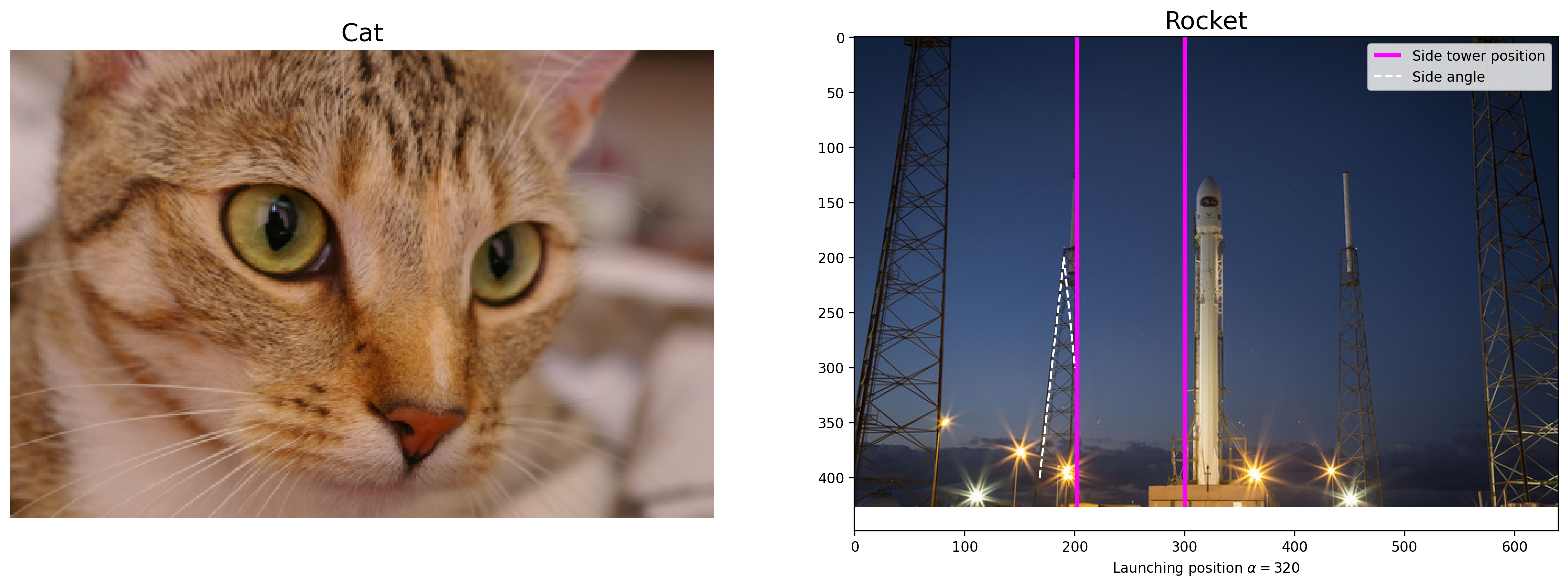
For more on plotting, see the Matplotlib documentation and pyplot API.
Data types and image values#
In literature, one finds different conventions for representing image values:
  0 - 255   where  0 is black, 255 is white
  0 - 1     where  0 is black, 1 is white
scikit-image supports both conventions–the choice is determined by the
data-type of the array.
E.g., here, I generate two valid images:
# defines two linear spaced vectors, one from 0 to 1, one from 0 to 255.
linear0 = np.linspace(0, 1, 2500).reshape((50, 50))
linear1 = np.linspace(0, 255, 2500).reshape((50, 50)).astype(np.uint8)

# prints the information about the data
print("Linear0:", linear0.dtype, linear0.min(), linear0.max())
print("Linear1:", linear1.dtype, linear1.min(), linear1.max())

# plots the data
fig, (ax0, ax1) = plt.subplots(1, 2, figsize=(15, 15))
ax0.imshow(linear0, cmap="gray")
ax1.imshow(linear1, cmap="gray")
Linear0: float64 0.0 1.0
Linear1: uint8 0 255
<matplotlib.image.AxesImage at 0x1d85086a380>
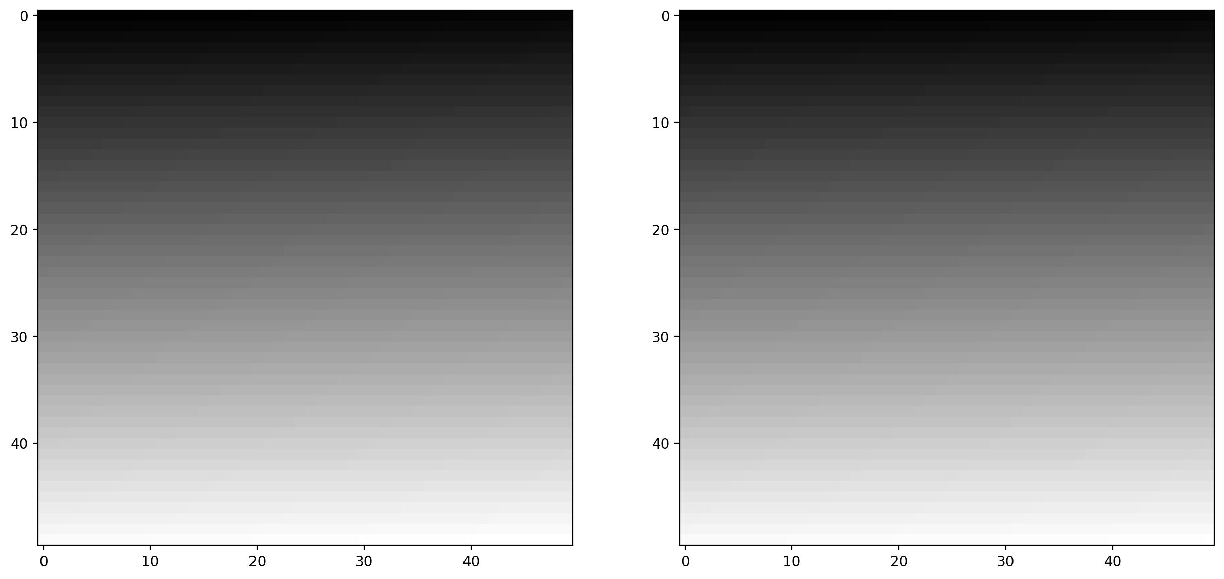
The library is designed in such a way that any data-type is allowed as input, as long as the range is correct (0-1 for floating point images, 0-255 for unsigned bytes, 0-65535 for unsigned 16-bit integers).
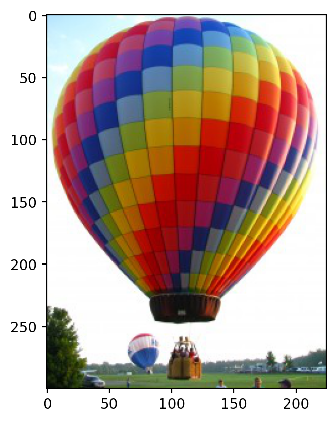
Image I/O#
Mostly, we won’t be using input images from the scikit-image example data sets. Those images are typically stored in JPEG or PNG format. Since scikit-image operates on NumPy arrays, any image reader library that provides arrays will do. Options include imageio, matplotlib, pillow, etc.
scikit-image conveniently wraps many of these in the io submodule and will use whichever of the libraries mentioned above are installed:
# reads the ballon image
image = io.imread("./images/balloon.jpg")

# prints information about the ballon image array
print(type(image))
print(image.dtype)
print(image.shape)
print(image.min(), image.max())

plt.imshow(image)
<class 'numpy.ndarray'>
uint8
(300, 225, 3)
0 255
<matplotlib.image.AxesImage at 0x1d85090dfc0>
We also have the ability to load multiple images, or multi-layer TIFF images:
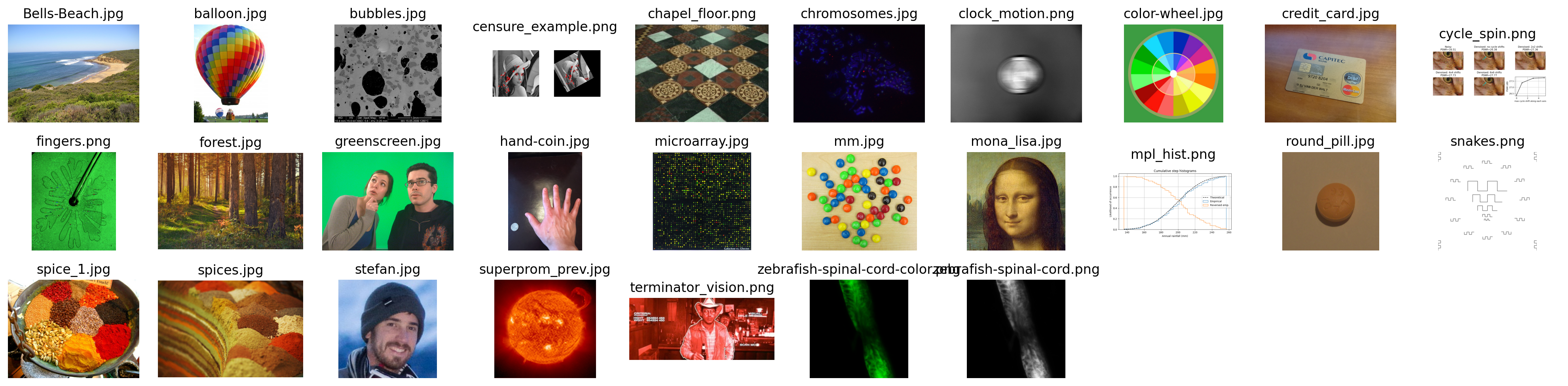
# Reads a folder of images
ic = io.ImageCollection(["./images/*.jpg", "./images/*.png"])
# the * is a wildcard operator that takes all that match that description

# prints what the ic object is
print("Type:", type(ic))

# shows the list of files
ic.files
Type: <class 'skimage.io.collection.ImageCollection'>
['./images\\Bells-Beach.jpg',
 './images\\balloon.jpg',
 './images\\bubbles.jpg',
 './images\\censure_example.png',
 './images\\chapel_floor.png',
 './images\\chromosomes.jpg',
 './images\\clock_motion.png',
 './images\\color-wheel.jpg',
 './images\\credit_card.jpg',
 './images\\cycle_spin.png',
 './images\\fingers.png',
 './images\\forest.jpg',
 './images\\greenscreen.jpg',
 './images\\hand-coin.jpg',
 './images\\microarray.jpg',
 './images\\mm.jpg',
 './images\\mona_lisa.jpg',
 './images\\mpl_hist.png',
 './images\\round_pill.jpg',
 './images\\snakes.png',
 './images\\spice_1.jpg',
 './images\\spices.jpg',
 './images\\stefan.jpg',
 './images\\superprom_prev.jpg',
 './images\\terminator_vision.png',
 './images\\zebrafish-spinal-cord-color.png',
 './images\\zebrafish-spinal-cord.png']
# This is one of the many ways to make subplots
f, axes = plt.subplots(nrows=3, ncols=len(ic) // 3 + 1, figsize=(20, 5))

# subplots returns the figure and an array of axes
# we use `axes.ravel()` to turn these into a list
axes = axes.ravel()

# turns all of the axis off
for ax in axes:
    ax.axis("off")

# plots all of the images in the collection
for i, image in enumerate(ic):
    axes[i].imshow(image, cmap="gray")
    axes[i].set_title(os.path.basename(ic.files[i]))

# This cleans the layout of the image
plt.tight_layout()
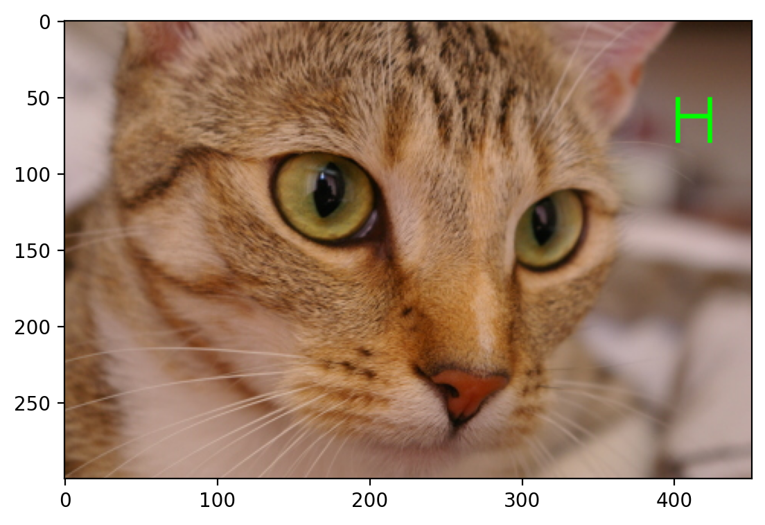
In Class Exercise: Draw the Letter H#
Define a function that takes as input an RGB image and a pair of coordinates (row, column), and returns a copy with a green letter H overlaid at those coordinates. The coordinates point to the top-left corner of the H.
The arms and strut of the H should have a width of 3 pixels, and the H itself should have a height of 24 pixels and width of 20 pixels.
Start with the following template:
from skimage import img_as_float


def draw_H(image, coords, color=(0, 255, 0)):
    # makes a copy of the image you should make a deep copy

    # Defines the size of the letter H
    # This should just be the rectangular box, we will modify this (make this a shallow copy)

    # sets the color

    return  # returns the image
from skimage import img_as_float


def draw_H(image, coords, color=(0, 255, 0)):
    # makes a copy of the image
    out = image.copy()

    # Defines the size of the letter H
    canvas = out[coords[0] : coords[0] + 30, coords[1] : coords[1] + 24]

    # sets the color
    canvas[:, :3] = color
    canvas[:, -3:] = color
    canvas[11:14] = color

    return out
Test your function:#
cat = data.chelsea()
cat_H = draw_H(cat, (50, -50))
plt.imshow(cat_H)
<matplotlib.image.AxesImage at 0x1d8533d5750>
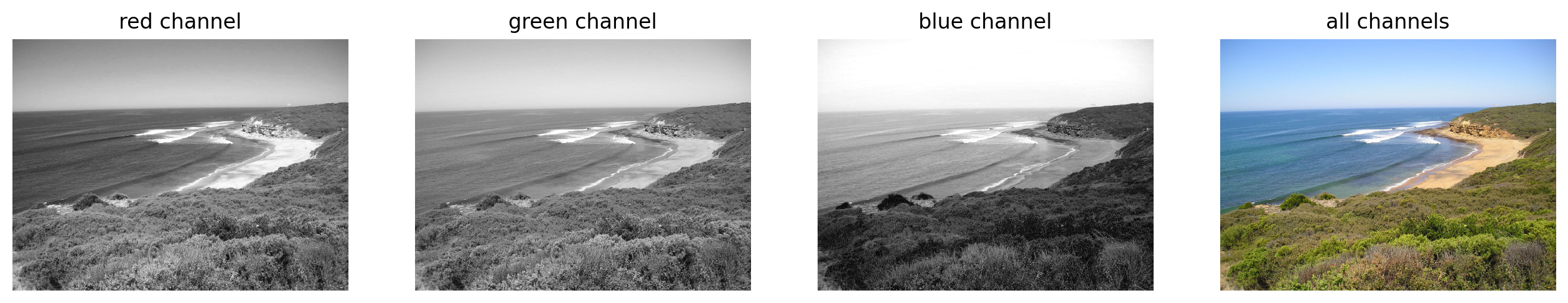
Exercise: Visualizing RGB Channels#
Display the different color channels of the image (each as a gray-scale image). Start with the following template:
# --- read in any image from the web ---


# --- assign each color channel to a different variable ---


# --- display the image and r, g, b channels ---


# --- Here, we stack the R, G, and B layers again
#     to form a color image ---
# --- read in the image ---

image = plt.imread("./images/Bells-Beach.jpg")

# --- assign each color channel to a different variable ---

r = image[..., 0]
g = image[..., 1]
b = image[..., 2]

# --- display the image and r, g, b channels ---

f, axes = plt.subplots(1, 4, figsize=(16, 5))

for ax in axes:
    ax.axis("off")

(ax_r, ax_g, ax_b, ax_color) = axes

ax_r.imshow(r, cmap="gray")
ax_r.set_title("red channel")

ax_g.imshow(g, cmap="gray")
ax_g.set_title("green channel")

ax_b.imshow(b, cmap="gray")
ax_b.set_title("blue channel")

# --- Here, we stack the R, G, and B layers again
#     to form a color image ---
ax_color.imshow(np.stack([r, g, b], axis=2))
ax_color.set_title("all channels")
Text(0.5, 1.0, 'all channels')
Visualizing Colors#
# builds 3 zero arrays
red = np.zeros((300, 300))
green = np.zeros((300, 300))
blue = np.zeros((300, 300))

# draws some circles with different positions
r, c = draw.disk((100, 100), 100)
red[r, c] = 1

r, c = draw.disk((100, 200), 100)
green[r, c] = 1

r, c = draw.disk((200, 150), 100)
blue[r, c] = 1

stacked = np.stack([red, green, blue], axis=2)

# plots the individual channels as binary images
f, axes = plt.subplots(1, 4)
for (ax, channel) in zip(axes, [red, green, blue, stacked]):
    ax.imshow(channel, cmap="gray")
    ax.axis("off")
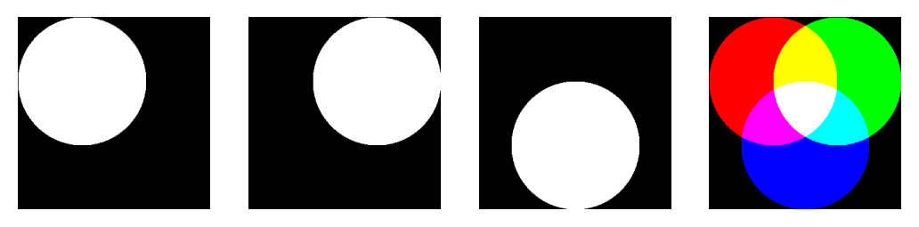
Image Filtering#
Image filtering theory#
Filtering is one of the most basic and common image operations in image processing. You can filter an image to remove noise or to enhance features; the filtered image could be the desired result or just a preprocessing step. Regardless, filtering is an important topic to understand.
Local filtering#
# This just sets the plotting format
plt.rcParams["image.cmap"] = "gray"
The “local” in local filtering simply means that a pixel is adjusted by values in some surrounding neighborhood. These surrounding elements are identified or weighted based on a “footprint”, “structuring element”, or “kernel”.
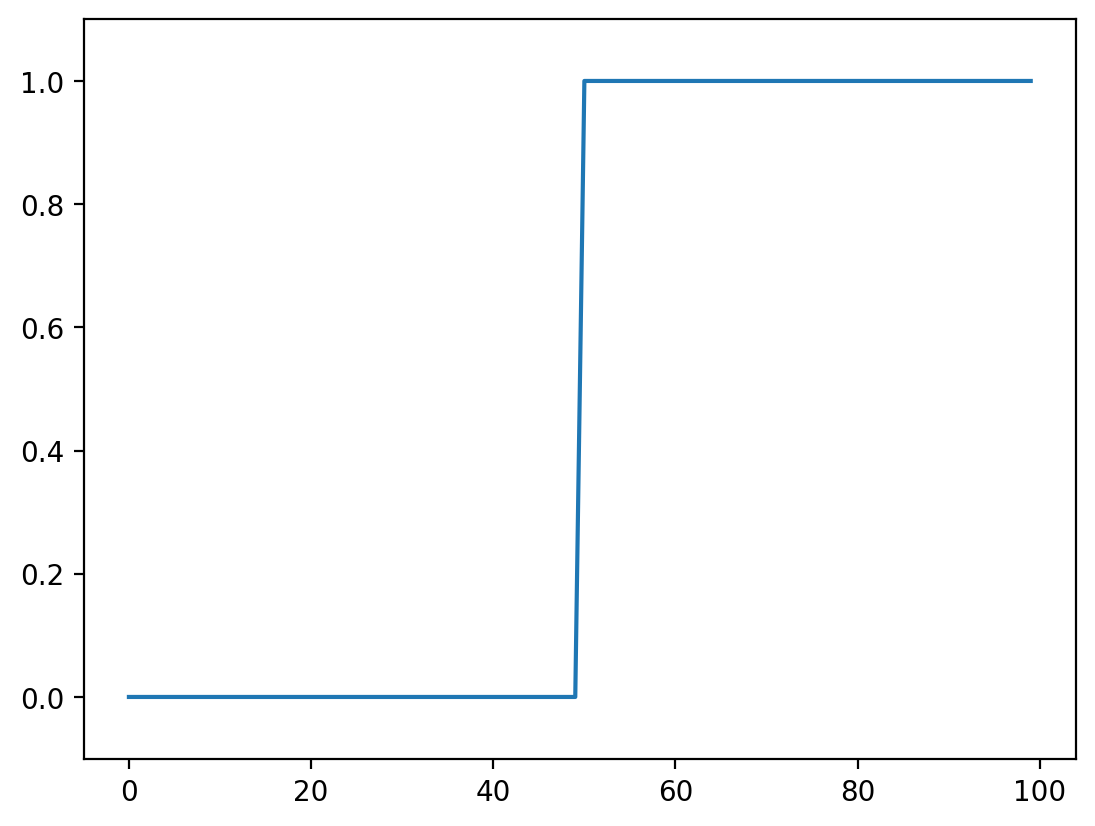
Let’s go to back to basics and look at a 1D step-signal
# creates a zero array
step_signal = np.zeros(100)

# replaces from 50 on with a value of 1
step_signal[50:] = 1

# plots the data
fig, ax = plt.subplots()
ax.plot(step_signal)
ax.margins(y=0.1)
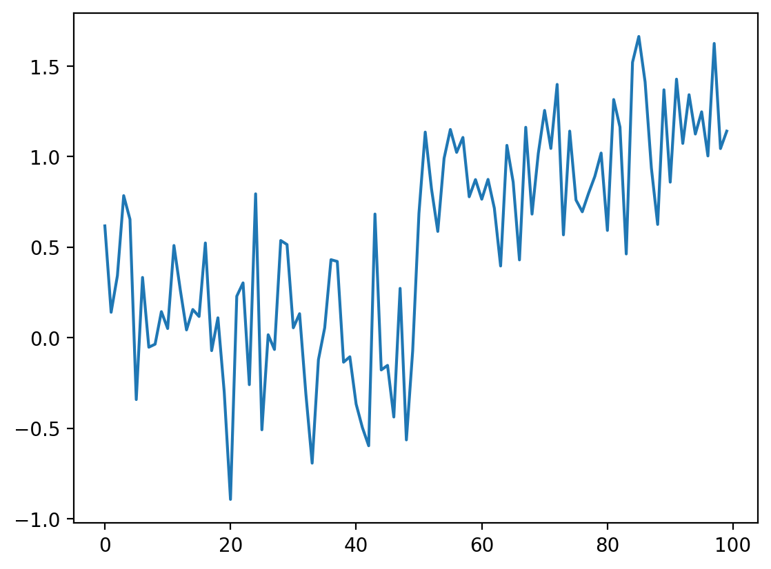
Now add some noise to this signal:
# Just to make sure we all see the same results
np.random.seed(0)
# Adds noise to the data
noisy_signal = step_signal + np.random.normal(0, 0.35, step_signal.shape)
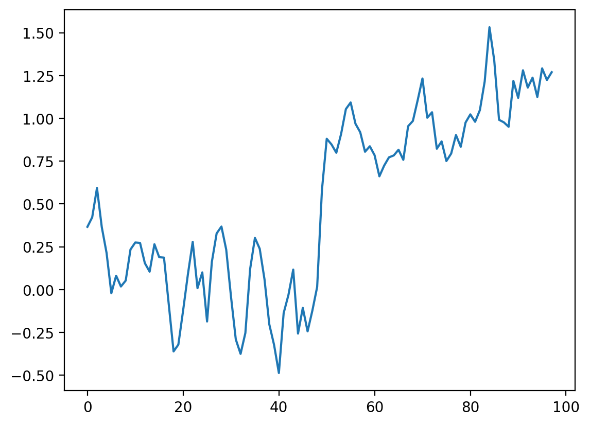
fig, ax = plt.subplots()
ax.plot(noisy_signal)
[<matplotlib.lines.Line2D at 0x1d857344d90>]
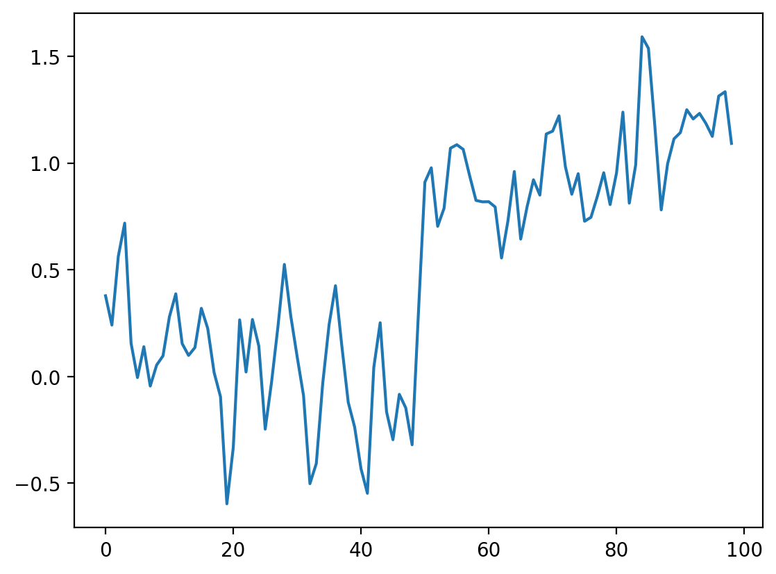
The simplest way to recover something that looks a bit more like the original signal is to take the average between neighboring “pixels”:
# Take the mean of neighboring pixels
smooth_signal = (noisy_signal[:-1] + noisy_signal[1:]) / 2.0
fig, ax = plt.subplots()
ax.plot(smooth_signal)
[<matplotlib.lines.Line2D at 0x1d85738f190>]
What happens if we want to take the three neighboring pixels? We can do the same thing:
# smooth with size 3 points
smooth_signal3 = (noisy_signal[:-2] + noisy_signal[1:-1] + noisy_signal[2:]) / 3
fig, ax = plt.subplots()
ax.plot(smooth_signal, label="mean of 2")
ax.plot(smooth_signal3, label="mean of 3")
ax.legend(loc="upper left")
<matplotlib.legend.Legend at 0x1d8573e3040>
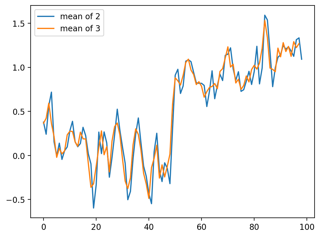
For averages of more points, the expression keeps getting hairier. And you have to worry more about what’s happening in the margins. Is there a better way?
It turns out there is. This same concept, nearest-neighbor averages, can be expressed as a convolution with an averaging kernel. Note that the operation we did with smooth_signal3 can be expressed as follows:
Create an output array called
smooth_signal3, of the same length asnoisy_signal.At each element in
smooth_signal3starting at point 1, and ending at point -2, place the average of the sum of: 1/3 of the element to the left of it innoisy_signal, 1/3 of the element at the same position, and 1/3 of the element to the right.discard the leftmost and rightmost elements.
This is called a convolution between the input image and the array [1/3, 1/3, 1/3].
We’ll give a more in-depth explanation of convolution in the next section
# Same as above, using a convolution kernel
# Neighboring pixels multiplied by 1/3 and summed
mean_kernel3 = np.full((3,), 1 / 3)
smooth_signal3p = np.convolve(noisy_signal, mean_kernel3, mode="valid")
fig, ax = plt.subplots()
ax.plot(smooth_signal3p)

# shows that the two curves are equal.
print(
    "smooth_signal3 and smooth_signal3p are equal:",
    np.allclose(smooth_signal3, smooth_signal3p),
)
smooth_signal3 and smooth_signal3p are equal: True
def convolve_demo(signal, kernel):
    ksize = len(kernel)
    convolved = np.correlate(signal, kernel)

    def filter_step(i):
        fig, ax = plt.subplots()
        ax.plot(signal, label="signal")
        ax.plot(convolved[: i + 1], label="convolved")
        ax.legend()
        ax.scatter(np.arange(i, i + ksize), signal[i : i + ksize])
        ax.scatter(i, convolved[i])

    return filter_step


# This adds a simple interactive slider from Ipywidgets
i_slider = widgets.IntSlider(min=0, max=len(noisy_signal) - 3, value=0)

# This sets what happens on an interaction
interact(convolve_demo(noisy_signal, mean_kernel3), i=i_slider)
<function __main__.convolve_demo.<locals>.filter_step(i)>
The advantage of convolution is that it’s just as easy to take the average of 11 points as 3:
# builds the size 11 mean kernel
mean_kernel11 = np.full((11,), 1 / 11)
# convolves the kernel over the signal
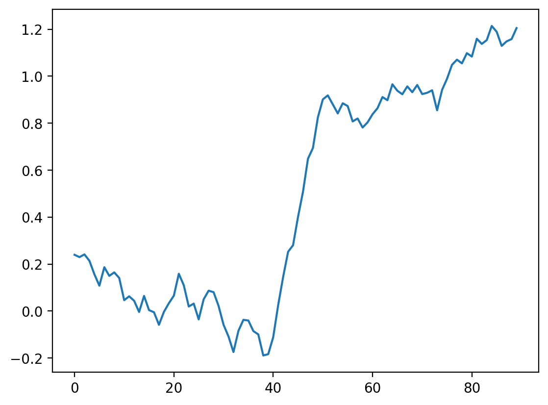
smooth_signal11 = np.convolve(noisy_signal, mean_kernel11, mode="valid")
fig, ax = plt.subplots()
ax.plot(smooth_signal11)
[<matplotlib.lines.Line2D at 0x1d8511a8490>]
# interactive example with a size 11 kernel
i_slider = widgets.IntSlider(min=0, max=len(noisy_signal) - 11, value=0)

interact(convolve_demo(noisy_signal, mean_kernel11), i=i_slider)
<function __main__.convolve_demo.<locals>.filter_step(i)>
Of course, to take the mean of 11 values, we have to move further and further away from the edges, and this starts to be noticeable. You can use mode='same' to pad the edges of the array and compute a result of the same size as the input:
# shows the difference between different convolution modes.
# Same assumes the end is 0.
smooth_signal3same = np.convolve(noisy_signal, mean_kernel3, mode="same")
smooth_signal11same = np.convolve(noisy_signal, mean_kernel11, mode="same")

fig, ax = plt.subplots(1, 2)
ax[0].plot(smooth_signal3p)
ax[0].plot(smooth_signal11)
ax[0].set_title("mode=valid")
ax[1].plot(smooth_signal3same)
ax[1].plot(smooth_signal11same)
ax[1].set_title("mode=same")
Text(0.5, 1.0, 'mode=same')
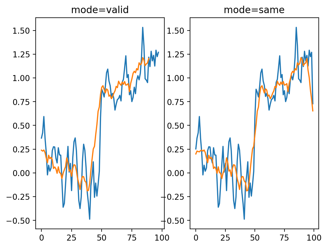
But now we see edge effects on the ends of the signal…
This is because mode='same' actually pads the signal with 0s and then applies mode='valid' as before.
# shows this in an interactive form
def convolve_demo_same(signal, kernel):
    ksize = len(kernel)
    padded_signal = np.pad(signal, ksize // 2, mode="constant")
    convolved = np.correlate(padded_signal, kernel)

    def filter_step(i):
        fig, ax = plt.subplots()
        x = np.arange(-ksize // 2, len(signal) + ksize // 2)
        ax.plot(signal, label="signal")
        ax.plot(convolved[: i + 1], label="convolved")
        ax.legend()
        start, stop = i, i + ksize
        ax.scatter(x[start:stop] + 1, padded_signal[start:stop])
        ax.scatter(i, convolved[i])
        ax.set_xlim(-ksize // 2, len(signal) + ksize // 2)

    return filter_step


i_slider = widgets.IntSlider(min=0, max=len(noisy_signal) - 1, value=0)

interact(convolve_demo_same(noisy_signal, mean_kernel11), i=i_slider)
<function __main__.convolve_demo_same.<locals>.filter_step(i)>
Exercise: Fixing the edges#
Look up the documentation of scipy.ndimage.convolve. Apply the same convolution, but using a different mode= keyword argument to avoid the edge effects we see here.
# Your Code Goes Here
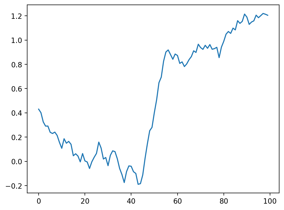
smooth_ndi = ndi.convolve(noisy_signal, mean_kernel11, mode="reflect")

plt.plot(smooth_ndi)
[<matplotlib.lines.Line2D at 0x1d8510d4a30>]
A Difference Filter#
Let’s look again at our simplest signal, the step signal from before:
fig, ax = plt.subplots()
ax.plot(step_signal)
ax.margins(y=0.1)

Exercise: Can you predict what a convolution with the kernel [-1, 0, 1] does? Try thinking about it before running the cells below.#
# compare correlate and convolve on an edge filter
result_corr = np.correlate(step_signal, np.array([-1, 0, 1]), mode="valid")
result_conv = np.convolve(step_signal, np.array([-1, 0, 1]), mode="valid")
fig, ax = plt.subplots()
ax.plot(step_signal, label="signal")
ax.plot(result_conv, linestyle="dashed", label="convolved")
ax.plot(result_corr, linestyle="dashed", label="correlated", color="C3")
ax.legend(loc="upper left")
ax.margins(y=0.1)
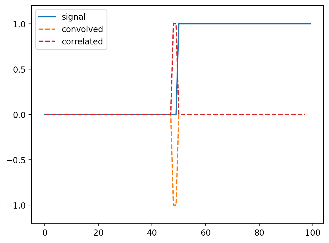
(For technical signal processing reasons, convolutions actually occur “back to front” between the input array and the kernel. Correlations occur in the signal order, so we’ll use correlate from now on.)
Whenever neighboring values are close, the filter response is close to 0. Right at the boundary of a step, we’re subtracting a small value from a large value and and get a spike in the response. This spike “identifies” our edge.
Commutativity and Associativity of filters#
What if we try the same trick with our noisy signal?
noisy_change = np.correlate(noisy_signal, np.array([-1, 0, 1]))
fig, ax = plt.subplots()
ax.plot(noisy_signal, label="signal")
ax.plot(noisy_change, linestyle="dashed", label="change")
ax.legend(loc="upper left")
ax.margins(0.1)
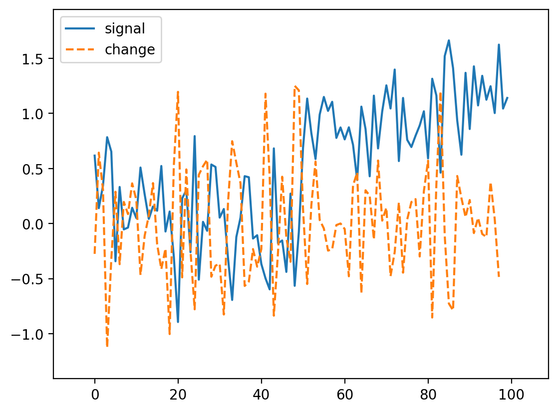
Oops! We lost our edge!
But recall that we smoothed the signal a bit by taking its neighbors. Perhaps we can do the same thing here. Actually, it turns out that we can do it in any order, so we can create a filter that combines both the difference and the mean:
mean_diff = np.correlate([-1, 0, 1], [1 / 3, 1 / 3, 1 / 3], mode="full")
print(mean_diff)
[-0.33333333 -0.33333333 0. 0.33333333 0.33333333]
Note
We use np.correlate here, because it has the option to output a wider result than either of the two inputs.
Now we can use this to find our edge even in a noisy signal:
smooth_change = np.correlate(noisy_signal, mean_diff, mode="same")
fig, ax = plt.subplots()
ax.plot(noisy_signal, label="signal")
ax.plot(smooth_change, linestyle="dashed", label="change")
ax.margins(0.1)
ax.hlines([-0.5, 0.5], 0, 100, linewidth=0.5, color="gray")
<matplotlib.collections.LineCollection at 0x1d8524b64d0>
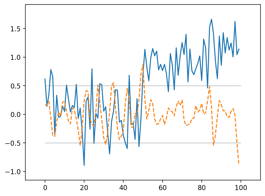
This is an edge detector in 1D!
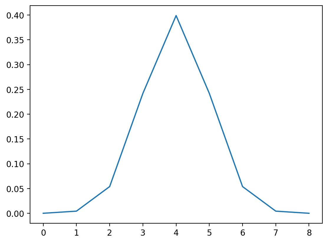
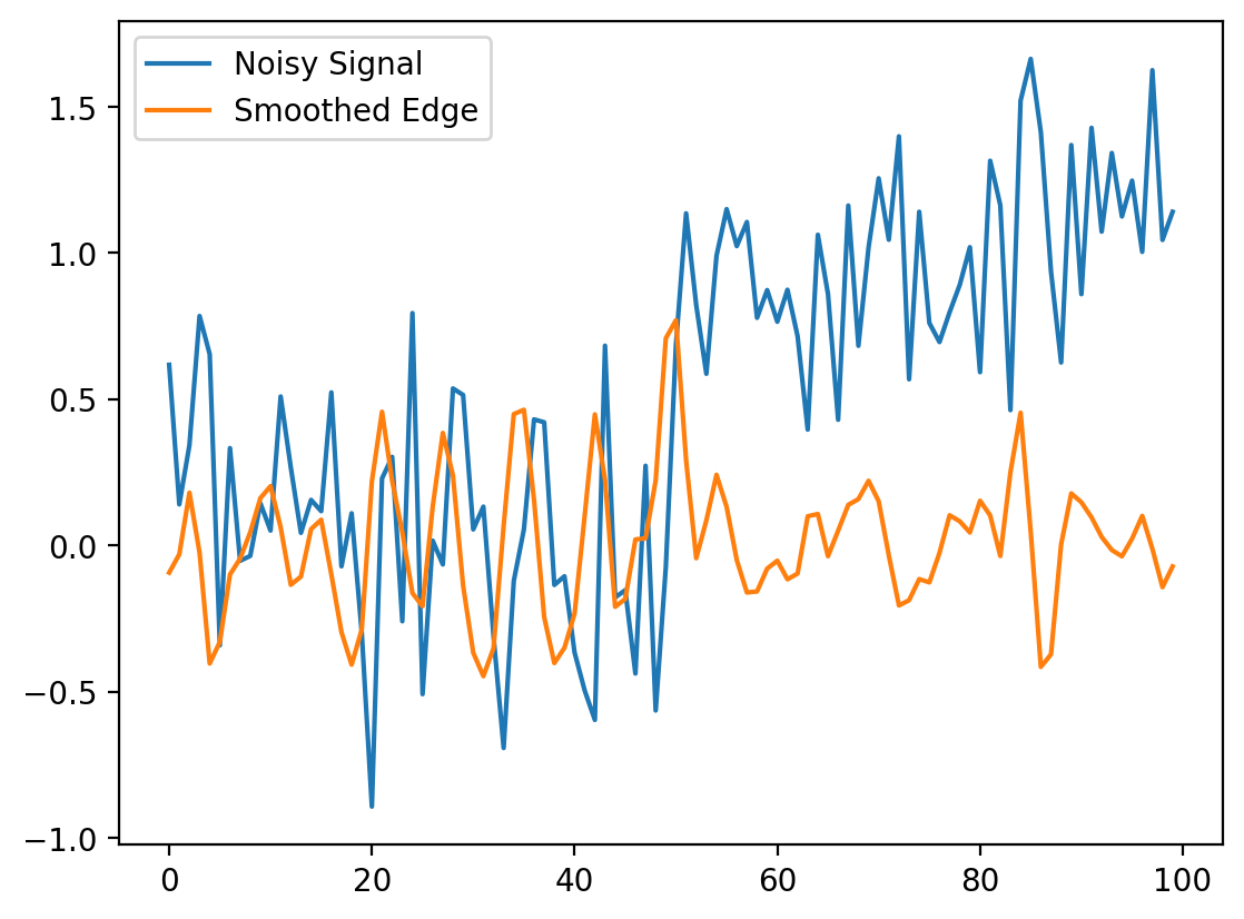
Exercise: A Gaussian Filter#
A gaussian filter with variance \(\sigma^2\) is given by:
Create this filter (for example, with width 9, center 4, sigma 1). (Plot it)
Convolve it with the difference filter (with appropriate mode). (Plot the result)
Convolve it with the noisy signal. (Plot the result)
# Type your Code Here
# builds a array of size 9
xi = np.arange(9)
# floor divide //
x0 = 9 // 2  # 4
x = xi - x0
# sets the standard deviation
sigma = 1

# function for the Gaussian kernel
gaussian_kernel = 1 / (np.sqrt(2 * np.pi) * sigma) * np.exp(-(x**2) / 2 * sigma**2)
fig = plt.figure()
plt.plot(gaussian_kernel)

# does the convolution
## 2

gauss_diff = np.convolve(gaussian_kernel, [-1, 0, 1], mode="full")

## 3

smooth_diff = ndi.correlate(noisy_signal, gauss_diff, mode="reflect")

fig = plt.figure()
plt.plot(noisy_signal, label="Noisy Signal")
plt.plot(smooth_diff, label="Smoothed Edge")
plt.legend()
<matplotlib.legend.Legend at 0x1d852632ce0>
Local Filtering of Images#
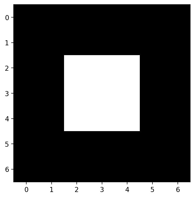
Now let’s apply all this knowledge to 2D images instead of a 1D signal. Let’s start with a simple image:
# builds an image with a bright square through indexing
bright_square = np.zeros((7, 7), dtype=float)
bright_square[2:5, 2:5] = 1
This gives the values below:
print(bright_square)
[[0. 0. 0. 0. 0. 0. 0.]
 [0. 0. 0. 0. 0. 0. 0.]
 [0. 0. 1. 1. 1. 0. 0.]
 [0. 0. 1. 1. 1. 0. 0.]
 [0. 0. 1. 1. 1. 0. 0.]
 [0. 0. 0. 0. 0. 0. 0.]
 [0. 0. 0. 0. 0. 0. 0.]]
and looks like a white square centered on a black square:
fig, ax = plt.subplots()
ax.imshow(bright_square)
<matplotlib.image.AxesImage at 0x1d8525abfa0>
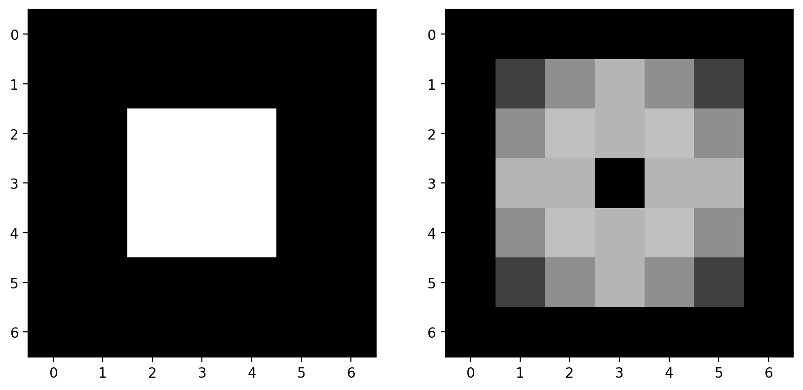
The Mean Filter#
For our first example of a filter, consider the following filtering array, which we’ll call a “mean kernel”. For each pixel, a kernel defines which neighboring pixels to consider when filtering, and how much to weight those pixels.
mean_kernel = np.full((3, 3), 1 / 9)

print(mean_kernel)
[[0.11111111 0.11111111 0.11111111]
 [0.11111111 0.11111111 0.11111111]
 [0.11111111 0.11111111 0.11111111]]
Now, let’s take our mean kernel and apply it to every pixel of the image.
Applying a (linear) filter essentially means:
Center a kernel on a pixel
Multiply the pixels under that kernel by the values in the kernel
Sum all the those results
Replace the center pixel with the summed result
This process is known as convolution.
Let’s take a look at the numerical result:
%precision 2
# this just sets the precision so it prints nicely in jupyter
print(bright_square)
print(ndi.correlate(bright_square, mean_kernel))
[[0. 0. 0. 0. 0. 0. 0.]
 [0. 0. 0. 0. 0. 0. 0.]
 [0. 0. 1. 1. 1. 0. 0.]
 [0. 0. 1. 1. 1. 0. 0.]
 [0. 0. 1. 1. 1. 0. 0.]
 [0. 0. 0. 0. 0. 0. 0.]
 [0. 0. 0. 0. 0. 0. 0.]]
[[0.   0.   0.   0.   0.   0.   0.  ]
 [0.   0.11 0.22 0.33 0.22 0.11 0.  ]
 [0.   0.22 0.44 0.67 0.44 0.22 0.  ]
 [0.   0.33 0.67 1.   0.67 0.33 0.  ]
 [0.   0.22 0.44 0.67 0.44 0.22 0.  ]
 [0.   0.11 0.22 0.33 0.22 0.11 0.  ]
 [0.   0.   0.   0.   0.   0.   0.  ]]
The meaning of “mean kernel” should be clear now: Each pixel was replaced with the mean value within the 3x3 neighborhood of that pixel. When the kernel was over n bright pixels, the pixel in the kernel’s center was changed to n/9 (= n * 0.111). When no bright pixels were under the kernel, the result was 0.
This filter is a simple smoothing filter and produces two important results:
The intensity of the bright pixel decreased.
The intensity of the region near the bright pixel increased.
Convolutions in Action#
(Execute the following cell, but don’t try to read it; its purpose is to generate an example.)
# --------------------------------------------------------------------------
#  Convolution Demo
# --------------------------------------------------------------------------


def mean_filter_demo(image, vmax=1):
    mean_factor = 1.0 / 9.0  # This assumes a 3x3 kernel.
    iter_kernel_and_subimage = iter_kernel(image)

    image_cache = []

    def mean_filter_step(i_step):
        while i_step >= len(image_cache):
            filtered = image if i_step == 0 else image_cache[-1][-1][-1]
            filtered = filtered.copy()

            (i, j), mask, subimage = next(iter_kernel_and_subimage)
            filter_overlay = color.label2rgb(
                mask, image, bg_label=0, colors=("cyan", "red")
            )
            filtered[i, j] = np.sum(mean_factor * subimage)
            image_cache.append(((i, j), (filter_overlay, filtered)))

        (i, j), images = image_cache[i_step]
        fig, axes = plt.subplots(1, len(images), figsize=(10, 5))

        for ax, imc in zip(axes, images):
            ax.imshow(imc, vmax=vmax)
            rect = patches.Rectangle(
                [j - 0.5, i - 0.5], 1, 1, color="yellow", fill=False
            )
            ax.add_patch(rect)

        plt.show()

    return mean_filter_step


def mean_filter_interactive_demo(image):
    from ipywidgets import IntSlider, interact

    mean_filter_step = mean_filter_demo(image)
    step_slider = IntSlider(min=0, max=image.size - 1, value=0)
    interact(mean_filter_step, i_step=step_slider)


def iter_kernel(image, size=1):
    """Yield position, kernel mask, and image for each pixel in the image.

    The kernel mask has a 2 at the center pixel and 1 around it. The actual
    width of the kernel is 2*size + 1.
    """
    width = 2 * size + 1
    for (i, j), pixel in iter_pixels(image):
        mask = np.zeros(image.shape, dtype="int16")
        mask[i, j] = 1
        mask = ndi.grey_dilation(mask, size=width)
        # mask[i, j] = 2
        subimage = image[bounded_slice((i, j), image.shape[:2], size=size)]
        yield (i, j), mask, subimage


def iter_pixels(image):
    """Yield pixel position (row, column) and pixel intensity."""
    height, width = image.shape[:2]
    for i in range(height):
        for j in range(width):
            yield (i, j), image[i, j]


def bounded_slice(center, xy_max, size=1, i_min=0):
    slices = []
    for i, i_max in zip(center, xy_max):
        slices.append(slice(max(i - size, i_min), min(i + size + 1, i_max)))
    return tuple(slices)
mean_filter_interactive_demo(bright_square)
Incidentally, the above filtering is the exact same principle behind the convolutional neural networks, or CNNs, that you might have heard much about over the past few years. The only difference is that while above, the simple mean kernel is used, in CNNs, the values inside the kernel are learned to find a specific feature, or accomplish a specific task. Time permitting, we’ll demonstrate this in an exercise at the end of the notebook.
Downsampled image#
Let’s consider a real image now. It’d be easier to see some of the filterings we’re doing if we downsampled the image a bit. We can slice into the image using the “step” argument to sub-sample it (don’t scale images using this method for real work; use skimage.transform.rescale):
image = data.camera()

# this just takes every 10th pixel
pixilated = image[::10, ::10]
fig, (ax0, ax1) = plt.subplots(1, 2, figsize=(10, 5))
ax0.imshow(image)
ax1.imshow(pixilated)
<matplotlib.image.AxesImage at 0x1d8525dda20>
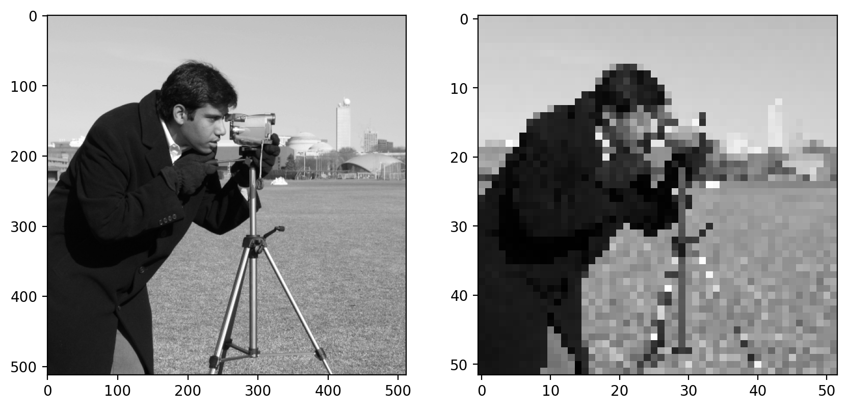
Here we use a step of 10, giving us every tenth column and every tenth row of the original image. You can see the highly pixilated result on the right.
We are actually going to be using the pattern of plotting multiple images side by side quite often, so we are going to make the following helper function:
def imshow_all(*images, titles=None):
    images = [img_as_float(img) for img in images]

    if titles is None:
        titles = [""] * len(images)
    vmin = min(map(np.min, images))
    vmax = max(map(np.max, images))
    ncols = len(images)
    height = 5
    width = height * len(images)
    fig, axes = plt.subplots(nrows=1, ncols=ncols, figsize=(width, height))
    for ax, img, label in zip(axes.ravel(), images, titles):
        ax.imshow(img, vmin=vmin, vmax=vmax)
        ax.set_title(label)
Mean filter on an actual image#
Now we can apply the filter to this downsampled image:
filtered = ndi.correlate(pixilated, mean_kernel)
imshow_all(pixilated, filtered, titles=["pixilated", "mean filtered"])
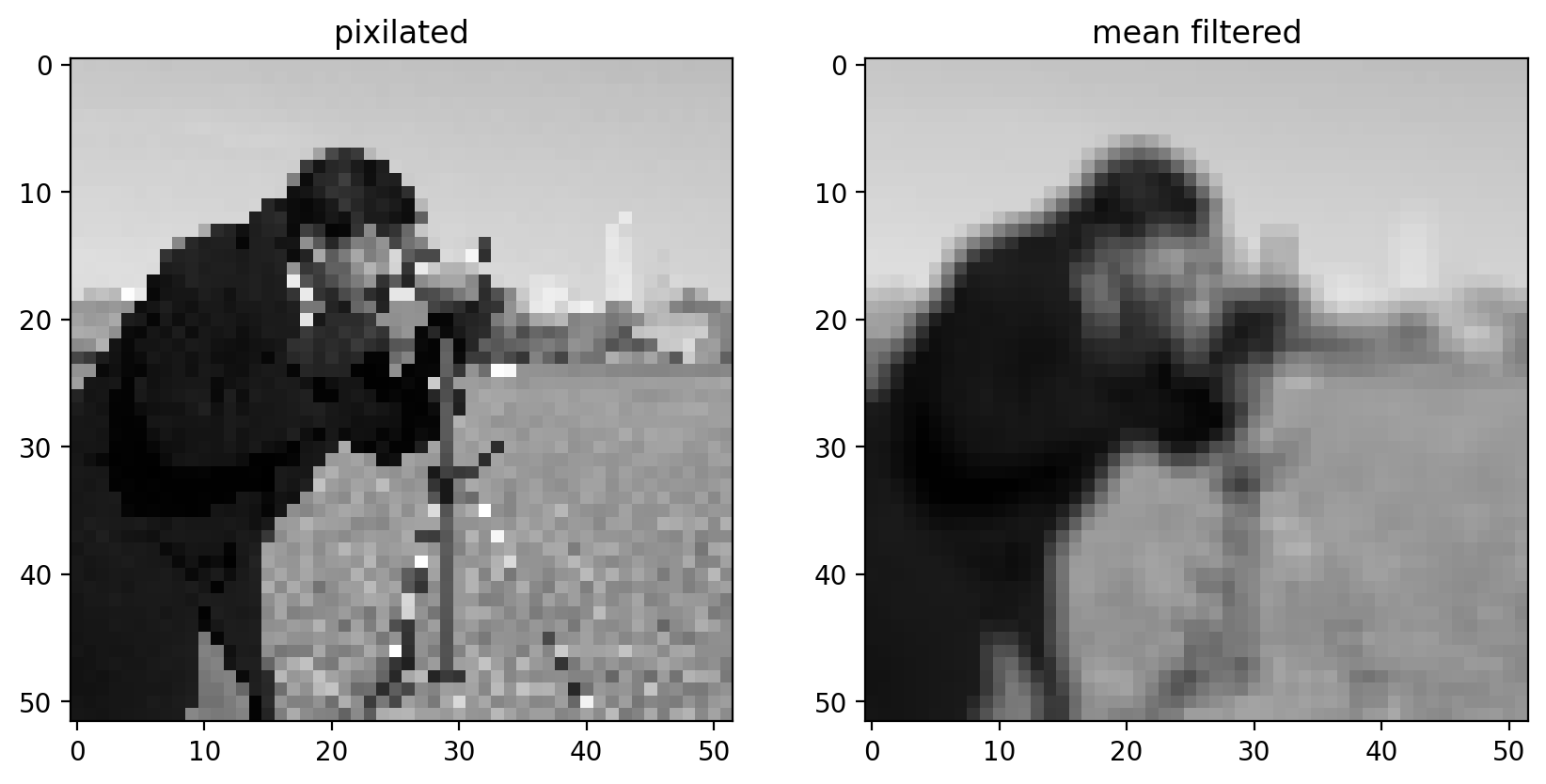
Comparing the filtered image to the pixilated image, we can see that this filtered result is smoother: Sharp edges (which are just borders between dark and bright pixels) are smoothed because dark pixels reduce the intensity of neighboring pixels and bright pixels do the opposite.
Essential filters#
If you read through the last section, you’re already familiar with the essential concepts of image filtering. But, of course, you don’t have to create custom filter kernels for all of your filtering needs. There are many standard filter kernels pre-defined from half a century of image and signal processing.
Gaussian filter#
The classic image filter is the Gaussian filter. This is similar to the mean filter, in that it tends to smooth images. The Gaussian filter, however, doesn’t weight all values in the neighborhood equally. Instead, pixels closer to the center are weighted more than those farther away.
# Rename module so we don't shadow the builtin function
from skimage import filters

smooth_mean = ndi.correlate(bright_square, mean_kernel)
sigma = 1
smooth = filters.gaussian(bright_square, sigma)
imshow_all(
    bright_square,
    smooth_mean,
    smooth,
    titles=["original", "result of mean filter", "result of gaussian filter"],
)
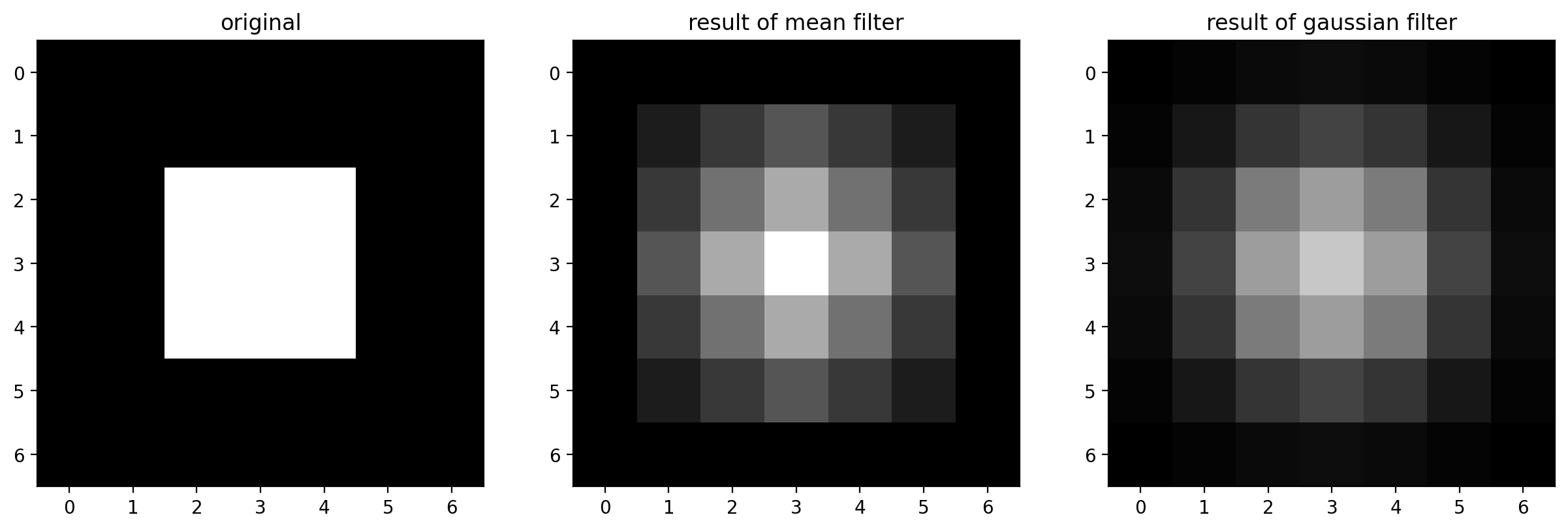
For the Gaussian filter, sigma, the standard deviation, defines the size of the neighborhood.
For a real image, we get the following:
# The Gaussian filter returns a float image, regardless of input.
# Cast to float so the images have comparable intensity ranges.
pixilated_float = img_as_float(pixilated)
smooth = filters.gaussian(pixilated_float, sigma=1)
imshow_all(pixilated_float, smooth)

This doesn’t look drastically different than the mean filter, but the Gaussian filter is typically preferred because of the distance-dependent weighting, and because it does not have any sharp transitions (consider what happens in the Fourier domain!). For a more detailed image and a larger filter, you can see artifacts in the mean filter since it doesn’t take distance into account:
size = 20
structuring_element = np.ones((3 * size, 3 * size))
smooth_mean = filters.rank.mean(image, structuring_element)
smooth_gaussian = filters.gaussian(image, size)
titles = ["mean", "gaussian"]
imshow_all(smooth_mean, smooth_gaussian, titles=titles)
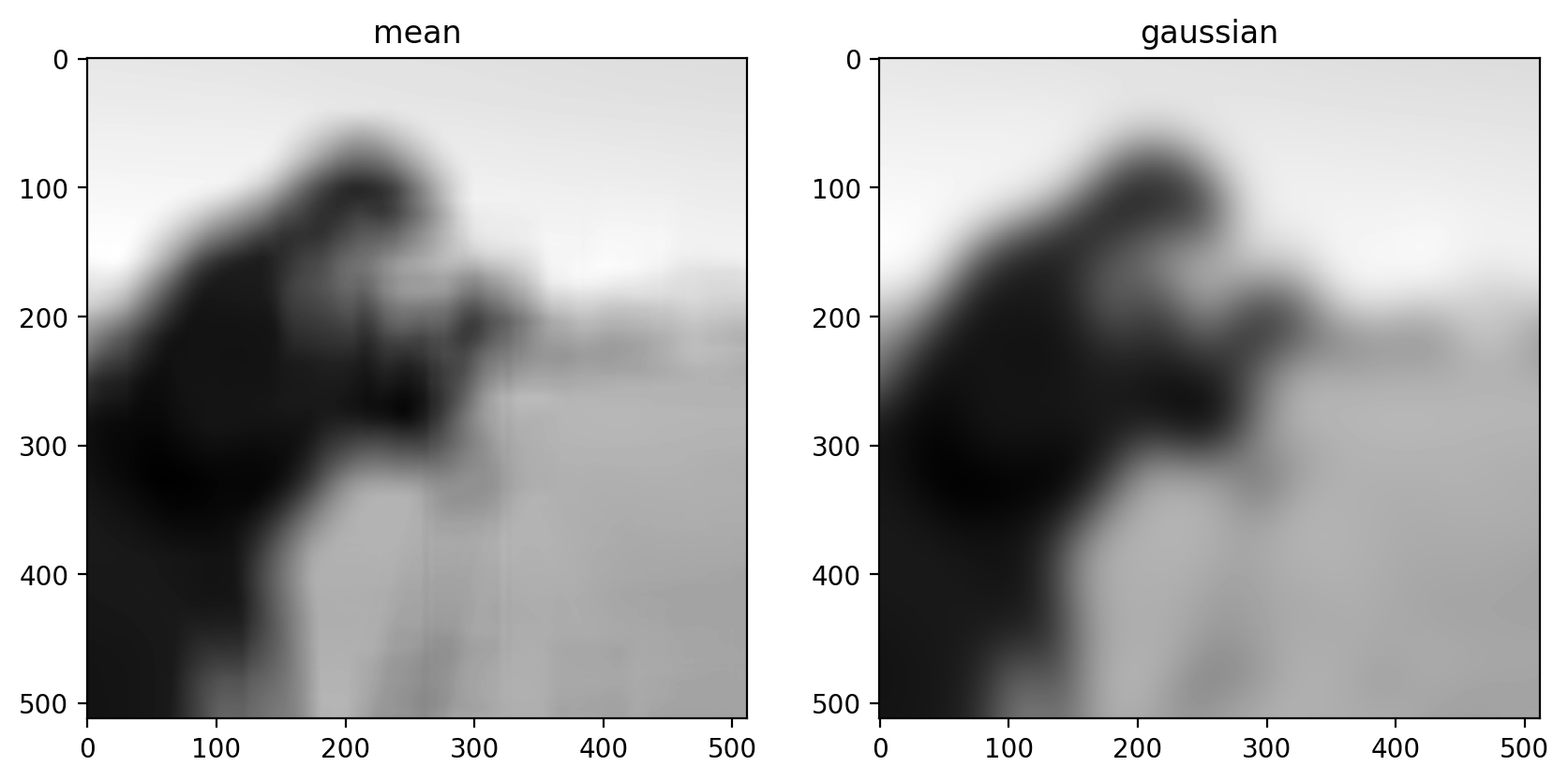
(Above, we’ve tweaked the size of the structuring element used for the mean filter and the standard deviation of the Gaussian filter to produce an approximately equal amount of smoothing in the two results.)
Basic Edge Filtering#
For images, edges are boundaries between light and dark values. The detection of edges can be useful on its own, or it can be used as preliminary step in other algorithms (which we’ll see later).
Difference Filters in 2D#
For images, you can think of an edge as points where the gradient is large in one direction. We can approximate gradients with difference filters.
vertical_kernel = np.array(
    [
        [-1],
        [0],
        [1],
    ]
)

gradient_vertical = ndi.correlate(pixilated.astype(float), vertical_kernel)
fig, ax = plt.subplots()
ax.imshow(gradient_vertical)
<matplotlib.image.AxesImage at 0x1d85856f460>
Sobel edge filter#
The Sobel filter, the most commonly used edge filter, should look pretty similar to what you developed above. Take a look at the vertical and horizontal components of the Sobel kernel to see how they differ from your earlier implementation:
http://scikit-image.org/docs/dev/api/skimage.filters.html#skimage.filters.sobel_v
http://scikit-image.org/docs/dev/api/skimage.filters.html#skimage.filters.sobel_h
imshow_all(bright_square, filters.sobel(bright_square))
Notice that the output size matches the input, and the edges aren’t preferentially shifted to a corner of the image. Furthermore, the weights used in the Sobel filter produce diagonal edges with responses that are comparable to horizontal or vertical edges.
Like any derivative, noise can have a strong impact on the result:
pixilated_gradient = filters.sobel(pixilated)
imshow_all(pixilated, pixilated_gradient)

Smoothing is often used as a preprocessing step in preparation for feature detection and image-enhancement operations because sharp features can distort results.
smooth = filters.gaussian(pixilated_float, sigma=1)
gradient = filters.sobel(smooth)
titles = ["gradient before smoothing", "gradient after smoothing"]
# Scale smoothed gradient up so they're of comparable brightness.
imshow_all(pixilated_gradient, gradient * 1.8, titles=titles)
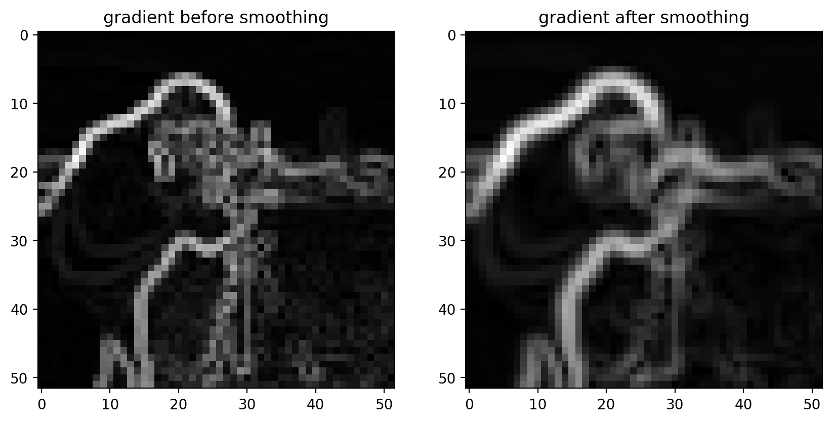
Notice how the edges look more continuous in the smoothed image.
Denoising filters#
At this point, we make a distinction. The earlier filters were implemented as a linear dot-product of values in the filter kernel and values in the image. The following kernels implement an arbitrary function of the local image neighborhood. Denoising filters in particular are filters that preserve the sharpness of edges in the image.
As you can see from our earlier examples, mean and Gaussian filters smooth an image rather uniformly, including the edges of objects in an image. When denoising, however, you typically want to preserve features and just remove noise. The distinction between noise and features can, of course, be highly situation-dependent and subjective.
Median Filter#
The median filter is the classic edge-preserving filter. As the name implies, this filter takes a set of pixels (i.e. the pixels within a kernel or “structuring element”) and returns the median value within that neighborhood. Because regions near a sharp edge will have many dark values and many light values (but few values in between) the median at an edge will most likely be either light or dark, rather than some value in between. In that way, we don’t end up with edges that are smoothed.
neighborhood = disk(
    radius=1
)  # "selem" is often the name used for "structuring element"
median = filters.rank.median(pixilated, neighborhood)
titles = ["image", "gaussian", "median"]
imshow_all(pixilated, smooth, median, titles=titles)

This difference is more noticeable with a more detailed image.
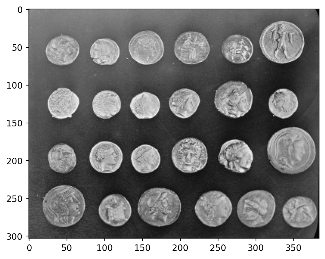
neighborhood = disk(10)
coins = data.coins()
mean_coin = filters.rank.mean(coins, neighborhood)
median_coin = filters.rank.median(coins, neighborhood)
titles = ["image", "mean", "median"]
imshow_all(coins, mean_coin, median_coin, titles=titles)
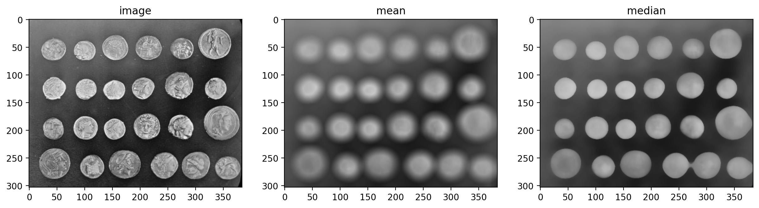
Notice how the edges of coins are preserved after using the median filter.
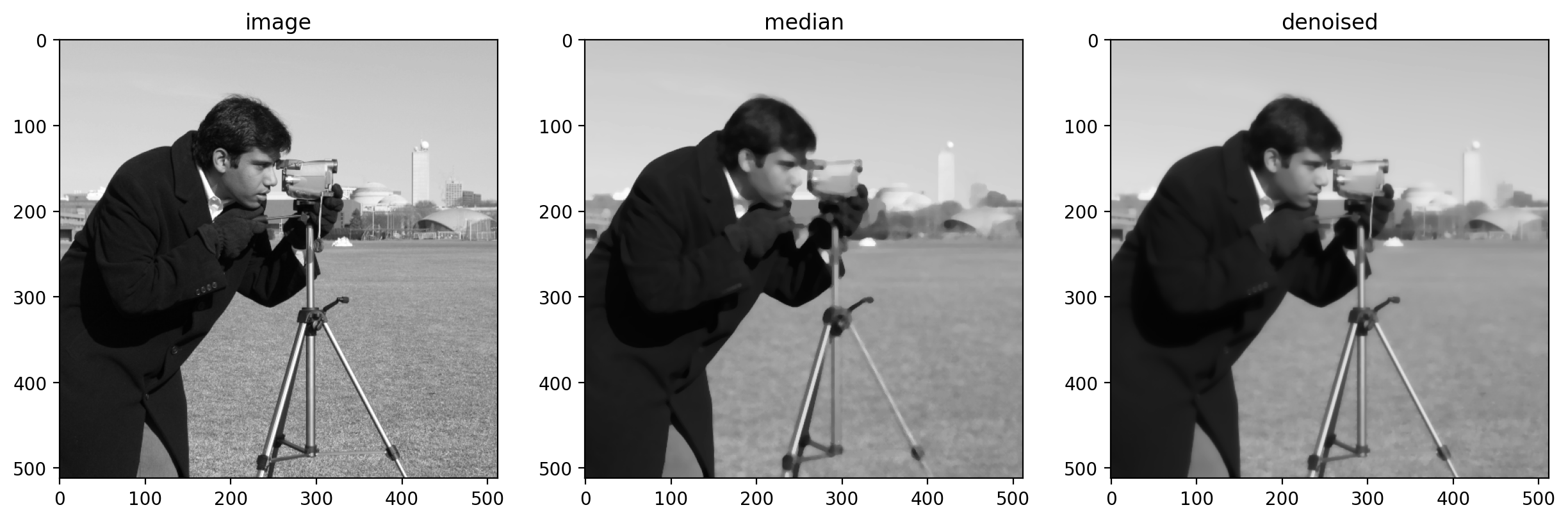
Further reading#
scikit-image also provides more sophisticated denoising filters:
# more advanced denoising technique
denoised = denoise_tv_bregman(image, 4)
d = disk(4)
median = filters.rank.median(image, d)
titles = ["image", "median", "denoised"]
imshow_all(image, median, denoised, titles=titles)
Feature Detection#
Feature detection is often the result of image processing. We’ll detect some basic features (edges, points, and circles) in this section, but there are a wealth of available feature detectors.
Edge detection#
Before we start, let’s set the default color map to grayscale and turn off pixel interpolation.
plt.rcParams["image.cmap"] = "gray"
plt.rcParams["image.interpolation"] = "none"
We’ve already discussed edge filtering, using the Sobel filter, in the last section.
image = data.camera()
pixilated = image[::10, ::10]
gradient = filters.sobel(pixilated)
imshow_all(pixilated, gradient)
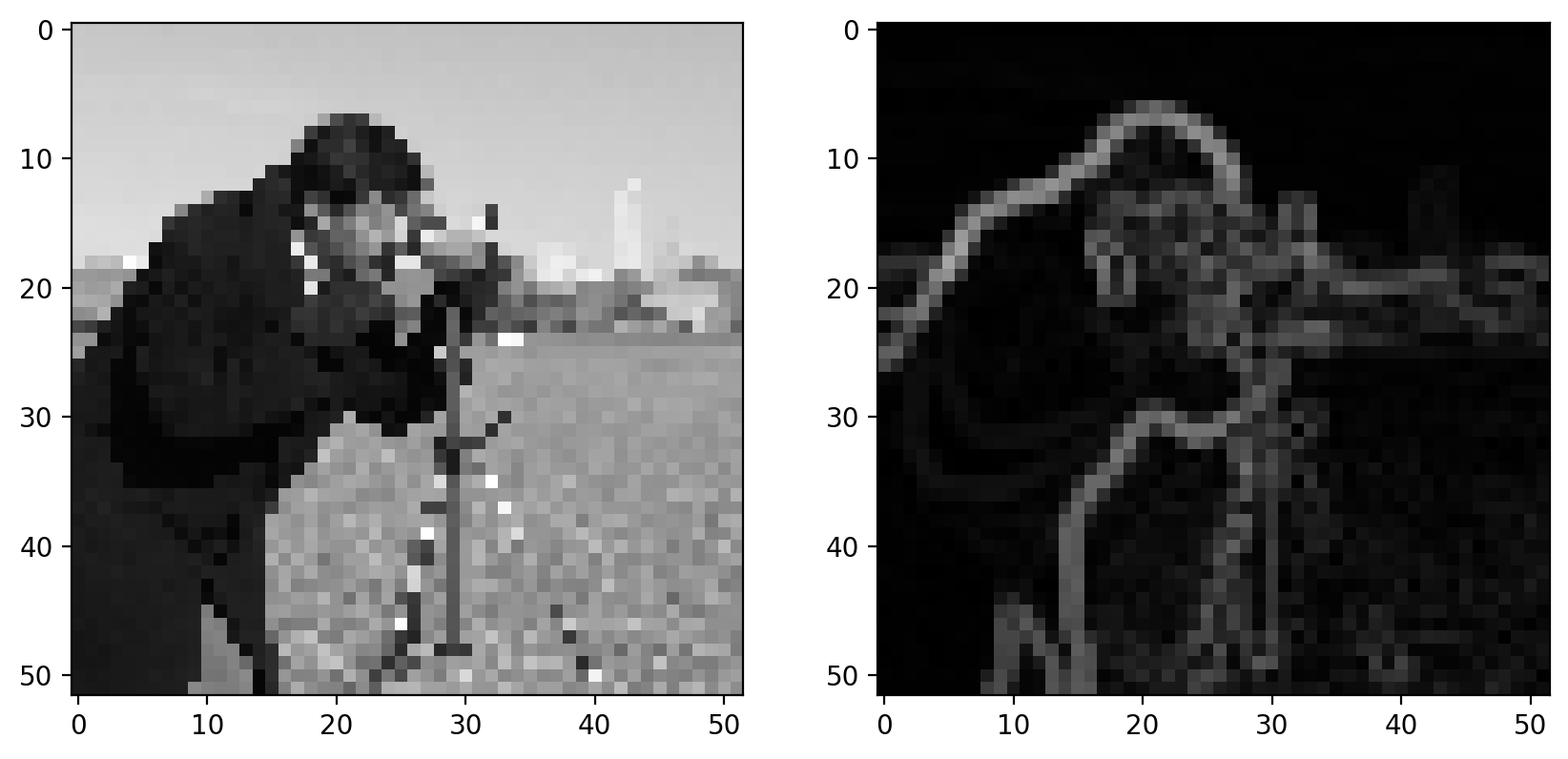
With the Sobel filter, however, we get back a grayscale image, which essentially tells us the likelihood that a pixel is on the edge of an object.
We can apply a bit more logic to detect an edge; i.e. we can use that filtered image to make a decision whether or not a pixel is on an edge. The simplest way to do that is with thresholding:
imshow_all(gradient, gradient > 0.4)
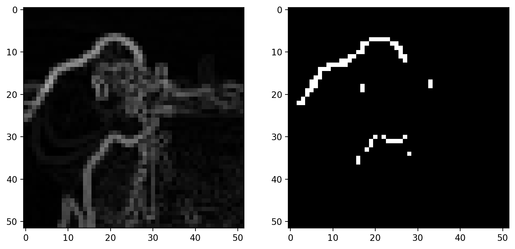
That approach doesn’t do a great job. It’s noisy and produces thick edges. Furthermore, it doesn’t use our knowledge of how edges work: They should be thin and tend to be connected along the direction of the edge.
Canny edge detector#
The Canny edge detector combines the Sobel filter with a few other steps to give a binary edge image. The steps are as follows:
Gaussian filter
Sobel filter
Non-maximal suppression
Hysteresis thresholding
Let’s go through these steps one at a time.
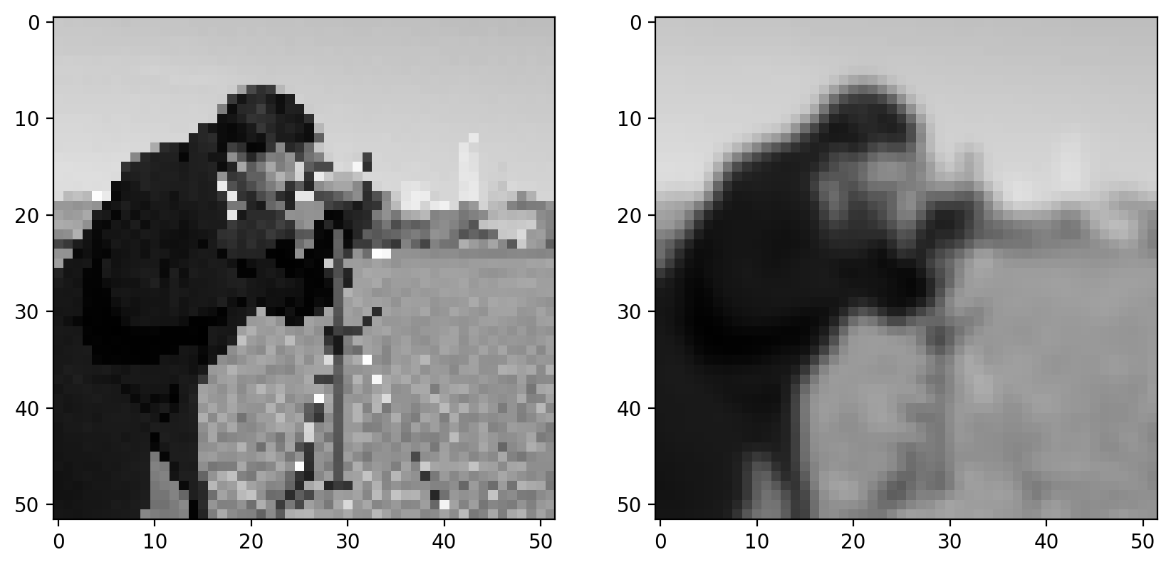
Step 1: Gaussian filter#
As discussed earlier, gradients tend to enhance noise. To combat this effect, we first smooth the image using a gradient filter:
sigma = 1  # Standard-deviation of Gaussian; larger smooths more.
pixilated_float = img_as_float(pixilated)
pixilated_float = pixilated
smooth = filters.gaussian(pixilated_float, sigma)
imshow_all(pixilated_float, smooth)
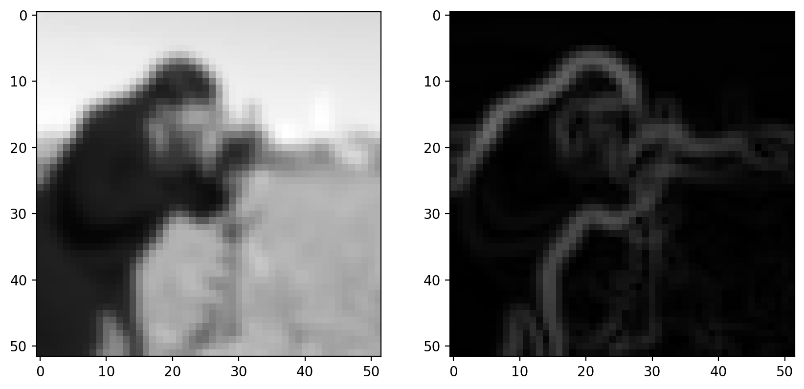
Step 2: Sobel filter#
Next, we apply our edge filter:
gradient_magnitude = filters.sobel(smooth)
imshow_all(smooth, gradient_magnitude)
Step 3: Non-maximal suppression#
Goal: Suppress gradients that aren’t on an edge
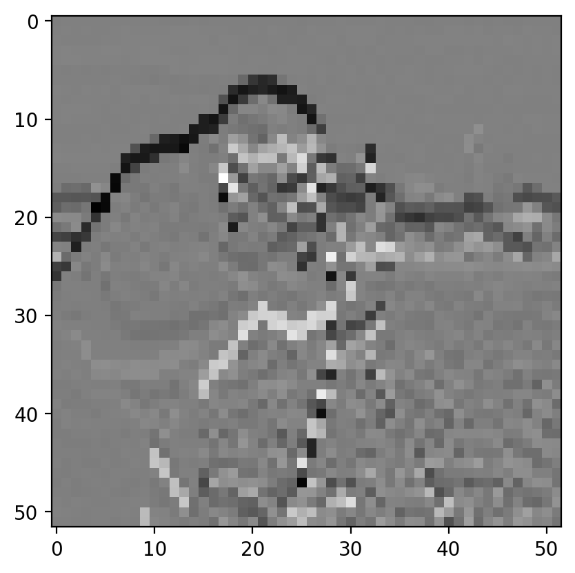
Ideally, an edge is thin: In some sense, an edge is infinitely thin, but images are discrete so we want edges to be a single pixel wide. To accomplish this, we thin the image using “non-maximal suppression”. This takes the edge-filtered image and thins the response across the edge direction; i.e. in the direction of the maximum gradient:
zoomed_grad = gradient_magnitude[15:25, 5:15]
maximal_mask = np.zeros_like(zoomed_grad)
# This mask is made up for demo purposes
maximal_mask[range(10), (7, 6, 5, 4, 3, 2, 2, 2, 3, 3)] = 1
grad_along_edge = maximal_mask * zoomed_grad

fig, axes = plt.subplots(nrows=1, ncols=2, figsize=(10, 5))

axes[0].imshow(zoomed_grad)
axes[1].imshow(grad_along_edge)
<matplotlib.image.AxesImage at 0x1d851236890>
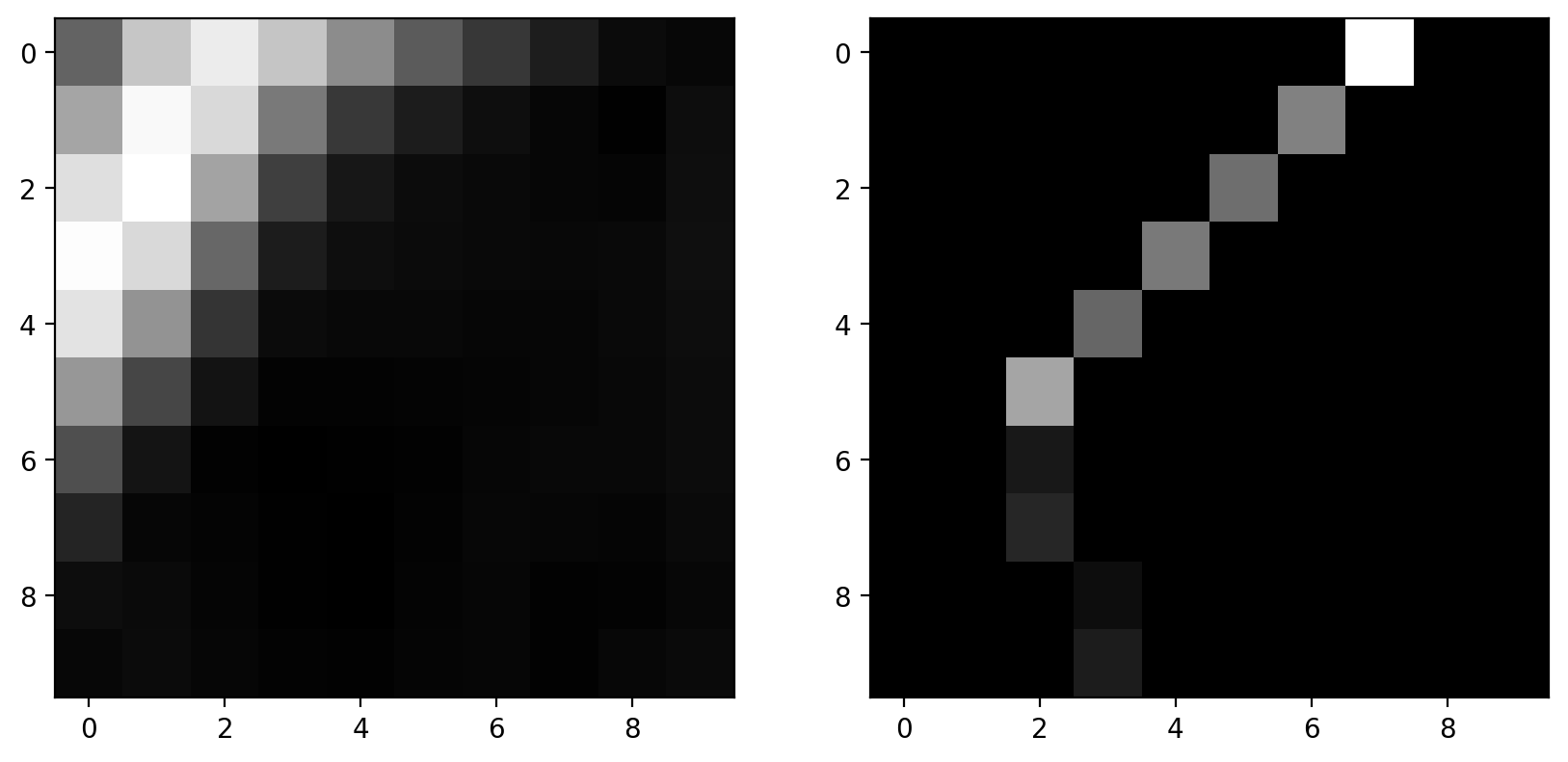
This is a faked version of non-maximal suppression: Pixels are manually masked here.
The actual algorithm detects the direction of edges and keeps a pixel only if it has a locally maximal gradient magnitude in the direction normal to the edge direction. It doesn’t mask pixels along the edge direction since an adjacent edge pixel will be of comparable magnitude.
The result of the filter is that an edge is only possible if there are no better edges near it.
Step 4: Hysteresis thresholding#
Goal: Prefer pixels that are connected to edges
The final step is the actual decision-making process.
Here, we have two parameters: The low threshold and the high threshold. The high threshold sets the gradient value that you know is definitely an edge. The low threshold sets the gradient value that could be an edge, but only if it’s connected to a pixel that we know is an edge.
These two thresholds are displayed below:
low_threshold = 0.2
high_threshold = 0.3
label_image = np.zeros_like(pixilated)
# This uses `gradient_magnitude` which has NOT gone through non-maximal-suppression.
label_image[gradient_magnitude > low_threshold] = 1
label_image[gradient_magnitude > high_threshold] = 2
demo_image = color.label2rgb(
    label_image, gradient_magnitude, bg_label=0, colors=("yellow", "red")
)
plt.imshow(demo_image)
<matplotlib.image.AxesImage at 0x1d852a926b0>
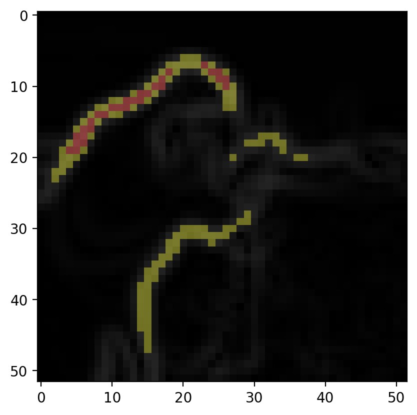
The red points here are above high_threshold and are seed points for edges. The yellow points are edges if connected (possibly by other yellow points) to seed points; i.e. isolated groups of yellow points will not be detected as edges.
Note that the demo above is on the edge image before non-maximal suppression, but in reality, this would be done on the image after non-maximal suppression. There isn’t currently an easy way to get at the intermediate result.
The Canny Edge Detector#
Now we’re ready to look at the actual result:
image = data.coins()


def canny_demo(**kwargs):
    edges = feature.canny(image, **kwargs)
    plt.imshow(edges)
    plt.show()


# As written, the following doesn't actually interact with the
# `canny_demo` function. Figure out what you need to add.
widgets.interact(
    canny_demo,
)
# <-- add keyword arguments for `canny`
<function __main__.canny_demo(**kwargs)>
Play around with the demo above. Make sure to add any keyword arguments to interact that might be necessary. (Note that keyword arguments passed to interact are passed to canny_demo and forwarded to filter.canny. So you should be looking at the docstring for filter.canny or the discussion above to figure out what to add.)
Can you describe how the low threshold makes a decision about a potential edge, as compared to the high threshold?
Hough transforms#
Hough transforms are a general class of operations that make up a step in feature detection. Just like we saw with edge detection, Hough transforms produce a result that we can use to detect a feature. (The distinction between the “filter” that we used for edge detection and the “transform” that we use here is a bit arbitrary.)
Circle detection#
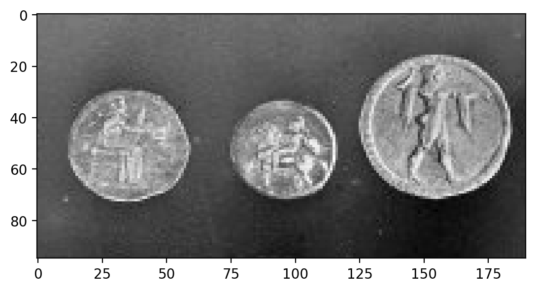
To explore the Hough transform, let’s take the circular Hough transform as our example. Let’s grab an image with some circles:
image = data.coins()[0:95, 180:370]
plt.imshow(image)
<matplotlib.image.AxesImage at 0x1d851278280>
We can use the Canny edge filter to get a pretty good representation of these circles:
edges = feature.canny(image, sigma=3, low_threshold=10, high_threshold=60)
plt.imshow(edges)
<matplotlib.image.AxesImage at 0x1d8512f0340>
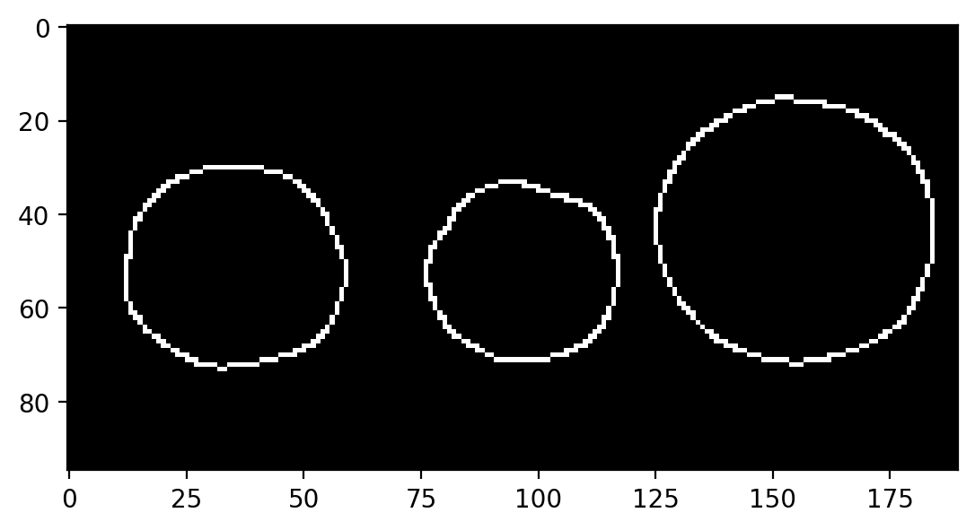
While it looks like we’ve extracted circles, this doesn’t give us much if what we want to do is measure these circles. For example, what are the size and position of the circles in the above image? The edge image doesn’t really tell us much about that.
We’ll use the Hough transform to extract circle positions and radii:
hough_radii = np.arange(15, 30, 2)
hough_response = hough_circle(edges, hough_radii)
Here, the circular Hough transform actually uses the edge image from before. We also have to define the radii that we want to search for in our image.
So… what’s the actual result that we get back?
print(edges.shape, hough_response.shape)
(95, 190) (8, 95, 190)
We can see that the last two dimensions of the response are exactly the same as the original image, so the response is image-like. Then what does the first dimension correspond to?
As always, you can get a better feel for the result by plotting it:
# Use max value to intelligently rescale the data for plotting.
h_max = hough_response.max()


def hough_responses_demo(i):
    # Use `plt.title` to add a meaningful title for each index.
    plt.imshow(hough_response[i, :, :], vmax=h_max * 0.5)
    plt.show()


widgets.interact(hough_responses_demo, i=(0, len(hough_response) - 1))
<function __main__.hough_responses_demo(i)>
Playing around with the slider should give you a pretty good feel for the result.
This Hough transforms simply counts the pixels in a thin (as opposed to filled) circular mask. Since the input is an edge image, the response is strongest when the center of the circular mask lies at the center of a circle with the same radius.
Further reading#
Interest point detection#
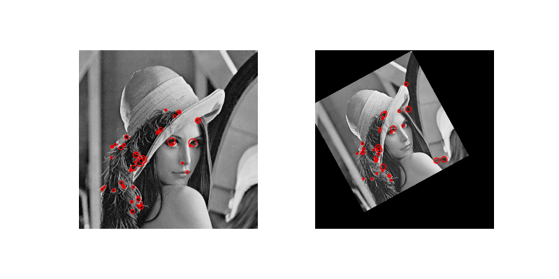
We’ve only skimmed the surface of what might be classified as “feature detection”. One major area that we haven’t covered is called interest point detection. Here, we don’t even need to know what we’re looking for, we just identify small patches (centered on a pixel) that are “distinct”. (The definition of “distinct” varies by algorithm; e.g., the Harris corner detector defines interest points as corners.) These distinct points can then be used to, e.g., compare with distinct points in other images.
One common use of interest point detection is for image registration, in which we align (i.e. “register”) images based on interest points. Here’s an example of the CENSURE feature detector from the gallery:
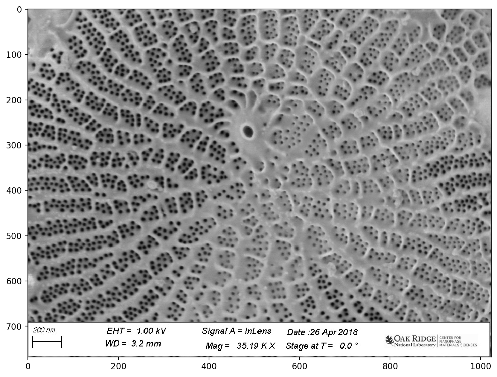
A Real Segmentation Example#
Diatom analysis#
See https://www.nature.com/articles/s41524-019-0202-3:
*Deep data analytics for genetic engineering of diatoms linking genotype to phenotype via machine learning
Artem A. Trofimov, Alison A. Pawlicki, Nikolay Borodinov, Shovon Mandal, Teresa J. Mathews, Mark Hildebrand, Maxim A. Ziatdinov, Katherine A. Hausladen, Paulina K. Urbanowicz, Chad A. Steed, Anton V. Ievlev, Alex Belianinov, Joshua K. Michener, Rama Vasudevan, and Olga S. Ovchinnikova.
# Set up matplotlib defaults: larger images, gray color map
import matplotlib

matplotlib.rcParams.update({"figure.figsize": (10, 10), "image.cmap": "gray"})
Load and Visualize the Data#
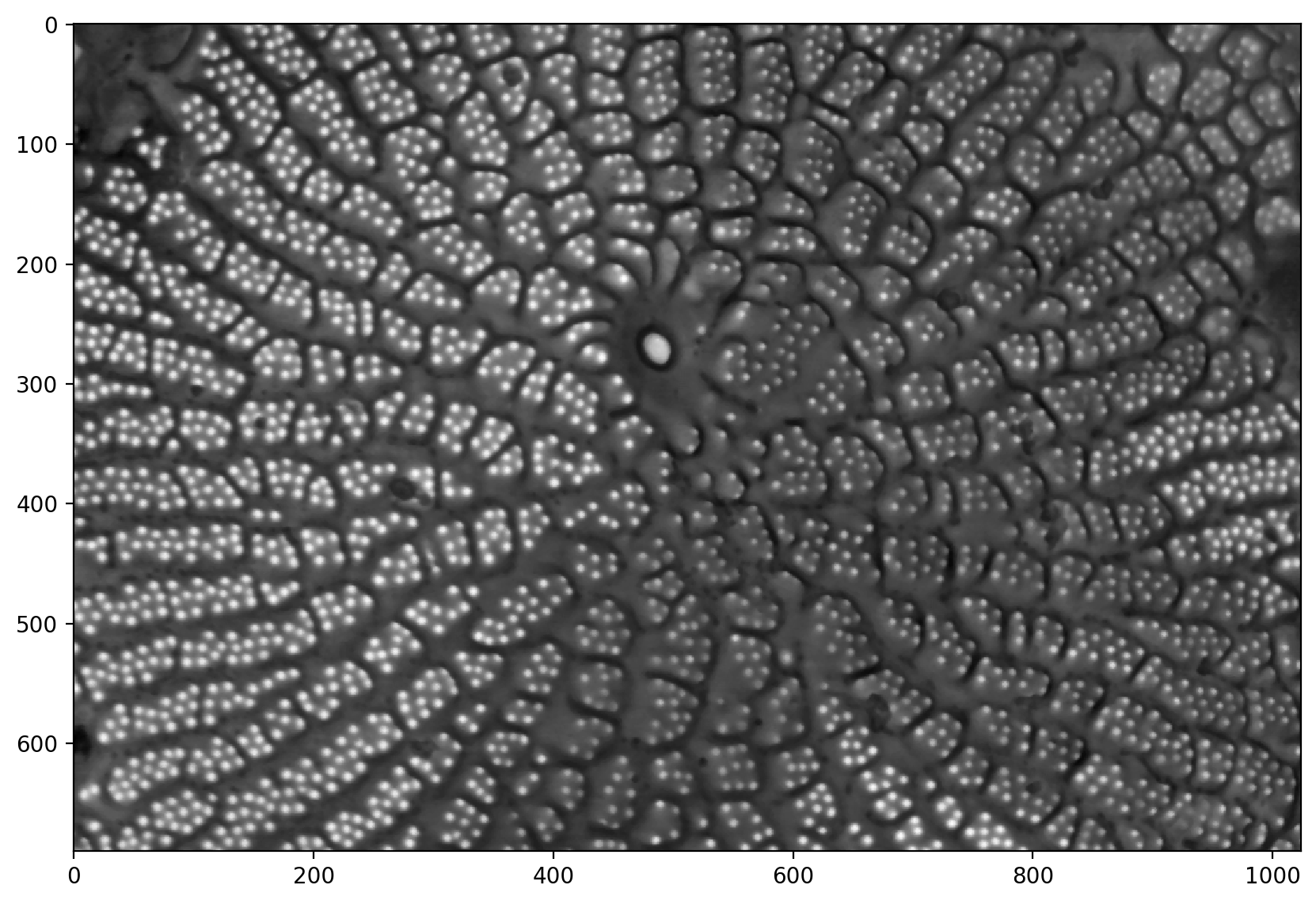
# reads the image from a file
image = io.imread(
    "https://raw.githubusercontent.com/jagar2/Fall_2022_MEM_T680Data_Analysis_and_Machine_Learning/main/jupyterbook/Topic_6/data/diatom-wild-000.jpg"
)

# shows the image
plt.imshow(image)
<matplotlib.image.AxesImage at 0x1d85135c0a0>
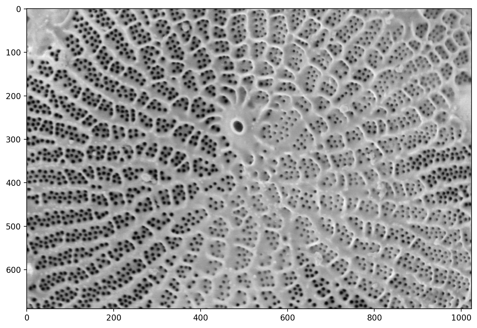
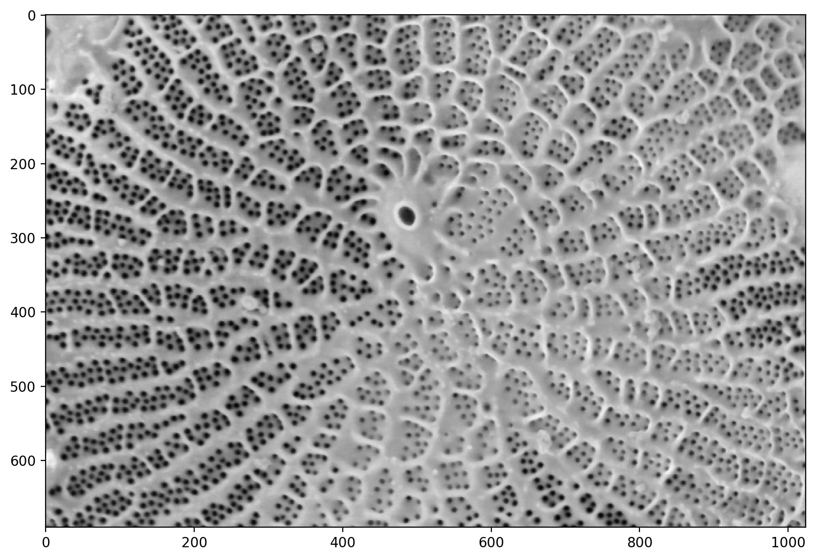
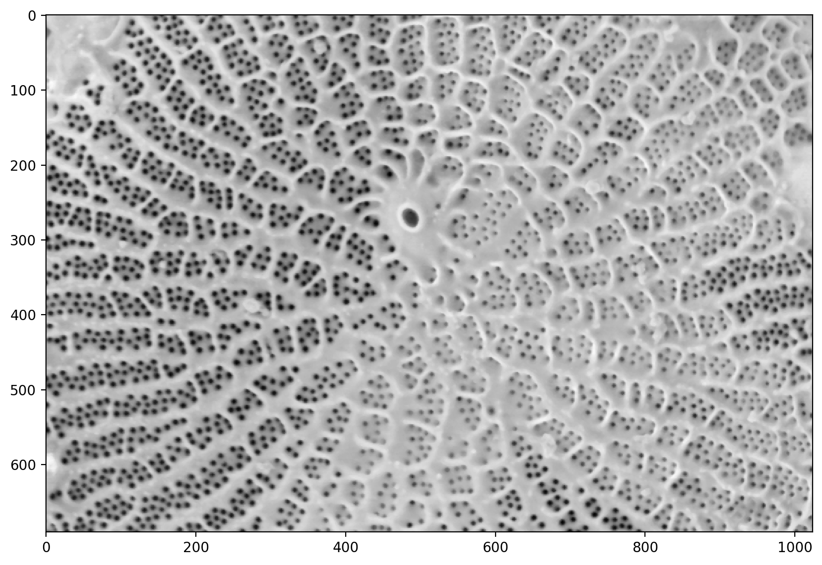
# This just crops the bottom bar that is useless
pores = image[:690, :]

plt.imshow(pores)
<matplotlib.image.AxesImage at 0x1d8535346a0>
# applies a median filter.
# Median filters remove speckles
denoised = ndi.median_filter(util.img_as_float(pores), size=3)

# shows the denoised image
plt.imshow(denoised)
<matplotlib.image.AxesImage at 0x1d852447610>
# adjusts the exposure
pores_gamma = exposure.adjust_gamma(denoised, 0.7)
plt.imshow(pores_gamma)
<matplotlib.image.AxesImage at 0x1d85259e530>
# inverts the image so the pores are more visible
pores_inv = 1 - pores_gamma
plt.imshow(pores_inv)
<matplotlib.image.AxesImage at 0x1d85099eec0>
# This is the problematic part of the manual pipeline: you need
# a good segmentation. There are algorithms for automatic thresholding,
# such as `filters.otsu` and `filters.li`, but they don't always get the
# result you want.
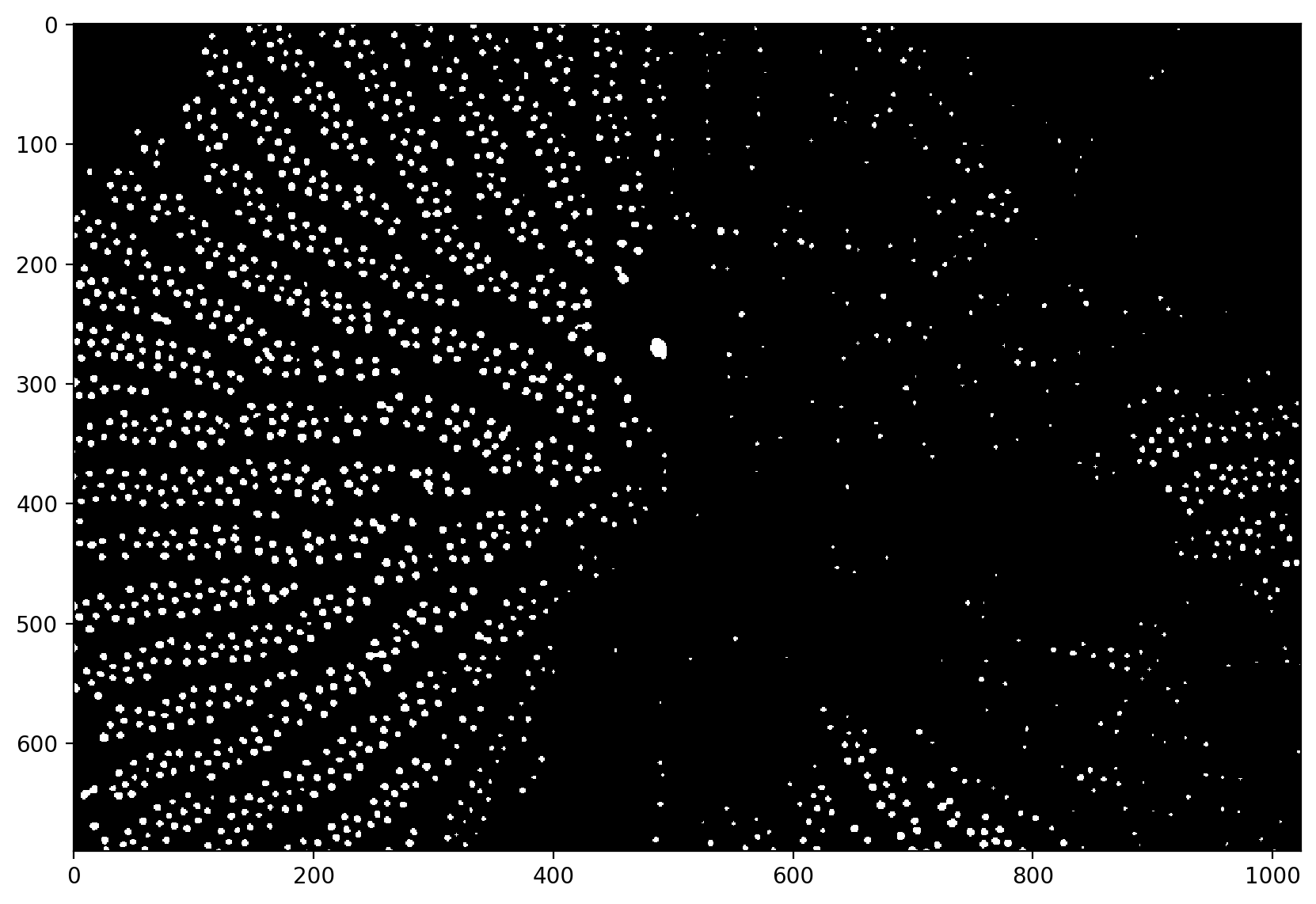
t = 0.325
thresholded = pores_gamma <= t
plt.imshow(thresholded)
<matplotlib.image.AxesImage at 0x1d856d60040>
# Utility function that tries a range of automatic thresholding approaches
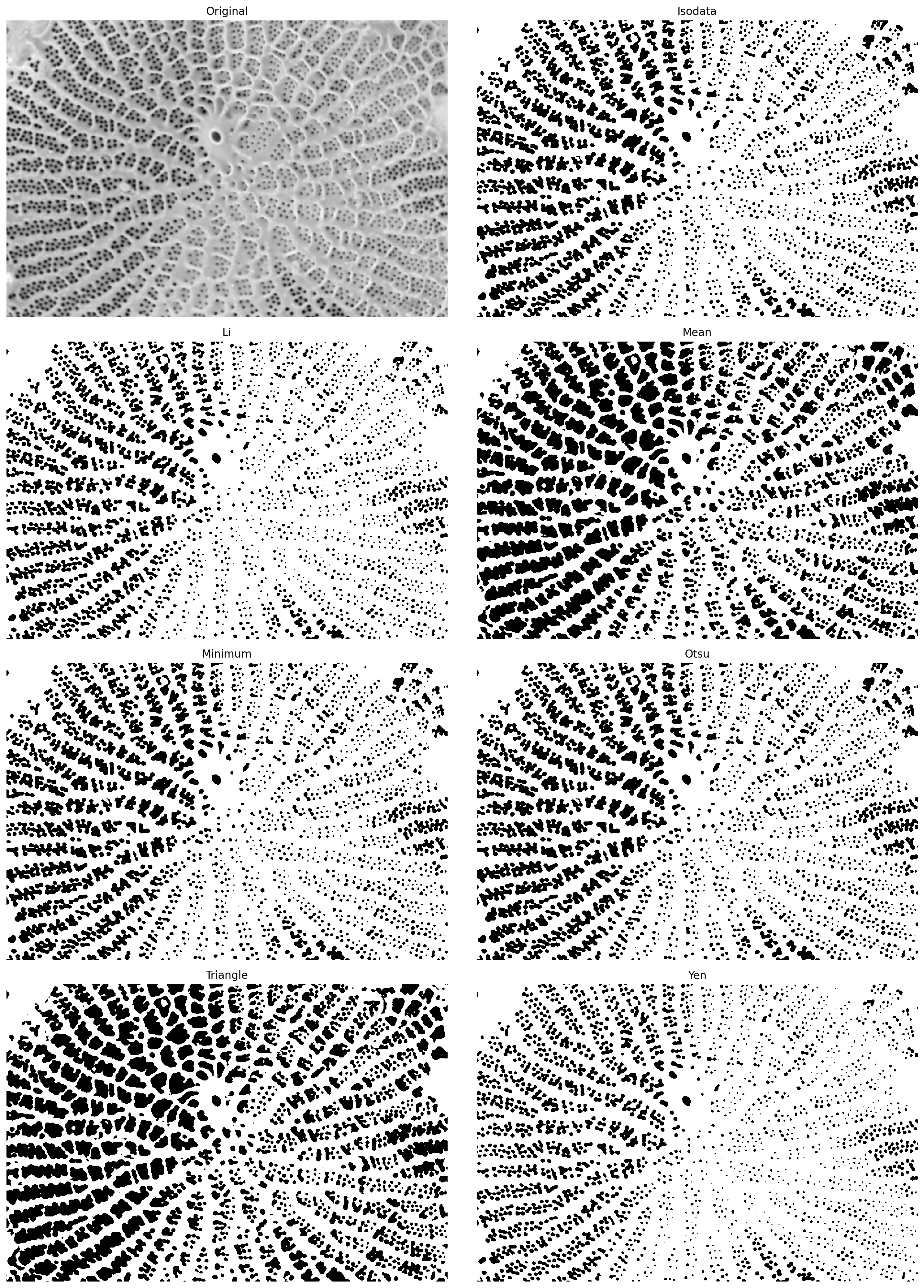
filters.try_all_threshold(pores_gamma, figsize=(15, 20))
skimage.filters.thresholding.threshold_isodata
skimage.filters.thresholding.threshold_li
skimage.filters.thresholding.threshold_mean
skimage.filters.thresholding.threshold_minimum
skimage.filters.thresholding.threshold_otsu
skimage.filters.thresholding.threshold_triangle
skimage.filters.thresholding.threshold_yen
(<Figure size 1500x2000 with 8 Axes>,
 array([<AxesSubplot:title={'center':'Original'}>,
        <AxesSubplot:title={'center':'Isodata'}>,
        <AxesSubplot:title={'center':'Li'}>,
        <AxesSubplot:title={'center':'Mean'}>,
        <AxesSubplot:title={'center':'Minimum'}>,
        <AxesSubplot:title={'center':'Otsu'}>,
        <AxesSubplot:title={'center':'Triangle'}>,
        <AxesSubplot:title={'center':'Yen'}>], dtype=object))
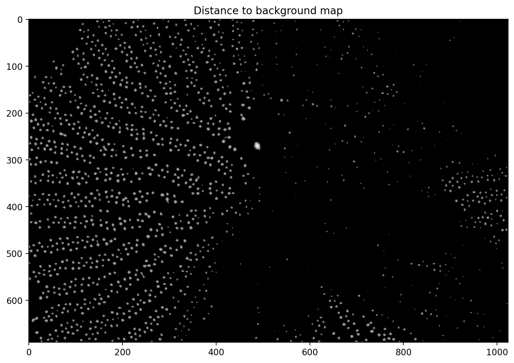
# computes the distance from the background based on the thresholded image
distance = ndi.distance_transform_edt(thresholded)

# adjusts the gamma and plots it
plt.imshow(exposure.adjust_gamma(distance, 0.5))
plt.title("Distance to background map")
Text(0.5, 1.0, 'Distance to background map')
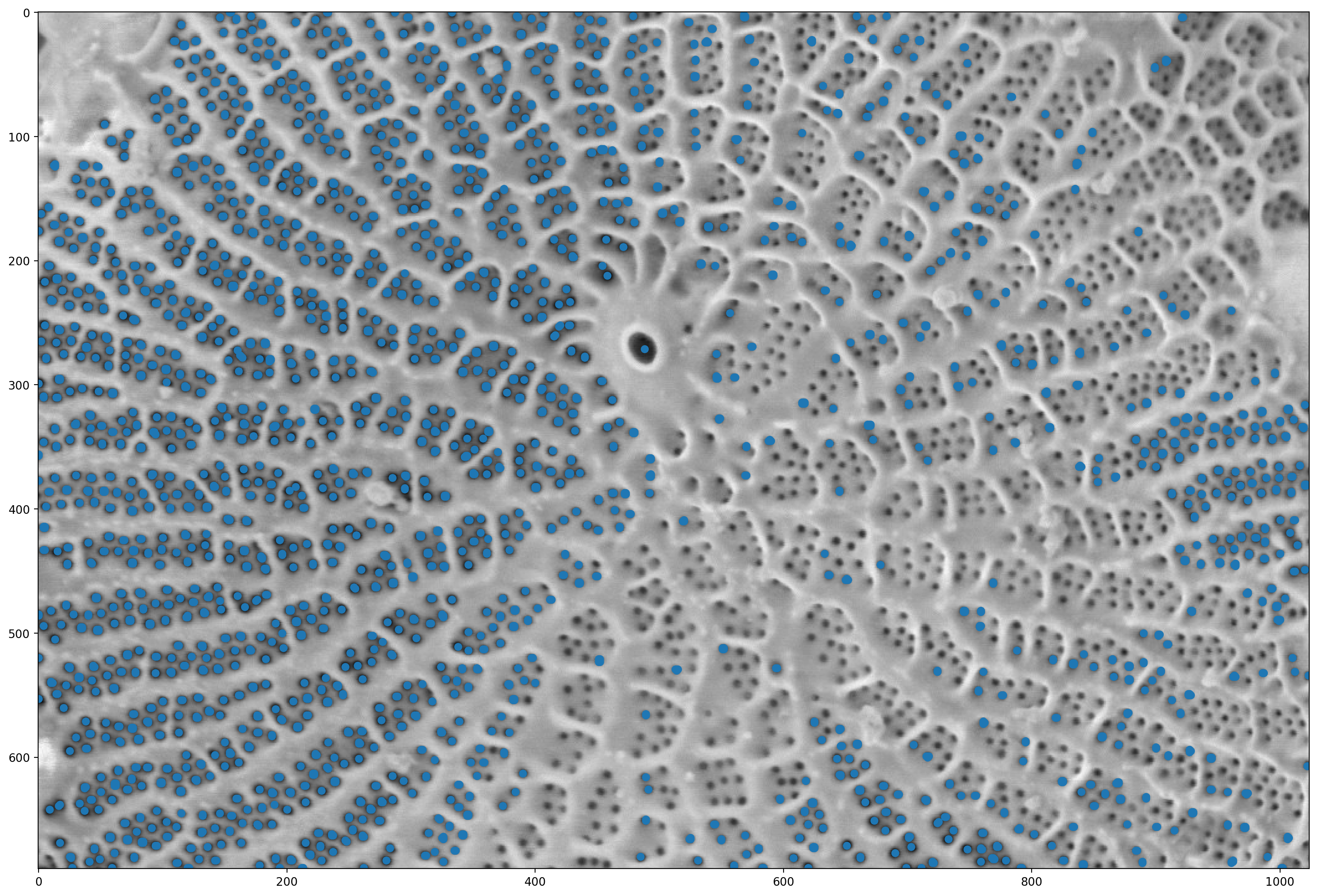
# finds the local maximum (this is the point furthest from the boundary for each object)
local_maxima = morphology.local_maxima(distance)

fig, ax = plt.subplots(figsize=(20, 20))

# finds the points where there is a non-zero local max
maxi_coords = np.nonzero(local_maxima)

# Finds the pores and marks them.
ax.imshow(pores)
plt.scatter(maxi_coords[1], maxi_coords[0])
<matplotlib.collections.PathCollection at 0x1d8532e7bb0>
# This is a utility function that we'll use for display in a while;
# you can ignore it for now and come and investigate later.


def shuffle_labels(labels):
    """Shuffle the labels so that they are no longer in order.
    This helps with visualization.
    """
    indices = np.unique(labels[labels != 0])
    indices = np.append([0], np.random.permutation(indices))
    return indices[labels]
# labels the local maximum interactively
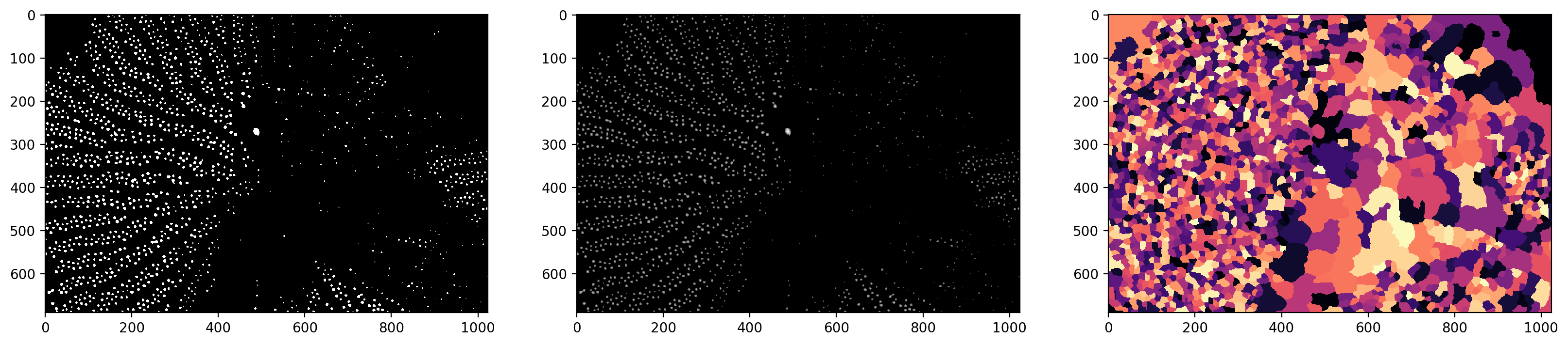
markers = ndi.label(local_maxima)[0]
# does a watershed segmentation. Look at the documentation for details
# essentially fills in the image with "water" from the marker points.
labels = segmentation.watershed(denoised, markers)
f, (ax0, ax1, ax2) = plt.subplots(1, 3, figsize=(20, 5))

# plots the thresholded image
ax0.imshow(thresholded)
# plots the distance image in log scale
ax1.imshow(np.log(1 + distance))
# plots the watershed segments
ax2.imshow(shuffle_labels(labels), cmap="magma")
<matplotlib.image.AxesImage at 0x1d851336920>
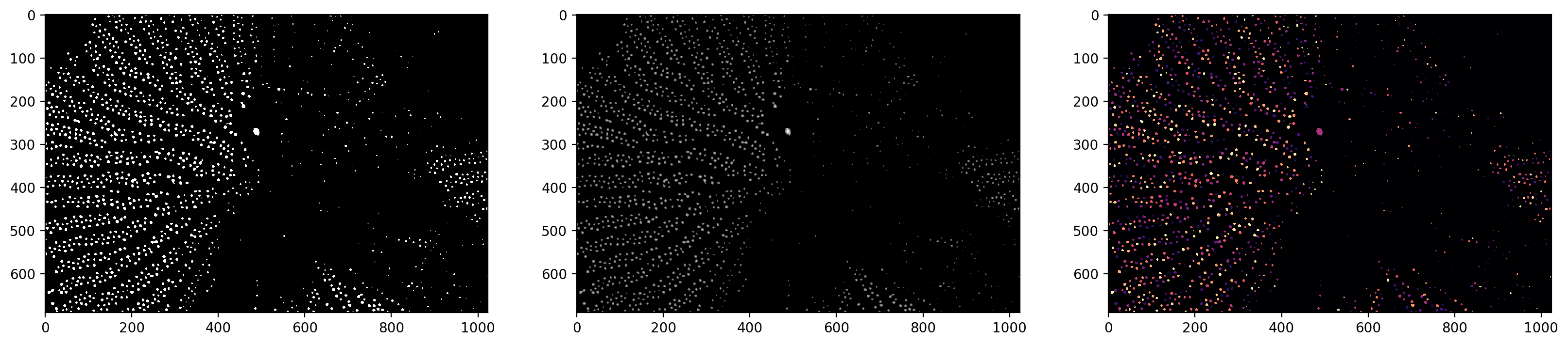
# small modification on the watershed
labels_masked = segmentation.watershed(
    thresholded, markers, mask=thresholded, connectivity=2
)
f, (ax0, ax1, ax2) = plt.subplots(1, 3, figsize=(20, 5))
ax0.imshow(thresholded)
ax1.imshow(np.log(1 + distance))
ax2.imshow(shuffle_labels(labels_masked), cmap="magma")
<matplotlib.image.AxesImage at 0x1d8524388e0>
# finds all of the contours and labels them.

contours = measure.find_contours(labels_masked, level=0.5)
plt.imshow(pores)
for c in contours:
    plt.plot(c[:, 1], c[:, 0])
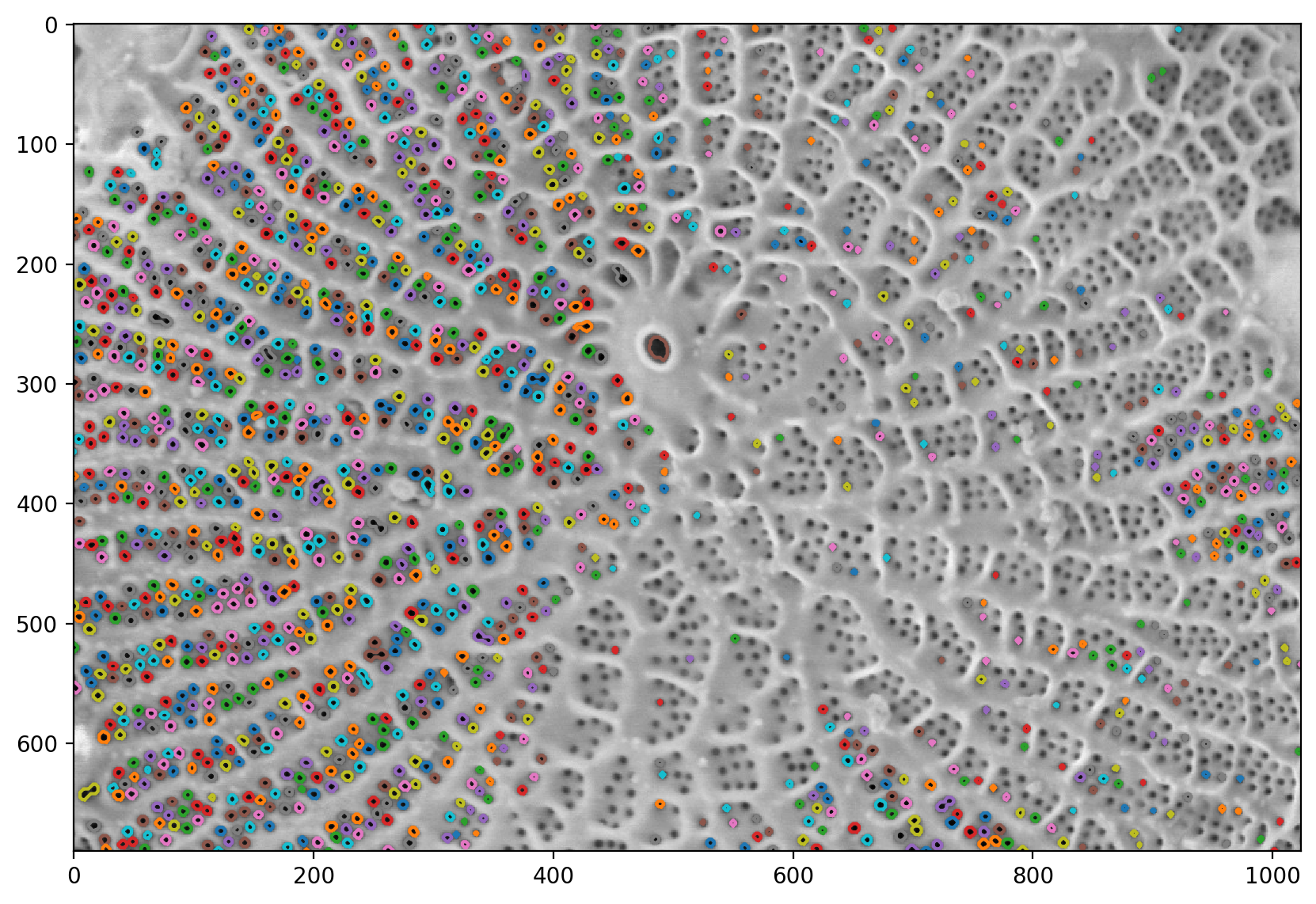
# Computes all of the region properties.
# you can look at the full list or region properties in the documentation
regions = measure.regionprops(labels_masked)
# Shows all the methods of the class
print(dir(regions[0]))
['__class__', '__delattr__', '__dict__', '__dir__', '__doc__', '__eq__', '__format__', '__ge__', '__getattr__', '__getattribute__', '__getitem__', '__gt__', '__hash__', '__init__', '__init_subclass__', '__iter__', '__le__', '__lt__', '__module__', '__ne__', '__new__', '__reduce__', '__reduce_ex__', '__repr__', '__setattr__', '__sizeof__', '__str__', '__subclasshook__', '__weakref__', '_cache', '_cache_active', '_extra_properties', '_image_intensity_double', '_intensity_image', '_label_image', '_multichannel', '_ndim', '_slice', '_spatial_axes', 'area', 'area_bbox', 'area_convex', 'area_filled', 'axis_major_length', 'axis_minor_length', 'bbox', 'centroid', 'centroid_local', 'centroid_weighted', 'centroid_weighted_local', 'coords', 'eccentricity', 'equivalent_diameter_area', 'euler_number', 'extent', 'feret_diameter_max', 'image', 'image_convex', 'image_filled', 'image_intensity', 'inertia_tensor', 'inertia_tensor_eigvals', 'intensity_max', 'intensity_mean', 'intensity_min', 'label', 'moments', 'moments_central', 'moments_hu', 'moments_normalized', 'moments_weighted', 'moments_weighted_central', 'moments_weighted_hu', 'moments_weighted_normalized', 'orientation', 'perimeter', 'perimeter_crofton', 'slice', 'solidity']
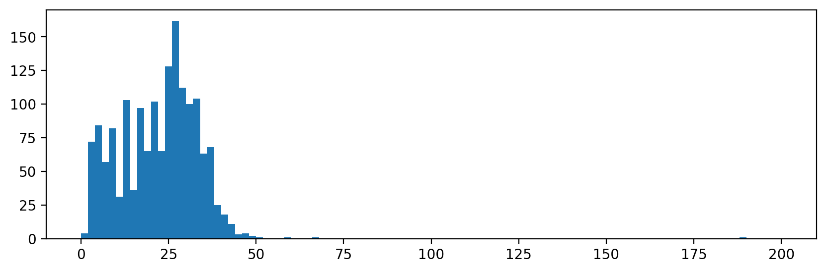
# Plots an example histogram showing the distribution in the area size.
f, ax = plt.subplots(figsize=(10, 3))
ax.hist([r.area for r in regions], bins=100, range=(0, 200))
(array([  4.,  72.,  84.,  57.,  82.,  31., 103.,  36.,  97.,  65., 102.,
         65., 128., 162., 112., 100., 104.,  63.,  68.,  25.,  18.,  11.,
          3.,   4.,   2.,   1.,   0.,   0.,   0.,   1.,   0.,   0.,   0.,
          1.,   0.,   0.,   0.,   0.,   0.,   0.,   0.,   0.,   0.,   0.,
          0.,   0.,   0.,   0.,   0.,   0.,   0.,   0.,   0.,   0.,   0.,
          0.,   0.,   0.,   0.,   0.,   0.,   0.,   0.,   0.,   0.,   0.,
          0.,   0.,   0.,   0.,   0.,   0.,   0.,   0.,   0.,   0.,   0.,
          0.,   0.,   0.,   0.,   0.,   0.,   0.,   0.,   0.,   0.,   0.,
          0.,   0.,   0.,   0.,   0.,   0.,   1.,   0.,   0.,   0.,   0.,
          0.]),
 array([  0.,   2.,   4.,   6.,   8.,  10.,  12.,  14.,  16.,  18.,  20.,
         22.,  24.,  26.,  28.,  30.,  32.,  34.,  36.,  38.,  40.,  42.,
         44.,  46.,  48.,  50.,  52.,  54.,  56.,  58.,  60.,  62.,  64.,
         66.,  68.,  70.,  72.,  74.,  76.,  78.,  80.,  82.,  84.,  86.,
         88.,  90.,  92.,  94.,  96.,  98., 100., 102., 104., 106., 108.,
        110., 112., 114., 116., 118., 120., 122., 124., 126., 128., 130.,
        132., 134., 136., 138., 140., 142., 144., 146., 148., 150., 152.,
        154., 156., 158., 160., 162., 164., 166., 168., 170., 172., 174.,
        176., 178., 180., 182., 184., 186., 188., 190., 192., 194., 196.,
        198., 200.]),
 <BarContainer object of 100 artists>)