Introduction to Plotting in Python
Contents
Introduction to Plotting in Python#
Most people are visual learners, to check and understand your code it is useful to create graphs and visualizations.
Matplotlib is the most common used Python package for 2D graphics
You can quickly make publication-quality graphics in many formats
# Libraries
from IPython.display import IFrame
import numpy as np
import matplotlib.pyplot as plt
from scipy.stats import kde
import plotly.graph_objects as go
import plotly.express as px
import pandas as pd
import seaborn as sns
import networkx as nx
Data Graphics#
Combined use of points, lines, a coordinate system, numbers, symbols, words, shading and color to display information
Surprisingly recent invention
1750’s that statistical graphics length and area to show, quantity, time-series, scatter plots and multivariate displays were used
Modern graphics are instruments for reasoning about quantitative information#
Good graphics allow large collections of data to be turned into actionable information
In science, making easy-to-interpret, honest graphical representations of information is the most effective way of communicating scientific information
What does an Excellent Graphic Do?#
Show the data
Allow the observer to extract information without thinking about the methodology or design \(\rightarrow\) good design is unnoticeable
Presents a large amount of data in a small space
Encourages the eye to compare important pieces of information
Reveal data at several levels of detail
Does not distort the data
Reinforces information in the text
Graphics can be more informative than statistics!
Example of how graphics can be used#
Famous dot of Dr. John Snow who showed deaths from Cholera in central London for September 1854
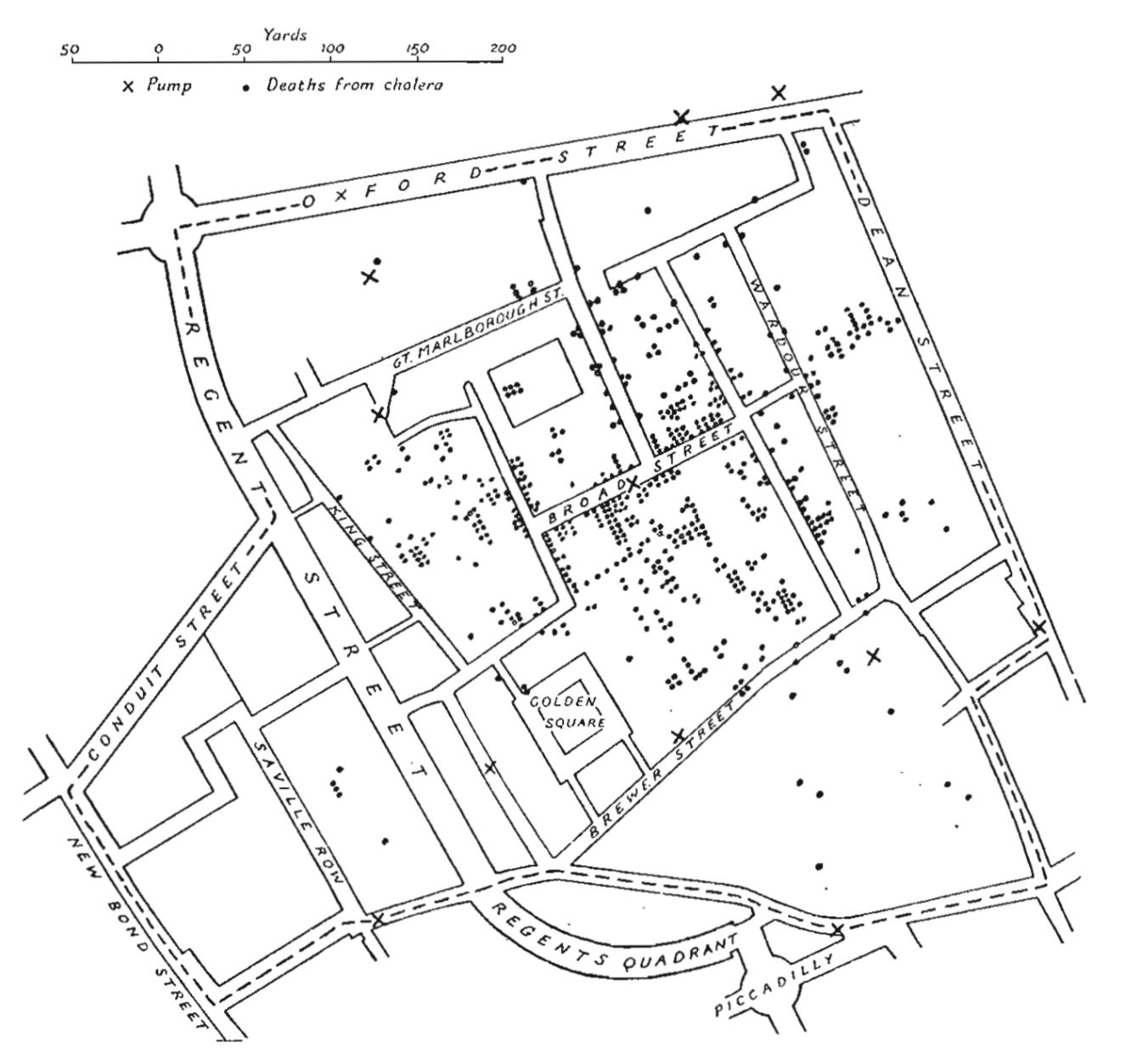
What does this graphic tell you?#
Adding a Spatial Dimension to a Time Series#
More information can be displayed by combining multiple data forms
You should design figures so information can be extracted without reading

Minard’s graphic is quite clever because of its ability to combine all of the dimensions: loss of life at a time and location, temperature, geography, and historical context, into one single graphic.
Shows when Napoleon’s army split by branching the graph
Adds thin lines to represent when the army had to cross rivers
Shows events with labels, changes in line width, and makes it easy for the eye to see where important events occur
Correlates secondary information (temperature in a graphical way) \(\rightarrow\) makes it so covariances can be identified
Principles of Graphical Excellence#
Presentation of data needs to consider substance, statistics, and design
Complex ideas should be communicated with clarity, precision, and efficiency
Gives the viewer the greatest amount of information in the shortest amount of time, using the least amount of ink
Graphical Integrity#
Graphics are just like words, they can be used to deceive
What is wrong with this figure?#

Negative data not represented well
Bar charts#
Bar charts show representation within groups that conceal the data
Should only be used for histograms

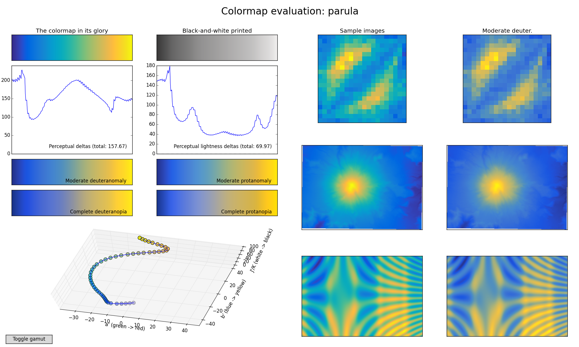
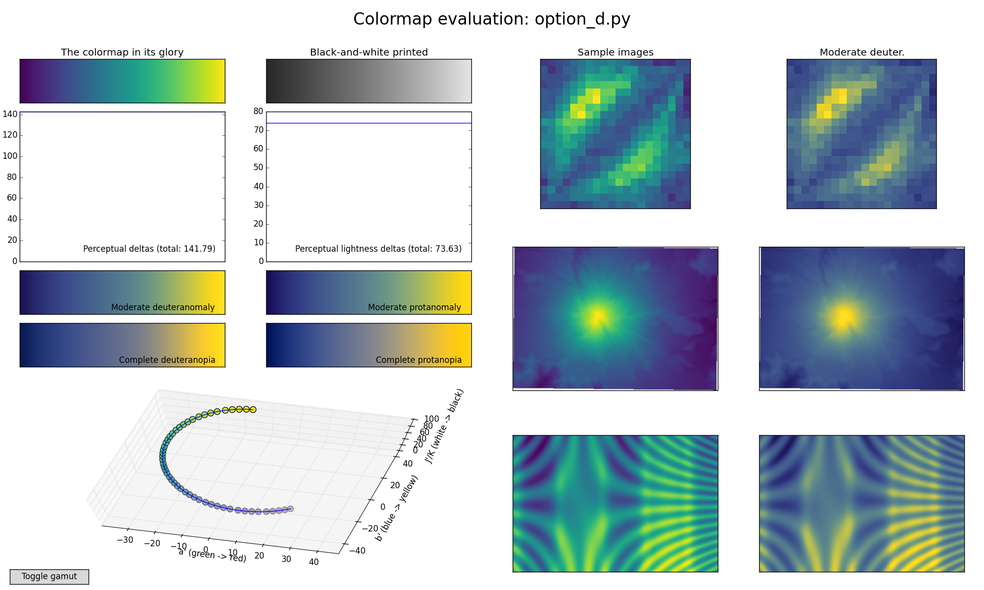
Color scales#
Colorful
pretty
should be sequential
accurately represents the values to brain
print in grayscale
good for colorblind
Why colormaps matter?#
Your eyes interpretation of the colormap represents the scale of the y-axis.
Use of an inappropriate colormap is like having a non-linear y-axis!**

The most common colormap JET#

This is what JET looks like#

Matlab’s Default [Parula]#
Perceptually uniform colormaps [Viridis]#
More details about perceptually correct colormaps#
IFrame(src="https://bids.github.io/colormap/", width=1000, height=1000)
Choosing Colors for your Figures#
IFrame(
    src="http://colorbrewer2.org/#type=sequential&scheme=BuGn&n=3",
    width=1000,
    height=1000,
)
Making a Simple Plot#
In this section, we want to draw the cosine and sine functions on the same plot. Starting from the default settings, we’ll enrich the figure step by step to make it nicer.
The first step is to get the data for the sine and cosine functions:
pyplot#
Most interaction is done using the pyplot module. This is built to mimic Matlab™
import numpy as np
import matplotlib.pyplot as plt

# creates a linear spaced array
X = np.linspace(-np.pi, np.pi, 256, endpoint=True)

# computes the sine and cosine
C, S = np.cos(X), np.sin(X)
X is now a NumPy array with 256 values ranging from -π to +π (included). C is the cosine (256 values) and S is the sine (256 values).
plt.plot(X, C)
plt.plot(X, S)

plt.show()

Customizing Plots#
In matplotlib everything is customizable in a variety of ways.
You can control the defaults of almost every property in matplotlib: figure size and dpi, line width, color and style, axes, axis and grid properties, text and font properties and so on.
# Imports
import numpy as np
import matplotlib.pyplot as plt

# Create a new figure of size 8x6 points, using 100 dots per inch
plt.figure(figsize=(8, 6), dpi=100)

# Create a new subplot from a grid of 1x1
plt.subplot(111)

X = np.linspace(-np.pi, np.pi, 256, endpoint=True)
C, S = np.cos(X), np.sin(X)

# Plot cosine using blue color with a continuous line of width 1 (pixels)
plt.plot(X, C, color="blue", linewidth=1.0, linestyle="-")

# Plot sine using green color with a continuous line of width 1 (pixels)
plt.plot(X, S, color="green", linewidth=1.0, linestyle="-")

# Set x limits
plt.xlim(-4.0, 4.0)

# Set x ticks
plt.xticks(np.linspace(-4, 4, 9, endpoint=True))

# Set y limits
plt.ylim(-1.0, 1.0)

# Set y ticks
plt.yticks(np.linspace(-1, 1, 5, endpoint=True))

# Save figure using 72 dots per inch
# savefig("../figures/exercice_2.png",dpi=72)

# Show result on screen
plt.show()

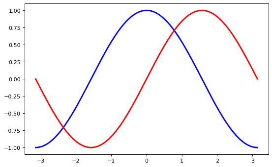
As a first step, we want to have the cosine in blue and the sine in red and a slightly thicker line for both of them. We’ll also slightly alter the figure size to make it more horizontal.
plt.figure(figsize=(10, 6), dpi=80)
plt.plot(X, C, color="blue", linewidth=2.5, linestyle="-")
plt.plot(X, S, color="red", linewidth=2.5, linestyle="-")
[<matplotlib.lines.Line2D at 0x1edbc29f0a0>]

Setting Limits#
Current limits of the figure are a bit too tight and we want to make some space in order to clearly see all data points.
plt.figure(figsize=(8, 5), dpi=80)
plt.subplot(111)

X = np.linspace(-np.pi, np.pi, 256, endpoint=True)
C, S = np.cos(X), np.sin(X)

plt.plot(X, C, color="blue", linewidth=2.5, linestyle="-")
plt.plot(X, S, color="red", linewidth=2.5, linestyle="-")

plt.xlim(X.min() * 1.1, X.max() * 1.1)
plt.ylim(C.min() * 1.1, C.max() * 1.1)

plt.show()
Setting Ticks#
Current ticks are not ideal because they do not show the interesting values (+/-π,+/-π/2) for sine and cosine. We’ll change them such that they show only these values.
plt.figure(figsize=(8, 5), dpi=80)
plt.subplot(111)

X = np.linspace(-np.pi, np.pi, 256, endpoint=True)
C, S = np.cos(X), np.sin(X)

plt.plot(X, C, color="blue", linewidth=2.5, linestyle="-")
plt.plot(X, S, color="red", linewidth=2.5, linestyle="-")

plt.xlim(X.min() * 1.1, X.max() * 1.1)
plt.ylim(C.min() * 1.1, C.max() * 1.1)

plt.xticks([-np.pi, -np.pi / 2, 0, np.pi / 2, np.pi])
plt.yticks([-1, 0, +1])

plt.show()
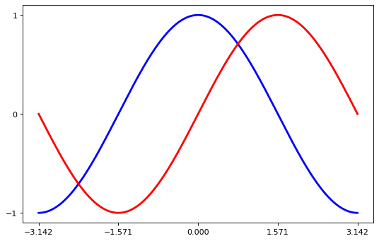
Setting the Tick Labels#
Ticks are now properly placed, but their label is not very explicit. We could guess that 3.142 is π, but it would be better to make it explicit. When we set tick values, we can also provide a corresponding label in the second argument list.
Note that we’ll use latex to allow for a nice rendering of the label.
import numpy as np
import matplotlib.pyplot as plt

plt.figure(figsize=(8, 5), dpi=80)
plt.subplot(111)

X = np.linspace(-np.pi, np.pi, 256, endpoint=True)
C, S = np.cos(X), np.sin(X)

plt.plot(X, C, color="blue", linewidth=2.5, linestyle="-")
plt.plot(X, S, color="red", linewidth=2.5, linestyle="-")

plt.xlim(X.min() * 1.1, X.max() * 1.1)
plt.xticks(
    [-np.pi, -np.pi / 2, 0, np.pi / 2, np.pi],
    [r"$-\pi$", r"$-\pi/2$", r"$0$", r"$+\pi/2$", r"$+\pi$"],
)

plt.ylim(C.min() * 1.1, C.max() * 1.1)
plt.yticks([-1, 0, +1], [r"$-1$", r"$0$", r"$+1$"])

plt.show()

Moving Splines#
Spines are the lines connecting the axis tick marks and noting the boundaries of the data area.
They can be placed at arbitrary positions until now, they were on the border of the axis.
We’ll change that since we want to have them in the middle.
Since there are four of them (top/bottom/left/right), we’ll discard the top and right by setting their color to none
we’ll move the bottom and left ones to coordinate 0 in data space coordinates.
import numpy as np
import matplotlib.pyplot as plt

plt.figure(figsize=(8, 5), dpi=80)
ax = plt.subplot(111)

ax.spines["right"].set_color("none")
ax.spines["top"].set_color("none")
ax.xaxis.set_ticks_position("bottom")
ax.spines["bottom"].set_position(("data", 0))
ax.yaxis.set_ticks_position("left")
ax.spines["left"].set_position(("data", 0))

X = np.linspace(-np.pi, np.pi, 256, endpoint=True)
C, S = np.cos(X), np.sin(X)

plt.plot(X, C, color="blue", linewidth=2.5, linestyle="-")
plt.plot(X, S, color="red", linewidth=2.5, linestyle="-")


plt.xlim(X.min() * 1.1, X.max() * 1.1)
plt.xticks(
    [-np.pi, -np.pi / 2, 0, np.pi / 2, np.pi],
    [r"$-\pi$", r"$-\pi/2$", r"$0$", r"$+\pi/2$", r"$+\pi$"],
)

plt.ylim(C.min() * 1.1, C.max() * 1.1)
plt.yticks([-1, 0, +1], [r"$-1$", r"$0$", r"$+1$"])

plt.show()

Adding a Legend#
Let’s add a legend in the upper left corner. This only requires adding the keyword argument label (that will be used in the legend box) to the plot commands.
import numpy as np
import matplotlib.pyplot as plt

plt.figure(figsize=(8, 5), dpi=80)
ax = plt.subplot(111)
ax.spines["right"].set_color("none")
ax.spines["top"].set_color("none")
ax.xaxis.set_ticks_position("bottom")
ax.spines["bottom"].set_position(("data", 0))
ax.yaxis.set_ticks_position("left")
ax.spines["left"].set_position(("data", 0))

X = np.linspace(-np.pi, np.pi, 256, endpoint=True)
C, S = np.cos(X), np.sin(X)

plt.plot(X, C, color="blue", linewidth=2.5, linestyle="-", label="cosine")
plt.plot(X, S, color="red", linewidth=2.5, linestyle="-", label="sine")

plt.xlim(X.min() * 1.1, X.max() * 1.1)
plt.xticks(
    [-np.pi, -np.pi / 2, 0, np.pi / 2, np.pi],
    [r"$-\pi$", r"$-\pi/2$", r"$0$", r"$+\pi/2$", r"$+\pi$"],
)

plt.ylim(C.min() * 1.1, C.max() * 1.1)
plt.yticks([-1, +1], [r"$-1$", r"$+1$"])

plt.legend(loc="upper left", frameon=False)
# plt.savefig("../figures/exercice_8.png",dpi=72)
plt.show()

Annotations#
In matplotlib you can add annotations to points of interest automatically.
import numpy as np
import matplotlib.pyplot as plt

plt.figure(figsize=(8, 5), dpi=80)
ax = plt.subplot(111)
ax.spines["right"].set_color("none")
ax.spines["top"].set_color("none")
ax.xaxis.set_ticks_position("bottom")
ax.spines["bottom"].set_position(("data", 0))
ax.yaxis.set_ticks_position("left")
ax.spines["left"].set_position(("data", 0))

X = np.linspace(-np.pi, np.pi, 256, endpoint=True)
C, S = np.cos(X), np.sin(X)

plt.plot(X, C, color="blue", linewidth=2.5, linestyle="-", label="cosine")
plt.plot(X, S, color="red", linewidth=2.5, linestyle="-", label="sine")

plt.xlim(X.min() * 1.1, X.max() * 1.1)
plt.xticks(
    [-np.pi, -np.pi / 2, 0, np.pi / 2, np.pi],
    [r"$-\pi$", r"$-\pi/2$", r"$0$", r"$+\pi/2$", r"$+\pi$"],
)

plt.ylim(C.min() * 1.1, C.max() * 1.1)
plt.yticks([-1, +1], [r"$-1$", r"$+1$"])

t = 2 * np.pi / 3
plt.plot([t, t], [0, np.cos(t)], color="blue", linewidth=1.5, linestyle="--")
plt.scatter(
    [
        t,
    ],
    [
        np.cos(t),
    ],
    50,
    color="blue",
)
plt.annotate(
    r"$\cos(\frac{2\pi}{3})=-\frac{1}{2}$",
    xy=(t, np.cos(t)),
    xycoords="data",
    xytext=(-90, -50),
    textcoords="offset points",
    fontsize=16,
    arrowprops=dict(arrowstyle="->", connectionstyle="arc3,rad=.2"),
)

plt.plot([t, t], [0, np.sin(t)], color="red", linewidth=1.5, linestyle="--")
plt.scatter(
    [
        t,
    ],
    [
        np.sin(t),
    ],
    50,
    color="red",
)
plt.annotate(
    r"$\sin(\frac{2\pi}{3})=\frac{\sqrt{3}}{2}$",
    xy=(t, np.sin(t)),
    xycoords="data",
    xytext=(+10, +30),
    textcoords="offset points",
    fontsize=16,
    arrowprops=dict(arrowstyle="->", connectionstyle="arc3,rad=.2"),
)

plt.legend(loc="upper left", frameon=False)
# plt.savefig("../figures/exercice_9.png", dpi=72)
plt.show()

Figures, Subplots , Axes, Ticks#
So far, we have used the built-in figure formatting. Within matplotlib you have complete control over your figures.
Within the figure, you can have subplots
The subplots can be on a regular grid or placed randomly
When we call plot by default, we get the current graphical axis
gca()and the current graphical figuregcf()
Creating Beautiful Figures#
When creating publish-quality figures, the details are essential. In the previous plot:
The tick labels are not visible - we can make them bigger, so they are visible
The tick labels are small. It would be helpful if they were bigger
Figures#
A figure is a window in the GUI.
Figures are numbered starting from 1
Several parameters determine what a figure looks like:
Argument |
Default |
Description |
|---|---|---|
num |
1 |
number of figure |
figsize |
figure.figsize |
figure size in in inches (width, height) |
dpi |
figure.dpi |
resolution in dots per inch |
facecolor |
figure.facecolor |
color of the drawing background |
edgecolor |
figure.edgecolor |
color of edge around the drawing background |
frameon |
True |
draw figure frame or not |
The defaults can be specified in the resource file and will be used most of the time. Only the number of the figure is frequently changed.
As with other objects, you can set figure properties with the set_something methods.
Subplots#
With subplot, you can arrange plots in a regular grid. You need to specify the number of rows and columns and the number of the plot.
from pylab import *

subplot(2, 1, 1)
xticks([]), yticks([])
text(0.5, 0.5, "subplot(2,1,1)", ha="center", va="center", size=24, alpha=0.5)

subplot(2, 1, 2)
xticks([]), yticks([])
text(0.5, 0.5, "subplot(2,1,2)", ha="center", va="center", size=24, alpha=0.5)

# plt.savefig('../figures/subplot-horizontal.png', dpi=64)
show()

from pylab import *

subplot(1, 2, 1)
xticks([]), yticks([])
text(0.5, 0.5, "subplot(2,2,1)", ha="center", va="center", size=24, alpha=0.5)

subplot(1, 2, 2)
xticks([]), yticks([])
text(0.5, 0.5, "subplot(2,2,2)", ha="center", va="center", size=24, alpha=0.5)

# plt.savefig('../figures/subplot-vertical.png', dpi=64)
show()

from pylab import *

subplot(2, 2, 1)
xticks([]), yticks([])
text(0.5, 0.5, "subplot(2,2,1)", ha="center", va="center", size=20, alpha=0.5)

subplot(2, 2, 2)
xticks([]), yticks([])
text(0.5, 0.5, "subplot(2,2,2)", ha="center", va="center", size=20, alpha=0.5)

subplot(2, 2, 3)
xticks([]), yticks([])
text(0.5, 0.5, "subplot(2,2,3)", ha="center", va="center", size=20, alpha=0.5)

subplot(2, 2, 4)
xticks([]), yticks([])
text(0.5, 0.5, "subplot(2,2,4)", ha="center", va="center", size=20, alpha=0.5)

# savefig('../figures/subplot-grid.png', dpi=64)
show()

You can also use GridSpec, a more powerful tool for laying out plots
from pylab import *
import matplotlib.gridspec as gridspec

G = gridspec.GridSpec(3, 3)

axes_1 = subplot(G[0, :])
xticks([]), yticks([])
text(0.5, 0.5, "Axes 1", ha="center", va="center", size=24, alpha=0.5)

axes_2 = subplot(G[1, :-1])
xticks([]), yticks([])
text(0.5, 0.5, "Axes 2", ha="center", va="center", size=24, alpha=0.5)

axes_3 = subplot(G[1:, -1])
xticks([]), yticks([])
text(0.5, 0.5, "Axes 3", ha="center", va="center", size=24, alpha=0.5)

axes_4 = subplot(G[-1, 0])
xticks([]), yticks([])
text(0.5, 0.5, "Axes 4", ha="center", va="center", size=24, alpha=0.5)

axes_5 = subplot(G[-1, -2])
xticks([]), yticks([])
text(0.5, 0.5, "Axes 5", ha="center", va="center", size=24, alpha=0.5)

# plt.savefig('../figures/gridspec.png', dpi=64)
show()

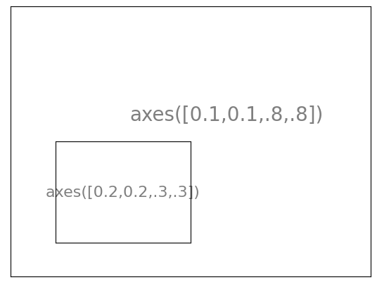
Axes#
Axes are very similar to subplots but allow the placement of plots at any location in the figure. So if we want to put a smaller plot inside a bigger one we do so with axes.
import matplotlib.pyplot as plt

plt.axes([0.1, 0.1, 0.8, 0.8])
plt.xticks([]), plt.yticks([])
plt.text(
    0.6, 0.6, "axes([0.1,0.1,.8,.8])", ha="center", va="center", size=20, alpha=0.5
)

plt.axes([0.2, 0.2, 0.3, 0.3])
plt.xticks([]), plt.yticks([])
plt.text(
    0.5, 0.5, "axes([0.2,0.2,.3,.3])", ha="center", va="center", size=16, alpha=0.5
)

# plt.savefig("../figures/axes.png",dpi=64)
plt.show()
import matplotlib.pyplot as plt

plt.axes([0.1, 0.1, 0.5, 0.5])
plt.xticks([]), plt.yticks([])
plt.text(0.1, 0.1, "axes([0.1,0.1,.5,.5])", ha="left", va="center", size=16, alpha=0.5)

plt.axes([0.2, 0.2, 0.5, 0.5])
plt.xticks([]), plt.yticks([])
plt.text(0.1, 0.1, "axes([0.2,0.2,.5,.5])", ha="left", va="center", size=16, alpha=0.5)

plt.axes([0.3, 0.3, 0.5, 0.5])
plt.xticks([]), plt.yticks([])
plt.text(0.1, 0.1, "axes([0.3,0.3,.5,.5])", ha="left", va="center", size=16, alpha=0.5)

plt.axes([0.4, 0.4, 0.5, 0.5])
plt.xticks([]), plt.yticks([])
plt.text(0.1, 0.1, "axes([0.4,0.4,.5,.5])", ha="left", va="center", size=16, alpha=0.5)

# plt.savefig("../figures/axes-2.png",dpi=64)
plt.show()

Ticks#
Well-formatted ticks are important for publish-ready figures.Matplotlib provides a configurable system for ticks.
Tick locators specify where ticks should appear
Tick formatters to give ticks the appearance you want.
Major and minor ticks can be located and formatted independently
By default, minor ticks are not shown
Tick Locators#
There are several locators for different kinds of requirements:
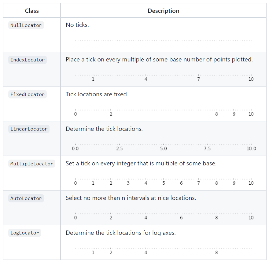
Dates are tricky to deal with. For this, you can use matplotlib.dates utility
Types of Graphs#
IFrame(src="https://www.data-to-viz.com/", width=1000, height=1200)
Making Plots in Python#
The most common library for making plots is Matplotlib
Violin Plots#
Like a box plot but provides a deeper understanding of data density
Good when you have large datasets
# This is a Pandas dataframe
# Pandas dataframes are like xls files for python
# They have their own structure and syntax
df = sns.load_dataset("iris")

# Change line width
sns.violinplot(x=df["species"], y=df["sepal_length"], linewidth=1)

# Change width
sns.violinplot(x=df["species"], y=df["sepal_length"], width=0.3)
<AxesSubplot:xlabel='species', ylabel='sepal_length'>

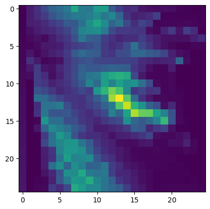
2D Density Plot#
Used to compare 2D quantitative information
Good for small data sets
When the density of data is high (shouldn’t use a scatter plot)
# Create data: 200 points
data = np.random.multivariate_normal([0, 0], [[1, 0.5], [0.5, 3]], 200)
x, y = data.T

# Create a figure with 6 plot areas
fig, axes = plt.subplots(ncols=6, nrows=1, figsize=(21, 5))

# Everything start with a Scatterplot
axes[0].set_title("Scatterplot")
axes[0].plot(x, y, "ko")
# As you can see there is a lot of overplotting here!

# Thus we can cut the plotting window in several hexbins
nbins = 20
axes[1].set_title("Hexbin")
axes[1].hexbin(x, y, gridsize=nbins, cmap=plt.cm.viridis)

# 2D Histogram
axes[2].set_title("2D Histogram")
axes[2].hist2d(x, y, bins=nbins, cmap=plt.cm.viridis)

# Evaluate a gaussian kde on a regular grid of nbins x nbins over data extents
k = kde.gaussian_kde(data.T)
xi, yi = np.mgrid[x.min() : x.max() : nbins * 1j, y.min() : y.max() : nbins * 1j]
zi = k(np.vstack([xi.flatten(), yi.flatten()]))

# plot a density
axes[3].set_title("Calculate Gaussian KDE")
axes[3].pcolormesh(xi, yi, zi.reshape(xi.shape), cmap=plt.cm.viridis)

# add shading
axes[4].set_title("2D Density with shading")
axes[4].pcolormesh(xi, yi, zi.reshape(xi.shape), shading="gouraud", cmap=plt.cm.viridis)

# contour
axes[5].set_title("Contour")
axes[5].pcolormesh(xi, yi, zi.reshape(xi.shape), shading="gouraud", cmap=plt.cm.viridis)
axes[5].contour(xi, yi, zi.reshape(xi.shape))

for ax_ in axes:
    ax_.set_box_aspect(1)


plt.tight_layout()
C:\Users\jca92\AppData\Local\Temp\ipykernel_19104\1176235122.py:23: DeprecationWarning: Please use `gaussian_kde` from the `scipy.stats` namespace, the `scipy.stats.kde` namespace is deprecated.
  k = kde.gaussian_kde(data.T)

Correlogram#
A correlogram or correlation matrix allows to analyze the relationship between each pair of numerical variables of a matrix.
df = sns.load_dataset("iris")

# with regression
sns.pairplot(df, kind="reg")
plt.show()

# without regression
sns.pairplot(df, kind="scatter")
plt.show()


Dendrogram#
A dendrogram or tree diagram allows to illustrate the hierarchical organization of several entities.
# Libraries
import seaborn as sns
import pandas as pd
from matplotlib import pyplot as plt

# Data set
df = pd.read_csv(".\data\mtcars.csv")
df = df.set_index("model")

# Change color palette
sns.clustermap(df, metric="euclidean", standard_scale=1, method="ward", cmap="viridis")
<seaborn.matrix.ClusterGrid at 0x1edc1683880>

Graph Structures#
Show interconnections between a set of entities.
Each entity is represented by a Node (or vertices).
The connection between nodes is represented through links (or edges).
Directed or undirected, weighted or unweighted.
z = [5, 3, 3, 3, 3, 2, 2, 2, 1, 1, 1]
print(nx.is_graphical(z))

print("Configuration model")
G = nx.configuration_model(z)  # configuration model
degree_sequence = [d for n, d in G.degree()]  # degree sequence
print("Degree sequence %s" % degree_sequence)
print("Degree histogram")
hist = {}
for d in degree_sequence:
    if d in hist:
        hist[d] += 1
    else:
        hist[d] = 1
print("degree #nodes")
for d in hist:
    print("%d %d" % (d, hist[d]))

nx.draw(G)
plt.show()
True
Configuration model
Degree sequence [5, 3, 3, 3, 3, 2, 2, 2, 1, 1, 1]
Degree histogram
degree #nodes
5 1
3 4
2 3
1 3

Guiding Principals#
Cutting the Y-axis/suppressing the zero#
Bad when using a bar chart or physical quantity based at zero
Good when the reference point and all of the values are greater than zero
Pie Charts#
Never use them … people are not good at determining angles

A bar chart or a line chart is much more informative

Overplotting#
Make sure the density of datapoints is visible!


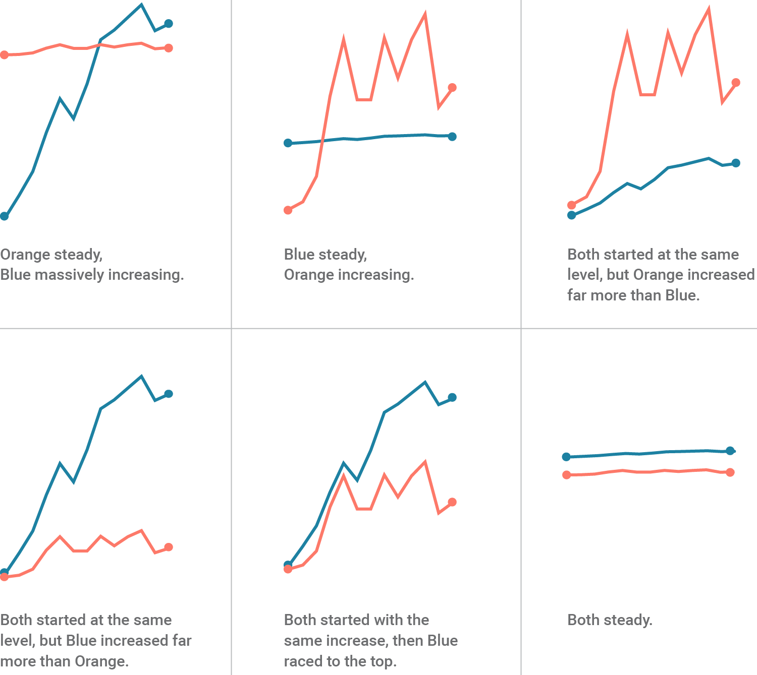
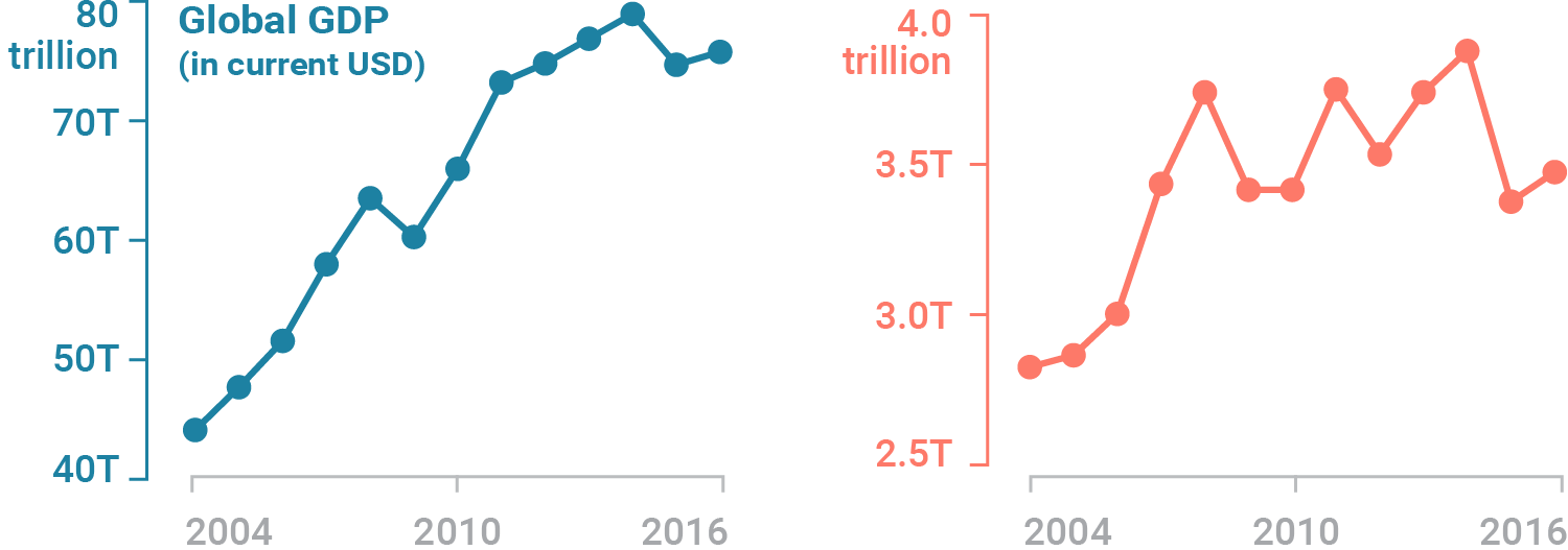
Plots with multiple lines#
Generally it is hard to extract information from these graphs
Can be used if only one piece of information is most important
Can be used if the scales are similar


3D graphics#
While 3D might look cool … it is nearly impossible to extract information
Don’t: 3D bar charts#
Information is hidden in 3D space

Don’t: Fixed 3D scatter plots#
You cannot see the data

Maybe if the graph is interactive#
iris = px.data.iris()
fig = px.scatter_3d(
    iris,
    x="sepal_length",
    y="sepal_width",
    z="petal_width",
    color="petal_length",
    symbol="species",
)
fig.show()
Don’t: Add dimensions to the data when they do not exist#
# Read data from a csv
z_data = pd.read_csv(
    "https://raw.githubusercontent.com/plotly/datasets/master/api_docs/mt_bruno_elevation.csv"
)

fig = go.Figure(data=[go.Surface(z=z_data.values)])

fig.update_layout(
    title="Mt Bruno Elevation",
    autosize=False,
    width=500,
    height=500,
    margin=dict(l=65, r=50, b=65, t=90),
)

fig.show()
Much more physical information can be visualized with just a 2d map.
plt.imshow(z_data.values)
<matplotlib.image.AxesImage at 0x1edbffd9780>
Use 3D it when absolutely necessary#
WTF Graphs#
IFrame(src="https://viz.wtf/", width=1000, height=1000)
Animations#
The easiest way to make an animation in matplotlib is to declare a FuncAnimation object that specifies to matplotlib what the figure is to update, what is the update function and what the delay is between frames.
Animation Example: Drip Drop#
A very simple rain effect can be obtained by having small growing rings randomly positioned over a figure.
Of course, they won’t grow forever since the wave is supposed to dampen with time.
To simulate that, we can use a more and more transparent color as the ring grows, up to the point where it is no more visible. At this point, we remove the ring and create a new one.
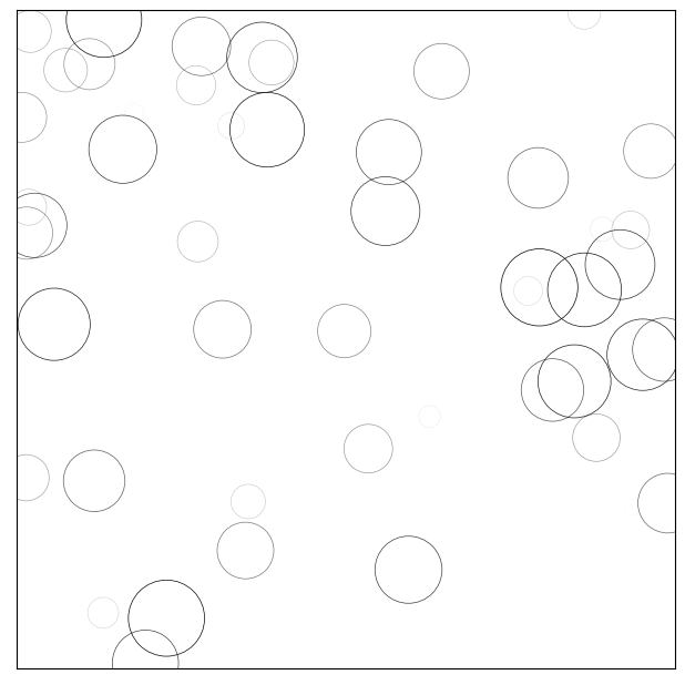
1. Create a Blank Figure#
# New figure with white background
fig = plt.figure(figsize=(6, 6), facecolor="white")

# New axis over the whole figure, no frame and a 1:1 aspect ratio
ax = fig.add_axes([0, 0, 1, 1], frameon=False, aspect=1)
2. Plotting data#
We want to create several rings using a scatter plot
We want to set the initial size of the ring between some range
We want to make sure as the rings get larger, they get lighter.
The transparency of an object is controlled with the alpha setting
import numpy as np
import matplotlib.pyplot as plt

# New figure with white background
fig = plt.figure(figsize=(6, 6), facecolor="white")

# New axis over the whole figure and a 1:1 aspect ratio
ax = fig.add_axes([0.005, 0.005, 0.99, 0.99], frameon=True, aspect=1)

# Number of ring
n = 50
size_min = 50
size_max = 50 * 50

# Ring position
P = np.random.uniform(0, 1, (n, 2))

# Ring colors
C = np.ones((n, 4)) * (0, 0, 0, 1)

# Alpha color channel goes from 0 (transparent) to 1 (opaque)
C[:, 3] = np.linspace(0, 1, n)

# Ring sizes
S = np.linspace(size_min, size_max, n)

# Scatter plot
scat = ax.scatter(P[:, 0], P[:, 1], s=S, lw=0.5, edgecolors=C, facecolors="None")

# Ensure limits are [0,1] and remove ticks
ax.set_xlim(0, 1), ax.set_xticks([])
ax.set_ylim(0, 1), ax.set_yticks([])

# plt.savefig("../figures/rain-static.png",dpi=72)
plt.show()
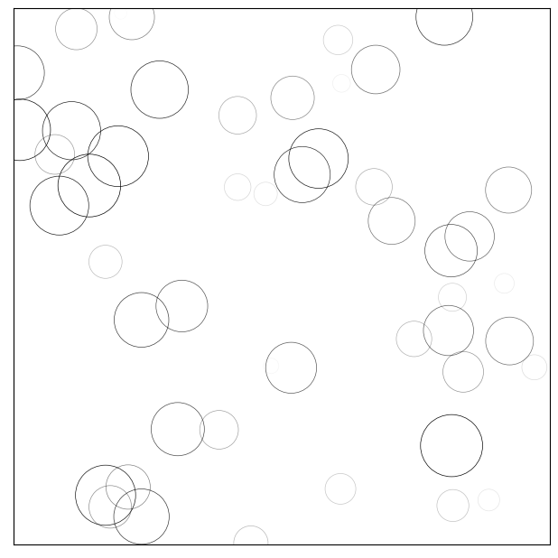
3. The Update Function#
Now, we need to write the update function for our animation.
At each time step, each ring should grow and become more transparent.
The largest ring should be totally transparent and thus removed.
We won’t actually remove the largest ring but re-use it to set a new ring at a new random position with nominal size and color. This will keep the number of rings constant
import numpy as np
import matplotlib
import matplotlib.pyplot as plt
from matplotlib.animation import FuncAnimation

# No toolbar
matplotlib.rcParams["toolbar"] = "None"

# New figure with white background
fig = plt.figure(figsize=(6, 6), facecolor="white")

# New axis over the whole figureand a 1:1 aspect ratio
# ax = fig.add_axes([0,0,1,1], frameon=False, aspect=1)
ax = fig.add_axes([0.005, 0.005, 0.990, 0.990], frameon=True, aspect=1)

# Number of ring
n = 50
size_min = 50
size_max = 50 * 50

# Ring position
P = np.random.uniform(0, 1, (n, 2))

# Ring colors
C = np.ones((n, 4)) * (0, 0, 0, 1)

# Alpha color channel goes from 0 (transparent) to 1 (opaque)
C[:, 3] = np.linspace(0, 1, n)

# Ring sizes
S = np.linspace(size_min, size_max, n)

# Scatter plot
scat = ax.scatter(P[:, 0], P[:, 1], s=S, lw=0.5, edgecolors=C, facecolors="None")

# Ensure limits are [0,1] and remove ticks
ax.set_xlim(0, 1), ax.set_xticks([])
ax.set_ylim(0, 1), ax.set_yticks([])


def update(frame):
    global P, C, S

    # Every ring is made more transparent
    C[:, 3] = np.maximum(0, C[:, 3] - 1.0 / n)

    # Each ring is made larger
    S += (size_max - size_min) / n

    # Reset ring specific ring (relative to frame number)
    i = frame % 50
    P[i] = np.random.uniform(0, 1, 2)
    S[i] = size_min
    C[i, 3] = 1

    # Update scatter object
    scat.set_edgecolors(C)
    scat.set_sizes(S)
    scat.set_offsets(P)
    return (scat,)


animation = FuncAnimation(fig, update, interval=10)
# animation.save('../figures/rain.gif', writer='imagemagick', fps=30, dpi=72)
plt.show()
4. Saving the Movie#
animation = FuncAnimation(fig, update, interval=10, blit=True, frames=200)
# animation.save('rain.gif', writer='imagemagick', fps=30, dpi=40)
plt.show()
5. Rendering the movie in a notebook#
from IPython.display import HTML

HTML(animation.to_html5_video())