
📝 Choices for Figures
Contents
📝 Choices for Figures#
Many choices are necessary when visualizing data. Here, we’ll discuss the type of visualization and the color scale representing a dimension of the data.
Types of Graphs#
Data to Viz provides a helpful decision tree for selecting the appropriate visualization.
Then, examples of each kind of plot are provided along with tips on how to use them appropriately.
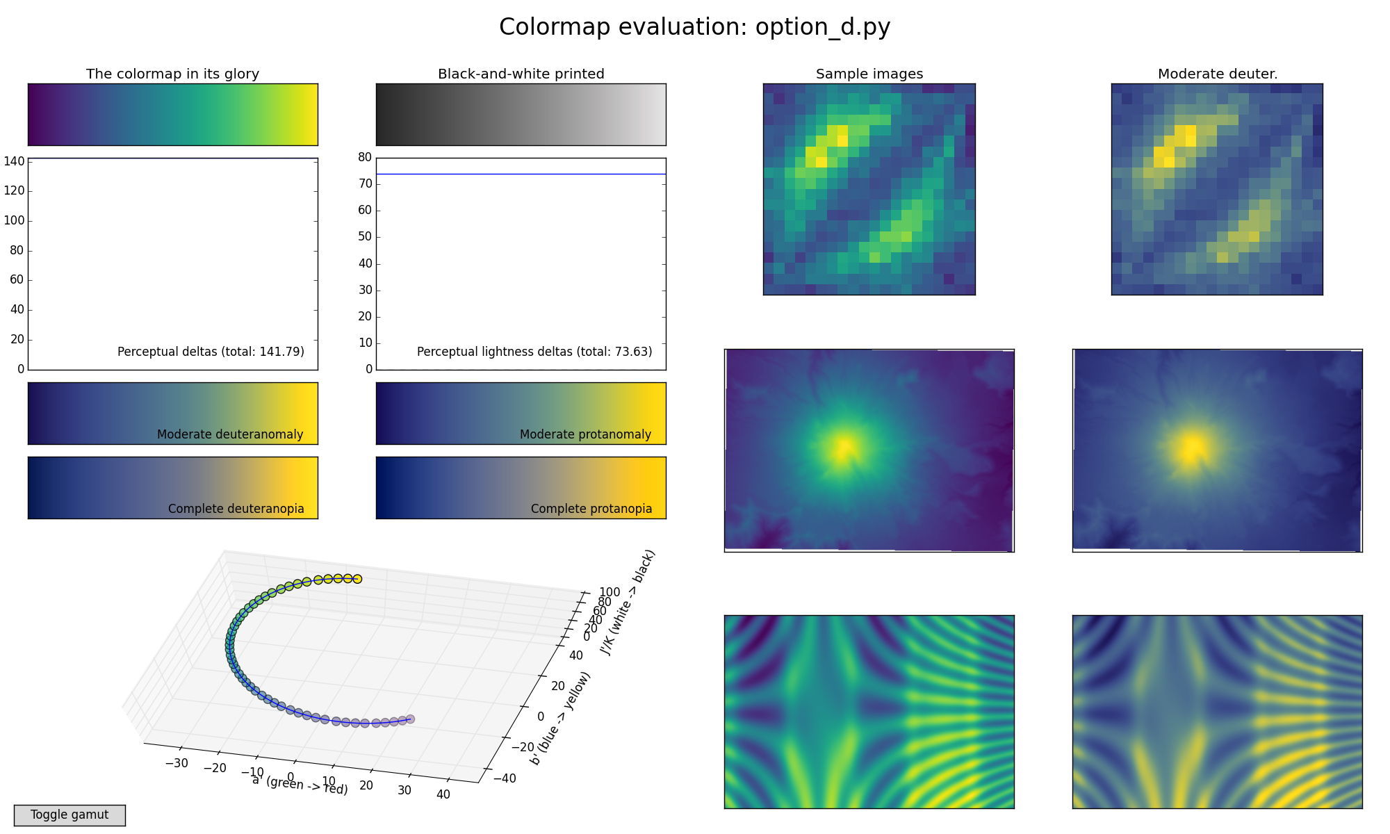
Choosing Colors for your Figures#
Why do colormaps matter?#
Your interpretation of the colormap represents a dimension of the data.
Use of an inappropriate colormap is like having a non-linear y-axis!

Perceptually uniform colormaps [Viridis]#
Python has packages, such as
palettablefor finding excellent color maps for color scales.Colorbrewer has an interactive interface for choosing the appropriate color map, which can then be imported using the
colorbrewermodule inpalettable. It provides guidance with colorblindness and gray scale printing in mind.If the data are all positive or negative on a number line (e.g., linear, log), a sequential color map is appropriate.
If the data range from negative to positive on a number line (e.g., linear, log), a diverging color map is appropriate.
If the data are qualitative, only then is a color scheme with unrelated colors adjacent to one another appropriate.