
📝Week 10 - Lab Intro
Contents
📝Week 10 - Lab Intro#
In this lab introduction we will review and discuss some functions for plotting using the matplotlib package. We will also briefly introduce the idea of fitting a function to some observed data.
Plotting#
matplotlib.pyplot#
The most common tool for plotting in Python is pyplot, from the matplotlib package. By convention, it is usually imported and assigned the nickname plt.
import matplotlib.pyplot as plt
The plot function#
If you provide plot with a single list (or numpy array) of values these will be taken as y values.
For x-values, plot will automatically use the indices of the list.
vals = [0, 1, 4, 9, 16, 25, 36]

plt.plot(vals)
plt.show() # plt.show() lets us see the plot

We can provide our own x and y values by plotting two lists to the plot function.
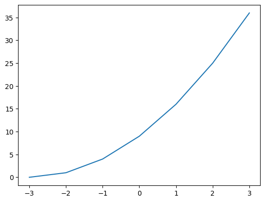
x_vals = [-3, -2, -1, 0, 1, 2, 3]
y_vals = [0, 1, 4, 9, 16, 25, 36]

plt.plot(x_vals, y_vals)
plt.show()
The plot function by default connects adjacent points with a line segment. We can plot continuous functions of x, as long as we have enough points to make the plot look smooth.
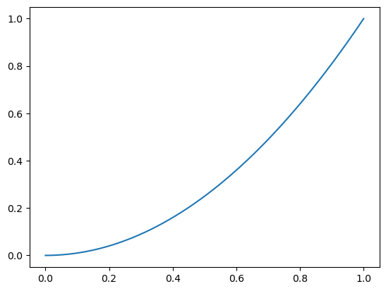
Example: plotting a smooth parabola#
import numpy as np

# start, stop, step
x_vals = np.arange(0,1,0.0001)
y_vals = x_vals ** 2

plt.plot(x_vals, y_vals)
plt.show()
The plot function is not ideal in all scenarios.
Consider this example where we want to plot students’ hours of study against their GPA.
hrs_study = [9,   10,  0,   0,   8,   6,   5,   4,   2,   4,   1]
gpa =       [4.0, 4.0, 3.9, 2.6, 3.7, 3.4, 3.7, 3.5, 3.3, 3.3, 3.0]

plt.plot(hrs_study, gpa)
plt.show()
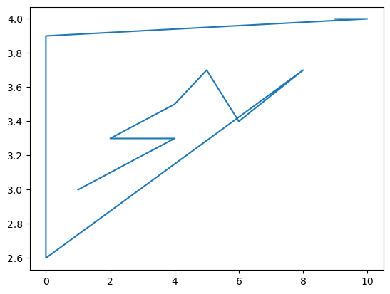
In this case, it makes much more sense to use a scatter plot.
The scatter function#
Scatter plots are good for determining what relationship (if any) exists between the variables of your data. You should choose a scatter plot when it’s possible the same x value is paired with more than one y value.
hrs_study = [9,   10,  0,   0,   8,   6,   5,   4,   2,   4,   1]
gpa =       [4.0, 4.0, 3.9, 2.6, 3.7, 3.4, 3.7, 3.5, 3.3, 3.3, 3.0]

plt.scatter(hrs_study, gpa)
plt.show()
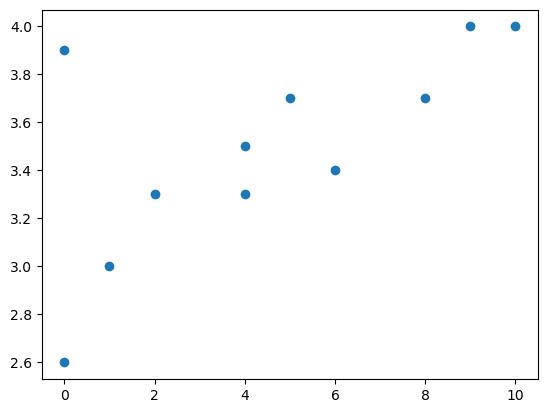
From this scatter plot we can more easily see that some correlation may exist between our variables.
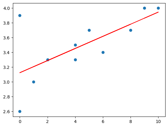
Combining scatter + plot functions for line of best fit.#
The two types of plots we’ve seen can be combined into a single plot.
The code below uses a numpy function called polyfit with a degree of 1 to estimate the parameters for a line that best fits the data. We plot the line using the plot function overtop of of the data which is plotted with scatter.
hrs_study = [9,   10,  0,   0,   8,   6,   5,   4,   2,   4,   1]
gpa =       [4.0, 4.0, 3.9, 2.6, 3.7, 3.4, 3.7, 3.5, 3.3, 3.3, 3.0]

plt.scatter(hrs_study, gpa)

# this estimates parameters for a line (y = mx + b)
m, b = np.polyfit(hrs_study, gpa, 1)

# compute estimated y values by plugging x values into the line equation
x = np.array(hrs_study)
y = m * x + b

# plot x and y with the color red
plt.plot(x, y, color="r")

plt.show()
Today’s lab will expound on this idea by implementing a class that will allow you fit data to any type of functions, not just lines or other polynomials.
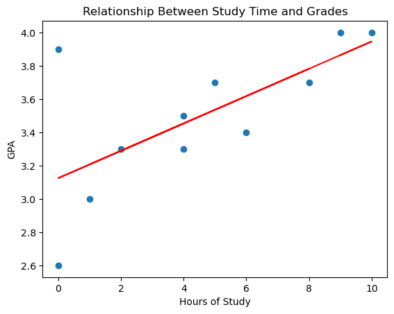
Adding labels and titles#
It’s important to add labels and titles to all plots in order to make it clear what information is being presented.
hrs_study = [9,   10,  0,   0,   8,   6,   5,   4,   2,   4,   1]
gpa =       [4.0, 4.0, 3.9, 2.6, 3.7, 3.4, 3.7, 3.5, 3.3, 3.3, 3.0]

plt.scatter(hrs_study, gpa)

m, b = np.polyfit(hrs_study, gpa, 1)

x = np.array(hrs_study)
y = m * x + b

plt.plot(x, y, color="r")

plt.xlabel('Hours of Study')
plt.ylabel('GPA')
plt.title('Relationship Between Study Time and Grades')

plt.show()
The matplotlib documentation#
There are many other types of plots that you will find useful including histograms, stem plots, bar charts, pie charts, and box plots, as well as 3D versions of many of these.
The matplotlib documentation is an extremely useful resource that includes examples for getting started with any of these types of plots.