📝 Introduction to Data Visualization 📈#
Visualizing quantitative data is one of the best applications for Python after you leave this class.
Matplotlib is the recommended Python package for 2-dimensional graphics.
Data visualization#
Display information graphically using elements such as coordinate systems, numbers, lines, symbols, words, shading, and color.
Graphics are instruments for reasoning about quantitative information.
Valuable graphics allow large collections of data to be turned into actionable information.
For engineers, making easy-to-interpret, honest graphical representations of information is often the best way to communicate technical information.
Graphics can be more informative than statistics!
What characterizes a valuable graphic?#
Presents data accurately, clearly, and efficiently
Encourages the viewer to relate important pieces of information
Examples of data visualization#
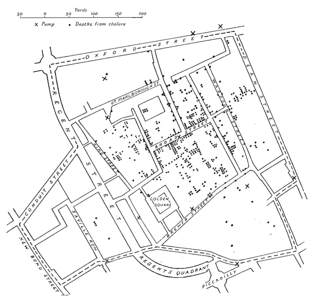
Famous dot map of deaths from Cholera in central London in September 1854 by Dr. John Snow
What could someone learn from reading this graphic?
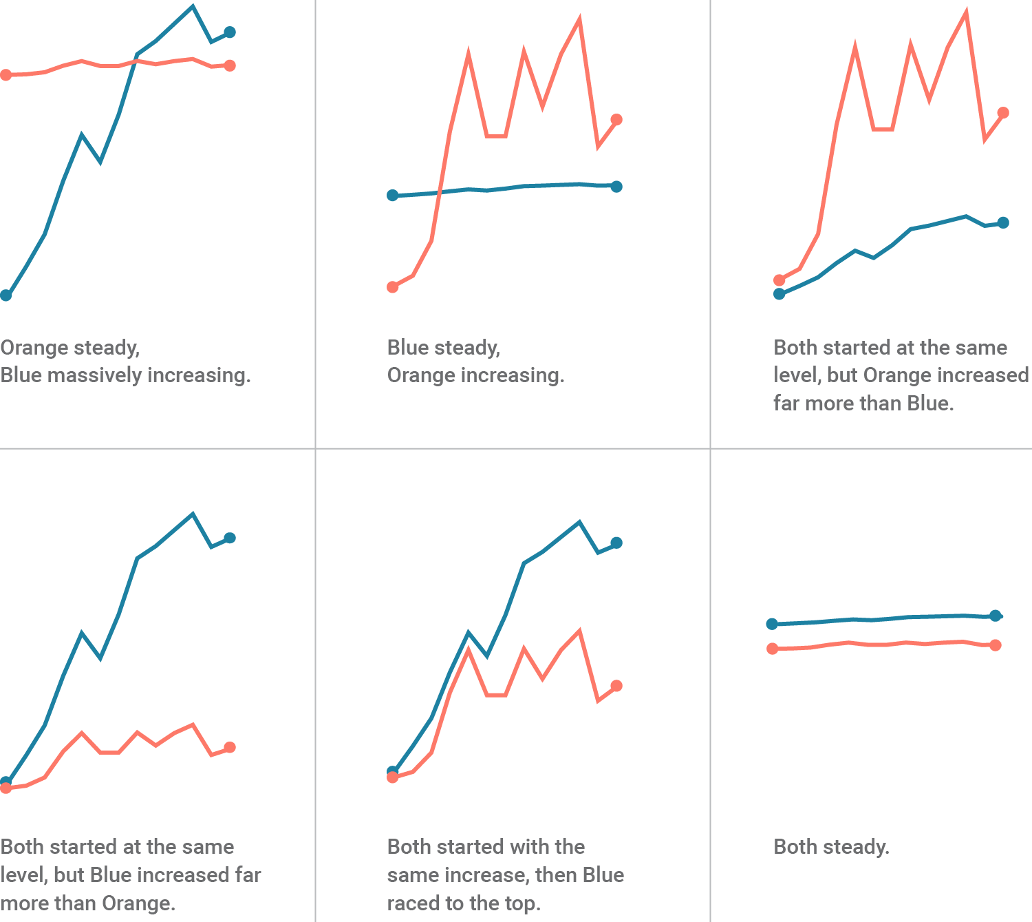
Including Various Dimensions#
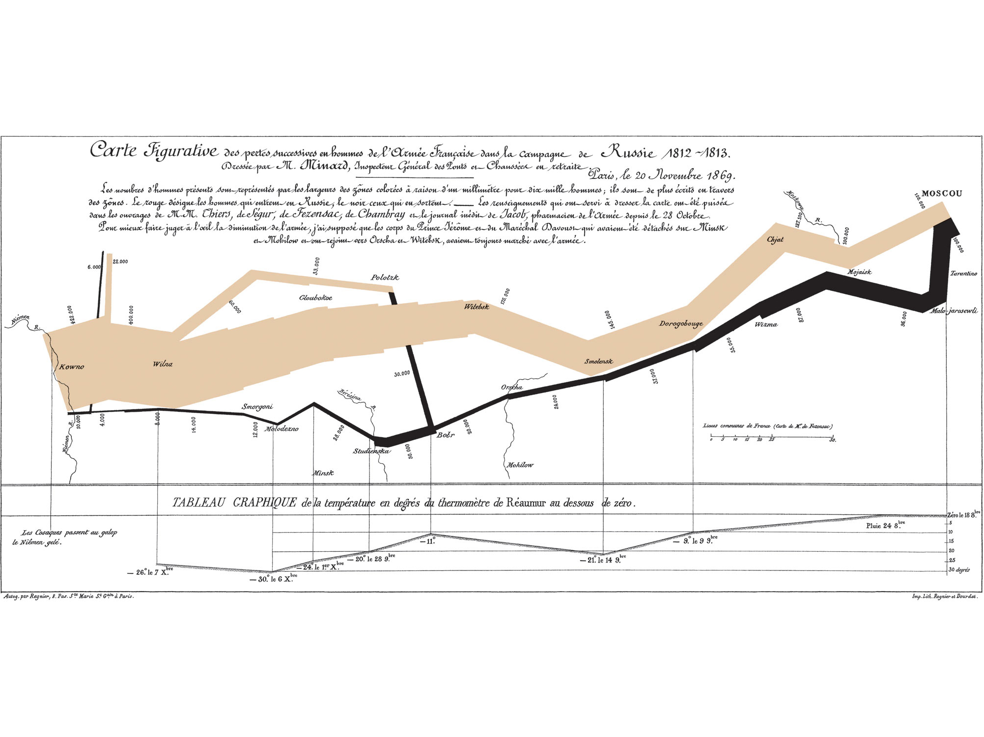
Most data have at least two dimensions, which are represented on an x-axis and y-axis.
Color, size, and marker type are common ways to represent additional kinds of data.

What additional dimensions are displayed by the following graphic?
Principles of Graphical Excellence#
Presentation of data needs to consider substance, statistics, and design
Complex ideas should be communicated with clarity, precision, and efficiency
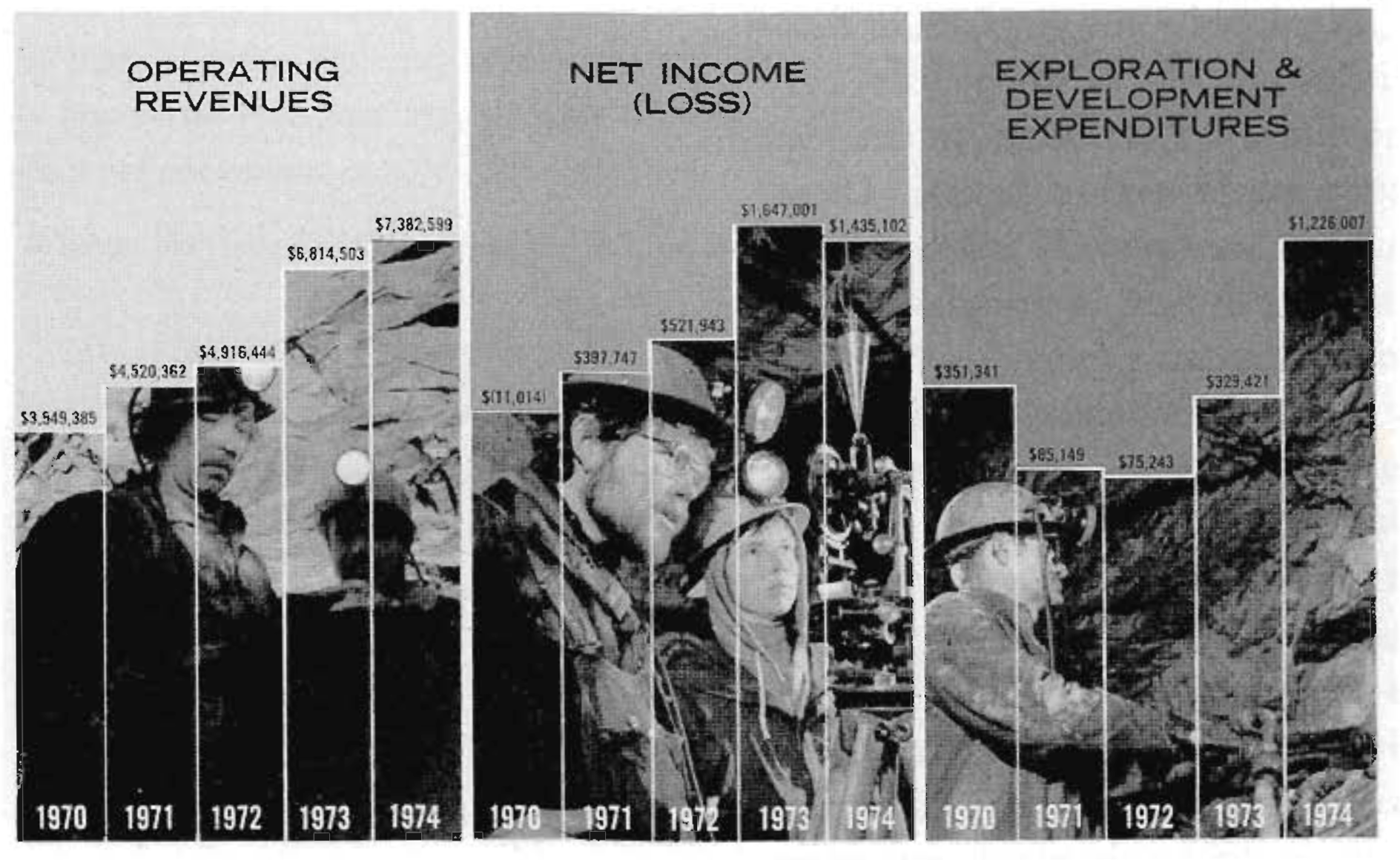
Graphics should not deceive the audience, intentionally or unintentionally.
What is wrong with this figure?#
Guiding Principles of visualization#
Appropriate visualization for the data#
Avoid pie charts if possible since people are generally not good at determining angles or extrapolating to area.

A bar chart or a line chart can be much more informative

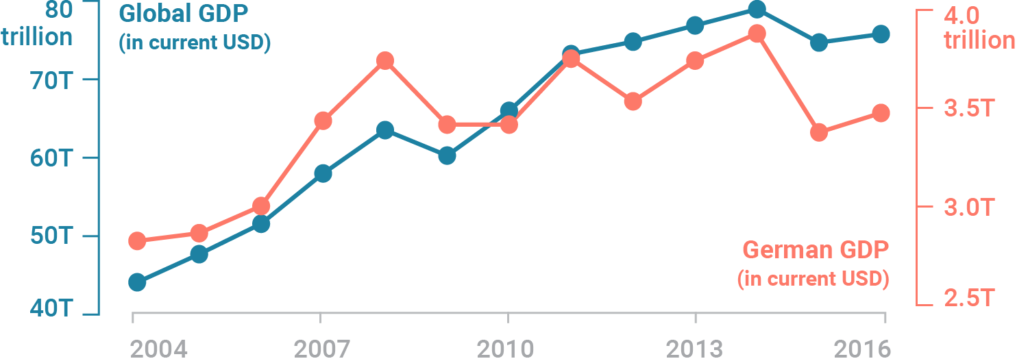
Plots with multiple y-axes#
Multiple y-axes are useful when it’s important to show the interrelationship of two variables with different absolute values.
Be intentional and careful when choosing this strategy.
Make the y-value zero at the origin#
Most figures displaying physical quantities are best represented with a value of zero at the origin.
If all plotted values are far greater than zero, it may be a good idea to have a non-zero value at the origin.
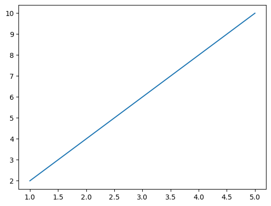
How to plot in Python#
Plotting is easy using matplotlib.
import matplotlib.pyplot as plt

# some example data
x = [1, 2, 3, 4, 5]
y = [2, 4, 6, 8, 10]

# try to plot the data
try:
    plt.plot(x, y)
    plt.show()
except:
    print("Something went wrong with the plot!")
You might have noticed we used try and except this is called exception handling.
If a code in a try statement encounters an error it continues with the except statement.
This is helpful in making code where it is not easy to define a branching statement for all cases.
This is also the basis of error handeling, which makes your code fail gracefully.
import matplotlib.pyplot as plt

# some example data
x = [1, 2, 3, 4, plt]
y = [2, 4, 6, 8, 10]

# try to plot the data
try:
    plt.plot(x, y)
except:
    print("Something went wrong with the plot!")
Something went wrong with the plot!