
📖 📊 Data Visualization with Seaborn: The Engineer’s Guide 🚀⚙️#
🧠 Why Should You Care About Data Visualization?#
Imagine you’re an engineer, sitting in your lab surrounded by piles of data, numbers, and measurements. But wait… how do you know if that test result or sensor reading is any good? You can analyze all day, but nothing beats visualizing that data like a boss. 🎨💻
That’s where Seaborn comes in—just like a turbo boost for your analysis. No more boring spreadsheets, we’re talking flashy, cool visuals that will make your engineering colleagues say, “I want to see those plots again!” 😎
🏗️ Let’s Build the Blueprint: Classes & Plots!#
What Is Seaborn?#
Seaborn is like the Ferrari of Python’s data visualization libraries—super fast, super sleek, and always ready to show off. It builds on Matplotlib, but with much less code and way more style. Let’s get rolling! 🏎️
🎨 1️⃣ Line Plots: Keep Calm and Track Your Data 📡#
When you’re tracking sensor data over time, you need a smooth, continuous plot. No one wants to stare at raw numbers on a sheet—let’s line it up, baby!
Example: Temperature Data Over Time#
import numpy as np
import pandas as pd
import matplotlib.pyplot as plt
import seaborn as sns

# Simulating sensor data over 24 hours
time = np.linspace(0, 24, 100)  # 24-hour time window
temperature = 25 + 2 * np.sin(time / 3) + np.random.normal(scale=0.5, size=100)

# Making our cool DataFrame
df = pd.DataFrame({"Time (hrs)": time, "Temperature (°C)": temperature})

# Plot it like it’s hot
plt.figure(figsize=(8, 5))
sns.lineplot(x="Time (hrs)", y="Temperature (°C)", data=df, marker="o", linewidth=2)
plt.title("Temperature Fluctuations: We Have Data... And We’re Showing It Off!")
plt.xlabel("Time (hrs)")
plt.ylabel("Temperature (°C)")
plt.grid()
plt.show()
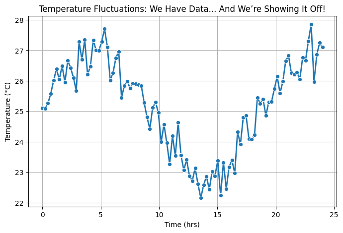
Chill Fact: The periodic fluctuations? That’s temperature dynamics—and you didn’t have to stare at a spreadsheet to realize it! 🎉
📉 2️⃣ Histograms & KDE: Making Sense of Material Strength 🏗️#
Ever wondered how strong your steel really is? A histogram (with a side of KDE, because why not?) tells you exactly that. Let’s show that tensile strength who’s boss. 💪
Example: Material Strength in Steel#
# Steel tensile strength, sampled with a nice bell curve
strength_data = np.random.normal(
    loc=400, scale=20, size=200
)  # 400 MPa average, 20 MPa std dev

# Create DataFrame
df = pd.DataFrame({"Tensile Strength (MPa)": strength_data})

# Plotting that beautiful distribution
plt.figure(figsize=(8, 5))
sns.histplot(df, x="Tensile Strength (MPa)", kde=True, bins=20, color="steelblue")
plt.title("Steel's Strength: How Strong is That Steel Anyway?")
plt.xlabel("Tensile Strength (MPa)")
plt.ylabel("Frequency")
plt.grid()
plt.show()
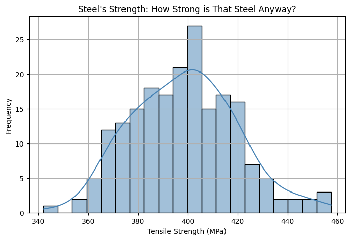
Hot Tip: If it looks like a normal distribution, you’re good to go. Otherwise, time to call in the engineers for some material testing adjustments! 🛠️
📦 3️⃣ Boxplots: Tuning Sensor Data for a Smooth Ride 🏁#
We engineers love data consistency, right? Boxplots help us spot those naughty outliers in sensor readings. Let’s see if your pressure sensors are on their best behavior! 🚨
Example: Comparing Sensors on Machines#
# Simulating pressure data for three different machines
np.random.seed(42)
machines = ["Machine A", "Machine B", "Machine C"]
pressure_data = {
    "Machine": np.repeat(machines, 50),
    "Pressure (Pa)": np.concatenate(
        [
            np.random.normal(100, 5, 50),
            np.random.normal(102, 4, 50),
            np.random.normal(98, 6, 50),
        ]
    ),
}

df = pd.DataFrame(pressure_data)

# Boxplot time, let's see which sensor needs a slap!
plt.figure(figsize=(8, 5))
sns.boxplot(x="Machine", y="Pressure (Pa)", data=df, palette="coolwarm")
plt.title("Pressure Readings: Spotting the Rebels in the Machine Squad")
plt.xlabel("Machine")
plt.ylabel("Pressure (Pa)")
plt.grid()
plt.show()
/tmp/ipykernel_1900921/1968305349.py:19: FutureWarning:

Passing `palette` without assigning `hue` is deprecated and will be removed in v0.14.0. Assign the `x` variable to `hue` and set `legend=False` for the same effect.

  sns.boxplot(x="Machine", y="Pressure (Pa)", data=df, palette="coolwarm")
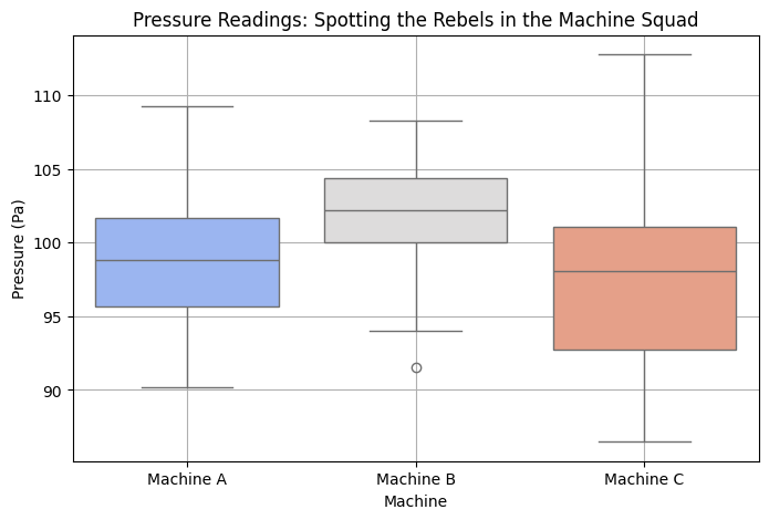
Tidy Tip: Outliers? A slap on the wrist (or maybe a recalibration). Keep an eye out for those rogue sensors! 👀
## 🌍 4️⃣ Scatter Plots: Finding Relationships Between Forces 🔍#
When you’re testing a beam under load, scatter plots help visualize the relationship. Is it a perfect linear relationship, or is your material being a diva and behaving erratically? 🧐
Example: Load vs. Deflection (Beam Testing)#
# Simulating a simple load vs. deflection data (engineering style!)
load = np.linspace(0, 1000, 100)  # Load in Newtons
deflection = 0.01 * load + np.random.normal(scale=5, size=100)  # Linear with some noise

df = pd.DataFrame({"Load (N)": load, "Deflection (mm)": deflection})

# Scatter plot to reveal the **force of deflection**! ⚡
plt.figure(figsize=(8, 5))
sns.scatterplot(
    x="Load (N)", y="Deflection (mm)", data=df, color="darkorange", alpha=0.7
)
plt.title("Load vs. Deflection: Testing the Limits of Your Beam")
plt.xlabel("Load (N)")
plt.ylabel("Deflection (mm)")
plt.grid()
plt.show()
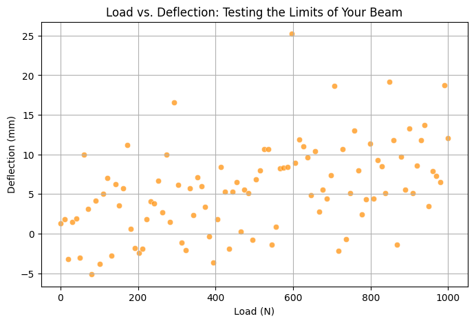
Pro Tip: If the plot looks straight—your material is behaving! If not, maybe it’s time to rethink the design. 🔨
## 🧠 5️⃣ Pair Plots: Analyzing Multiple Variables in One Go 🎯#
Why settle for just one relationship when you can see them all at once? Pair plots let you check out multiple material properties in a single glance. Perfect for when you’re making the ultimate engineering material decision. 🧳
Example: Mechanical Properties of Alloys#
# Simulating mechanical properties of alloys (Hardness, Tensile Strength, Yield Strength)
df = pd.DataFrame(
    {
        "Hardness": np.random.normal(200, 30, 100),
        "Tensile Strength": np.random.normal(400, 50, 100),
        "Yield Strength": np.random.normal(250, 40, 100),
    }
)

# Pair plot – all the properties, one view
sns.pairplot(df, diag_kind="kde", markers="o", plot_kws={"alpha": 0.7})
plt.show()
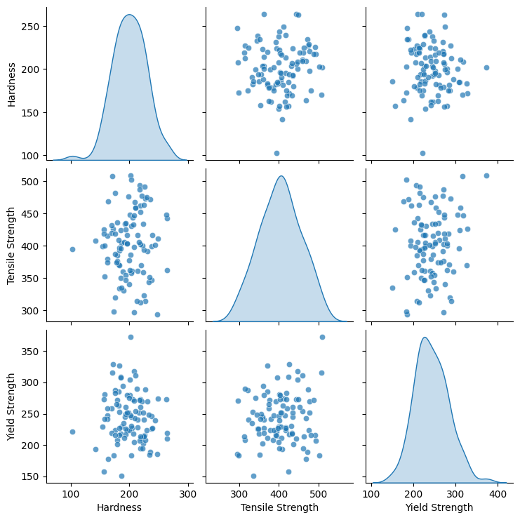
Key Insight: Want to know if Hardness correlates with Tensile Strength? This plot tells you all! 🔍
You just make a publication ready plot with a single line of code. That is pretty awesome – your boss will love you, and think you worked a lot harder than you did.
🔍 6️⃣ Violin Plots: Visualizing Circuit Performance Variability 🎛️#
👀 Use Case: You’re testing the output voltage of multiple circuits, and you want to see the distribution and spread of values.
Example: Voltage Output Across Multiple Circuit Boards#
# Simulated voltage output data for different circuits
np.random.seed(42)
circuits = ["Circuit A", "Circuit B", "Circuit C"]
data = {
    "Circuit": np.repeat(circuits, 50),
    "Voltage Output (V)": np.concatenate(
        [
            np.random.normal(5.0, 0.1, 50),
            np.random.normal(5.1, 0.15, 50),
            np.random.normal(4.9, 0.12, 50),
        ]
    ),
}

df = pd.DataFrame(data)

# Violin Plot - shows distribution density & spread
plt.figure(figsize=(8, 5))
sns.violinplot(x="Circuit", y="Voltage Output (V)", data=df, palette="viridis")
plt.title("Voltage Output Variation Across Circuit Boards 🎛️")
plt.xlabel("Circuit Board")
plt.ylabel("Voltage Output (V)")
plt.grid()
plt.show()
/tmp/ipykernel_1900921/1336381596.py:19: FutureWarning:

Passing `palette` without assigning `hue` is deprecated and will be removed in v0.14.0. Assign the `x` variable to `hue` and set `legend=False` for the same effect.

  sns.violinplot(x="Circuit", y="Voltage Output (V)", data=df, palette="viridis")
/home/jca92/drexel_runner_engineering/actions-runner/_work/_tool/Python/3.11.11/x64/lib/python3.11/site-packages/IPython/core/pylabtools.py:170: UserWarning: Glyph 127899 (\N{CONTROL KNOBS}) missing from font(s) DejaVu Sans.
  fig.canvas.print_figure(bytes_io, **kw)
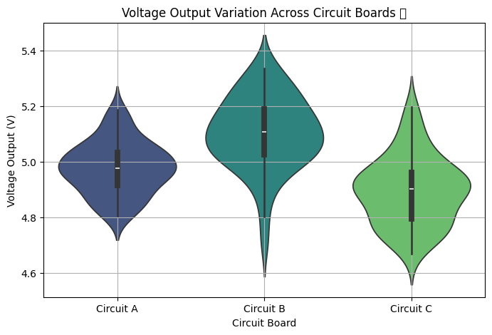
🔍 What This Reveals:#
✅ Circuit B has the highest spread, meaning it’s less stable. ✅ Circuit A is tightly packed, so it’s the most reliable choice. ✅ Circuit C dips below 4.9V too often—this could lead to underperformance.
🌊 7️⃣ Regression Plots: Modeling Fluid Dynamics & Flow Rate 💦#
👀 Use Case: You want to analyze the relationship between pipe diameter and fluid flow rate.
Example: Pipe Diameter vs. Flow Rate in a Hydraulics System#
# Simulated pipe diameter vs flow rate data
diameter = np.linspace(1, 10, 50)
flow_rate = 10 * diameter**1.8 + np.random.normal(
    scale=5, size=50
)  # Power-law relation

df = pd.DataFrame({"Pipe Diameter (cm)": diameter, "Flow Rate (L/s)": flow_rate})

# Regression Plot (Best-fit line)
plt.figure(figsize=(8, 5))
sns.regplot(
    x="Pipe Diameter (cm)",
    y="Flow Rate (L/s)",
    data=df,
    scatter_kws={"color": "blue"},
    line_kws={"color": "red"},
)
plt.title("Pipe Diameter vs. Flow Rate: Can We Predict Flow? 💦")
plt.xlabel("Pipe Diameter (cm)")
plt.ylabel("Flow Rate (L/s)")
plt.grid()
plt.show()
/home/jca92/drexel_runner_engineering/actions-runner/_work/_tool/Python/3.11.11/x64/lib/python3.11/site-packages/IPython/core/pylabtools.py:170: UserWarning: Glyph 128166 (\N{SPLASHING SWEAT SYMBOL}) missing from font(s) DejaVu Sans.
  fig.canvas.print_figure(bytes_io, **kw)
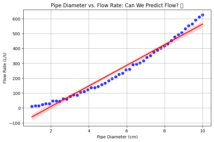
💡 What This Reveals:#
✅ Clear positive correlation—bigger pipes allow for more flow. ✅ Curve follows a power law (which makes sense for fluid dynamics). ✅ Outliers? If a pipe isn’t flowing as expected, check for blockages or turbulence!
📡 8️⃣ Joint Plots: Analyzing Noise vs. Signal Strength in Electronics 📶#
👀 Use Case: You’re designing a communication system and need to compare signal strength to noise levels.
Example: Noise Power vs. Signal Strength in RF Systems#
# Simulated noise vs. signal strength data
np.random.seed(42)
signal_strength = np.linspace(0, 100, 100)
noise_power = 10 + 0.1 * signal_strength + np.random.normal(scale=2, size=100)

df = pd.DataFrame(
    {"Signal Strength (dB)": signal_strength, "Noise Power (dB)": noise_power}
)

# Jointplot (Scatter + Histogram)
sns.jointplot(
    x="Signal Strength (dB)", y="Noise Power (dB)", data=df, kind="reg", height=6
)
plt.suptitle("Noise vs. Signal Strength: Is Our RF System Reliable? 📡", y=1.02)
plt.show()
/home/jca92/drexel_runner_engineering/actions-runner/_work/_tool/Python/3.11.11/x64/lib/python3.11/site-packages/IPython/core/pylabtools.py:170: UserWarning: Glyph 128225 (\N{SATELLITE ANTENNA}) missing from font(s) DejaVu Sans.
  fig.canvas.print_figure(bytes_io, **kw)
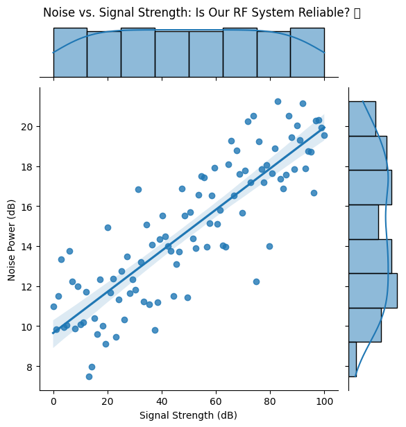
📡 What This Reveals:#
✅ Low signal strength = erratic noise behavior (expected in low-power signals). ✅ Higher signal strength = noise stabilizes—this is desired behavior. ✅ If noise spikes at high signals? Something’s wrong with the amplification stage!
🛠 9️⃣ Swarm Plots: Component Tolerances in Manufacturing 🏭#
👀 Use Case: In mass production, no two components are exactly the same. But are they within spec?
Example: Measuring Resistor Tolerances in PCB Assembly#
# Simulated resistor values from manufacturing batch
np.random.seed(42)
resistor_types = ["1kΩ", "10kΩ", "100kΩ"]
data = {
    "Resistor Type": np.repeat(resistor_types, 50),
    "Measured Resistance (Ω)": np.concatenate(
        [
            np.random.normal(1000, 20, 50),
            np.random.normal(10000, 150, 50),
            np.random.normal(100000, 500, 50),
        ]
    ),
}

df = pd.DataFrame(data)

# Swarm Plot - Shows individual data points
plt.figure(figsize=(8, 5))
sns.swarmplot(x="Resistor Type", y="Measured Resistance (Ω)", data=df, palette="rocket")
plt.title("Component Tolerances: Are These Resistors Within Spec? 🔬")
plt.xlabel("Resistor Type")
plt.ylabel("Measured Resistance (Ω)")
plt.grid()
plt.show()
/tmp/ipykernel_1900921/2191371144.py:19: FutureWarning:

Passing `palette` without assigning `hue` is deprecated and will be removed in v0.14.0. Assign the `x` variable to `hue` and set `legend=False` for the same effect.

  sns.swarmplot(x="Resistor Type", y="Measured Resistance (Ω)", data=df, palette="rocket")
/home/jca92/drexel_runner_engineering/actions-runner/_work/_tool/Python/3.11.11/x64/lib/python3.11/site-packages/seaborn/categorical.py:3399: UserWarning: 38.0% of the points cannot be placed; you may want to decrease the size of the markers or use stripplot.
  warnings.warn(msg, UserWarning)
/home/jca92/drexel_runner_engineering/actions-runner/_work/_tool/Python/3.11.11/x64/lib/python3.11/site-packages/seaborn/categorical.py:3399: UserWarning: 32.0% of the points cannot be placed; you may want to decrease the size of the markers or use stripplot.
  warnings.warn(msg, UserWarning)
/home/jca92/drexel_runner_engineering/actions-runner/_work/_tool/Python/3.11.11/x64/lib/python3.11/site-packages/IPython/core/pylabtools.py:170: UserWarning: Glyph 128300 (\N{MICROSCOPE}) missing from font(s) DejaVu Sans.
  fig.canvas.print_figure(bytes_io, **kw)
/home/jca92/drexel_runner_engineering/actions-runner/_work/_tool/Python/3.11.11/x64/lib/python3.11/site-packages/seaborn/categorical.py:3399: UserWarning: 54.0% of the points cannot be placed; you may want to decrease the size of the markers or use stripplot.
  warnings.warn(msg, UserWarning)
/home/jca92/drexel_runner_engineering/actions-runner/_work/_tool/Python/3.11.11/x64/lib/python3.11/site-packages/seaborn/categorical.py:3399: UserWarning: 48.0% of the points cannot be placed; you may want to decrease the size of the markers or use stripplot.
  warnings.warn(msg, UserWarning)
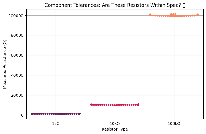
🎯 What This Reveals:#
✅ Most resistors are within expected tolerance (tight clusters). ✅ Some 100kΩ resistors are too far off—bad batch? Time to reject those. ✅ Can identify trends per component type (e.g., higher resistances show more variation).
📊 🔟 Pair Grids: Multivariate Analysis of Battery Performance 🔋#
👀 Use Case: You’re analyzing multiple characteristics of batteries—energy capacity, voltage, and charge cycles.
Example: Battery Data for a New EV Prototype#
# Simulated battery performance dataset
df = pd.DataFrame(
    {
        "Capacity (mAh)": np.random.normal(3000, 200, 100),
        "Voltage (V)": np.random.normal(3.7, 0.1, 100),
        "Charge Cycles": np.random.randint(100, 1000, 100),
    }
)

# Pair Grid Plot - Shows relationships between multiple variables
g = sns.pairplot(df, diag_kind="kde", markers="o", plot_kws={"alpha": 0.7})
g.fig.suptitle("Battery Performance Analysis 🔋", y=1.02)
plt.show()
/home/jca92/drexel_runner_engineering/actions-runner/_work/_tool/Python/3.11.11/x64/lib/python3.11/site-packages/IPython/core/pylabtools.py:170: UserWarning: Glyph 128267 (\N{BATTERY}) missing from font(s) DejaVu Sans.
  fig.canvas.print_figure(bytes_io, **kw)
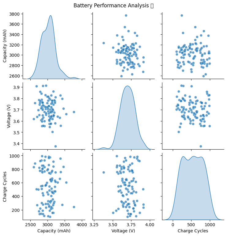
🔋 What This Reveals:#
✅ Higher capacity batteries may degrade faster (fewer charge cycles). ✅ Some outliers—are they defective batteries? ✅ Voltage stability—ensures batteries are consistent across production.
🎯 Final Takeaways#
🎨 Seaborn isn’t just about making graphs look cool—it’s about extracting insights from raw data in an efficient way.
✔️ Violin & Swarm plots uncover manufacturing variations. ✔️ Regression plots model fluid flow, signal strength, or material behavior. ✔️ Joint plots help engineers evaluate noise, interference, and performance. ✔️ Heatmaps detect thermal stress in materials. ✔️ Pair Grids enable multivariable analysis for complex systems.
🚀 Engineering is data-driven. If you’re not visualizing it, you’re missing the bigger picture!
So go forth, engineer beautiful visualizations and prevent catastrophic failures before they happen. 🎨⚡